Overview
Savee is a visual bookmarking and inspiration platform built around a dark-first aesthetic that places imagery at the center of attention. The interface employs a near-black canvas with subtle surface layers, allowing saved content—whether product photography, graphic design, or illustration—to dominate the viewport. The design philosophy prioritizes minimal chrome, high-contrast typography, and restrained interaction patterns that feel native to creative professionals.
The system uses a single custom typeface family across all text, creating a cohesive voice that ranges from small metadata labels to large section displays. Color is deployed sparingly: the vast majority of the interface reads in grayscale, with occasional accent moments in electric blue and lime green for interactive emphasis. Rounded shapes appear throughout, from pill buttons to circular avatars and color swatches, softening the otherwise stark dark environment. The layout adapts between a full-bleed image viewer and a collapsible right-side information panel, maintaining visual hierarchy through spacing and typographic scale rather than decorative elements.
Colors
The Savee palette is built on a foundation of extreme darkness, with surfaces stepping up through subtle gray values and text inverting to near-white for maximum legibility. Every interface color serves a functional role, with no decorative gradients or ornamental tints.
| token | value | use |
|---|---|---|
| canvas | #050505 | Primary page background, image viewer surround |
| surface | #151515 | Elevated cards, input fields, secondary containers |
| surface-elevated | #2F2F2F | Tag pills, toggle tracks, hover states |
| ink-primary | #D4D4D4 | Primary body text, headings, active navigation |
| ink-secondary | #A3A3A3 | Metadata, timestamps, secondary descriptions |
| ink-muted | #737373 | Placeholder text, disabled states, tertiary labels |
| ink-inverse | #050505 | Text on light or white backgrounds |
| border-subtle | #2F2F2F | Dividers, panel borders, inactive field outlines |
| border-default | #404040 | Active input borders, emphasized separators |
| action-primary | #FDFDFD | Primary button backgrounds, save actions |
| action-primary-text | #050505 | Text on primary buttons |
| action-secondary-bg | #000000 | Secondary button backgrounds |
| action-secondary-text | #D4D4D4 | Text on secondary buttons |
| action-secondary-border | #2F2F2F | Secondary button borders |
| accent-lime | #E8FA73 | Highlight moments, promotional badges |
| accent-blue | #1019ED | Active toggles, selected states, links |
The dark mode is not an alternative but the native state of the platform. Light values appear only as inverse text on dark grounds or as the occasional white button surface. The near-black canvas (#050505) absorbs visual noise, making colorful user-generated content appear more saturated and dimensional by contrast. Subtle borders in #2F2F2F and #404040 create structure without introducing visual weight. The two accent colors—electric blue and acid lime—are reserved for interactive feedback and premium callouts, ensuring they retain impact when deployed.
Typography
Savee employs a single custom typeface, Savee Fontac 0 Ea 6, for all interface text. This decision unifies the experience across body copy, navigation, buttons, and display headings, with weight and size variations providing hierarchy. The typeface carries a neutral, contemporary character with slightly rounded terminals that complement the system’s pill-shaped components.
The platform’s font sources also include Abc Diatype and Inter, which appear in the site’s loaded assets. Abc Diatype is designed by Johannes Breyer, Fabian Harb, Elias Hanzer, Renan Rosatti, and Erkin Karamemet of Dinamo. Inter is designed by Rasmus Andersson.
| token | family | size | weight | leading | tracking | use |
|---|---|---|---|---|---|---|
| body | Savee Fontac 0 Ea 6 | 1rem | 400 | 1.375 | 0.015em | Primary reading text, descriptions, navigation links |
| body-small | Savee Fontac 0 Ea 6 | 0.875rem | 400 | 1.286 | 0.015em | Secondary descriptions, source attributions |
| label | Savee Fontac 0 Ea 6 | 0.75rem | 400 | 1.375 | 0.02em | Tags, timestamps, metadata, small UI labels |
| display-hero | Savee Fontac 0 Ea 6 | 2.25rem | 600 | 1.111 | -0.01em | Page titles, major section headings |
| display-section | Savee Fontac 0 Ea 6 | 1.125rem | 400 | 1.333 | 0.015em | Subsection headings, card titles |
| display-large | Savee Fontac 0 Ea 6 | 1.3125rem | 400 | 1.286 | 0.013em | Prominent body, featured descriptions |
| button-primary | Savee Fontac 0 Ea 6 | 0.875rem | 500 | 1.286 | -0.01em | Primary action buttons, save actions |
| button-secondary | Savee Fontac 0 Ea 6 | 0.75rem | 500 | 1 | -0.01em | Compact buttons, follow actions |
| navigation | Savee Fontac 0 Ea 6 | 1rem | 400 | 1.375 | 0.015em | Top-level navigation, wayfinding |
The type scale is tightly constrained, with most interface text falling between 0.75rem and 1rem. Larger sizes appear only for hero displays and section headings, creating clear typographic contrast without excessive variation. Letter spacing is slightly positive for body sizes to improve readability on dark backgrounds, while buttons and displays use tighter tracking for a more compact, intentional feel. Weight 400 serves as the workhorse, with 500 reserved for button emphasis and 600 appearing only at hero scale.
Verify licensing for these families before production use. The Savee Fontac 0 Ea 6 family shows no designer or vendor attribution in available records.
Layout
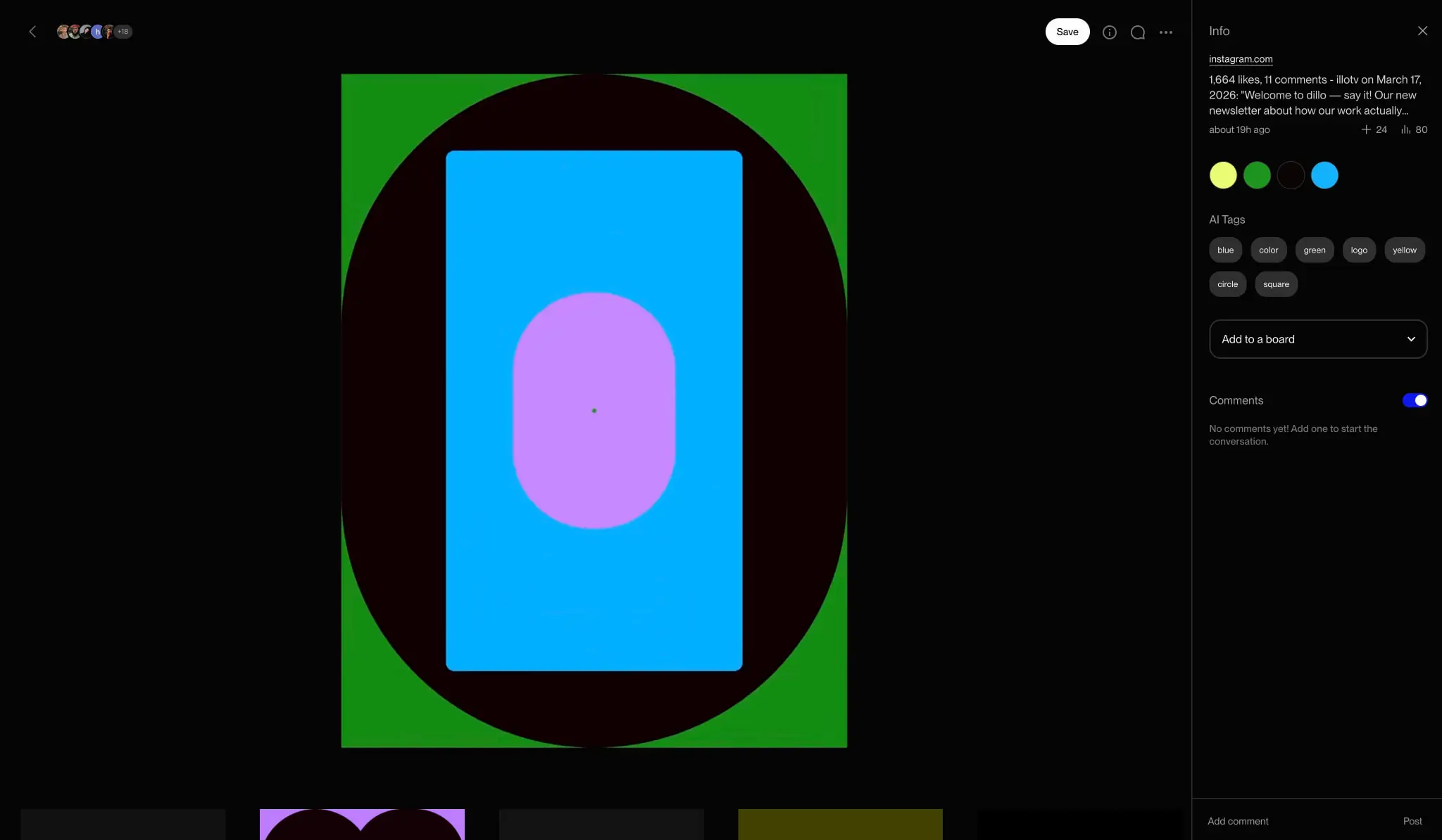
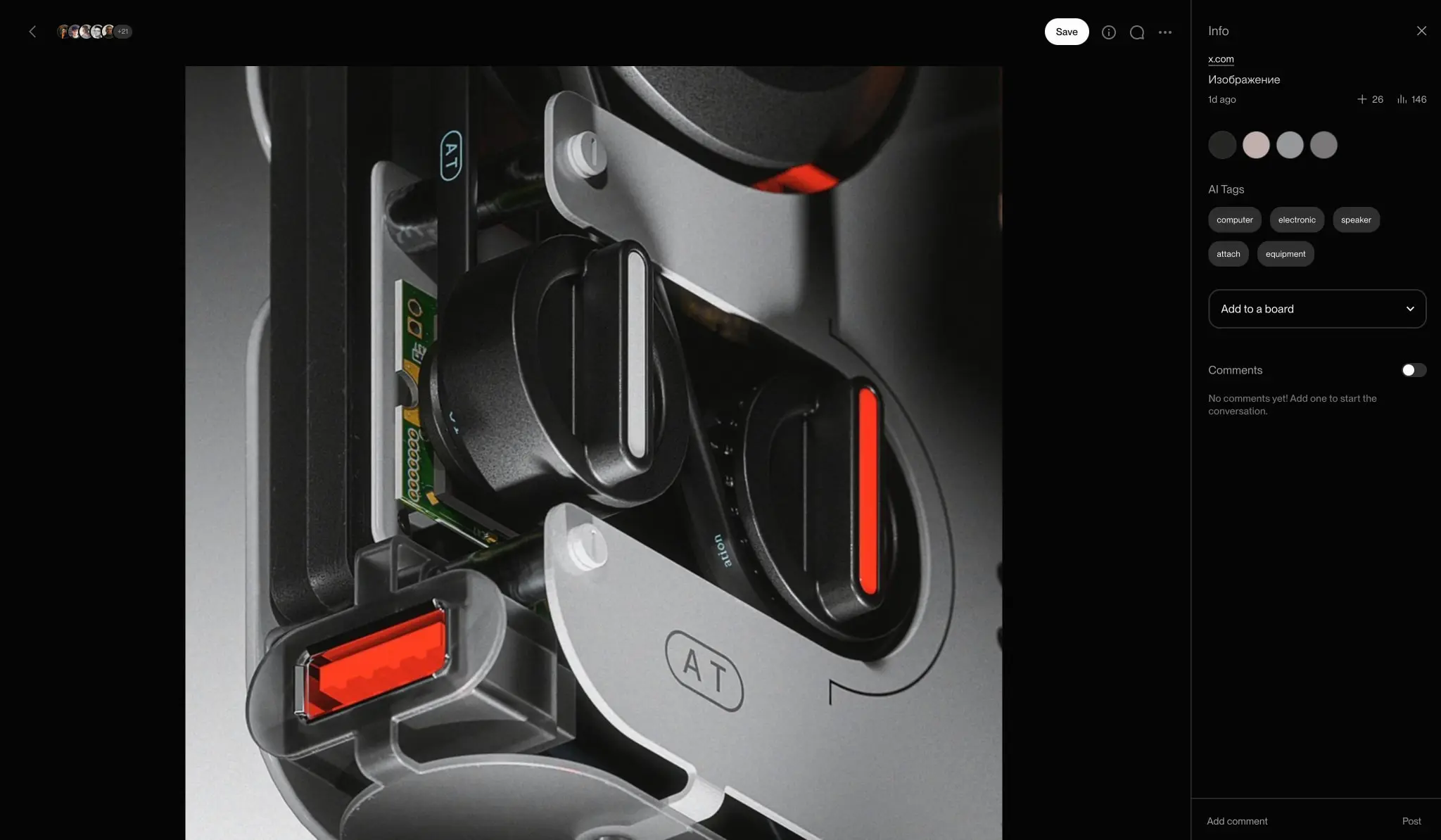
The Savee layout system is built on a flexible two-zone architecture that prioritizes content viewing while maintaining accessible information hierarchy. The primary zone occupies the majority of the viewport, presenting saved imagery at maximum scale against the dark canvas. A secondary zone—the info panel—slides or collapses from the right edge, providing metadata, interaction controls, and social features without permanently obscuring content.
The base spacing unit is 0.125rem (2px), with all measurements building from this foundation. Key layout values include:
- Page padding: 1.5rem horizontal on standard views, expanding to 2.0625rem for the info panel’s left edge to create visual separation from the image zone
- Section spacing: 3rem to 5rem between major content regions
- Component internal padding: 1rem standard, with 0.75rem for compact elements like tags
- Card and panel padding: 1.5rem for elevated surfaces
The image viewer uses full-bleed presentation with minimal chrome: a thin top bar with back navigation, user avatars, and action icons floats over the image with subtle transparency or blend modes. The info panel measures approximately one-third of viewport width on desktop, collapsing to a bottom sheet or modal on narrower viewports. Grid layouts for browse views use tight gutters of 0.5rem to 0.75rem, allowing image thumbnails to feel connected while maintaining distinct boundaries.
Vertical rhythm is established through consistent margin stacking: 0.5rem between related elements, 1rem between list items, 1.5rem between content blocks, and 3rem between major sections. This stepped approach creates predictable scan patterns without explicit divider lines.
Visual language
The Savee visual language communicates sophistication through restraint. The near-total absence of color in the chrome forces attention toward user-generated imagery, while the consistent use of rounded forms—pills, circles, soft rectangles—prevents the dark interface from feeling severe or technical.
Imagery is treated as sacred space: photographs and illustrations receive maximum real estate with minimal overlay. When UI chrome must appear over images, it uses the dark canvas color with high transparency or employs subtle inner shadows like rgba(253, 253, 253, 0.1) 0px 0px 0px 1px inset to create depth without harsh borders.
Interactive elements signal their purpose through shape and contrast rather than color alone. Primary actions use filled white pills against the dark ground; secondary actions use outlined pills with dark fills. The circular avatar pattern appears consistently across user lists, comment threads, and attribution rows, creating a recognizable social identity system. Color swatches for image palettes use the same circular form with thin borders, making them feel like interactive specimens rather than static labels.
The overall impression is of a premium gallery or studio tool rather than a mass-market social platform. Negative space is generous, animations (where present) are implied to be subtle and physics-based, and every element justifies its presence through functional necessity.
Components
Image Viewer
The image viewer is the platform’s central component, presenting saved content at maximum scale within the dark canvas environment.
- Anatomy: Full-bleed image container, floating top action bar (back button, collaborator avatars, save button, info/search/more icons), optional bottom thumbnail strip for multi-image items
- Surface: Transparent or near-transparent overlay for chrome; image itself unframed against #050505 canvas
- Typography: None within the image zone except overlaid metadata in navigation token
- Shape: Image respects original aspect ratio; container fills available space
- Spacing: 1.5rem padding for floating chrome elements from viewport edges
- Composition: Centered or letterboxed presentation; thumbnail strip at bottom uses 0.5rem gaps
Info Panel
The collapsible right panel provides context and interaction for viewed items.
- Anatomy: Header with source URL and close control, engagement metrics row, color palette swatches, AI Tags section with pill grid, “Add to a board” dropdown, Comments section with toggle and input field
- Surface: #050505 background with 1px left border in #2F2F2F
- Typography: Body for descriptions, body-small for metadata, label for tags and section headers
- Shape: Panel has no border-radius; internal elements use 1rem for dropdowns, 9999px for tags
- Spacing: 1.5rem padding all sides, 1.5rem left padding expanded to 2.0625rem for border breathing room; 1rem between sections, 0.5rem between tag rows
- Composition: Single column, vertically stacked with consistent section spacing
Tag Pill
Compact labels for AI-generated or user-applied tags.
- Surface: #2F2F2F background, no border
- Typography: label token
- Shape: 9999px border-radius for full pill
- Spacing: 0.5rem vertical padding, 0.75rem horizontal padding; 0.5rem gap between adjacent pills
- Composition: Inline wrapping grid, left-aligned
Follow Button
Primary social action for user directory and profile contexts.
- Surface: #FDFDFD fill, #050505 text
- Typography: button-primary token
- Shape: 9999px border-radius
- Spacing: 0.5rem vertical padding, 1rem horizontal padding
- Composition: Right-aligned within list rows, vertically centered with avatar and username
Secondary Button
Outlined alternative for less prominent actions.
- Surface: #000000 fill, #D4D4D4 text, 1px #2F2F2F border
- Typography: button-secondary token
- Shape: 9999px border-radius
- Spacing: 0.5rem vertical padding, 1.25rem horizontal padding
- Variants: May include icon prefix with 0.5rem text gap
Avatar
User identity marker appearing throughout social features.
- Surface: Circular crop of uploaded image, or solid color with initial for default
- Shape: 50% border-radius (perfect circle)
- Size: 2.5rem standard, 2rem compact variant
- Composition: Left-aligned in list rows, 1rem gap to username text
Color Swatch
- Surface: Solid color fill matching extracted value
- Shape: 50% border-radius (perfect circle), 2rem diameter
- Border: 2px solid #2F2F2F to separate from dark backgrounds
- Composition: Horizontal row with 0.5rem gaps, appearing below engagement metrics
Input Field
Text entry for comments, searches, and form interactions.
- Surface: #151515 background, 1px #404040 border
- Typography: body token
- Shape: 1rem border-radius
- Spacing: 1rem padding
- States: Focus state likely shifts border to ink-primary; placeholder in ink-muted
Toggle Switch
Binary control for comments visibility and similar features.
- Track: 2.5rem width, 1.25rem height, #2F2F2F inactive / #1019ED active
- Thumb: 1rem diameter, #737373 inactive / #FDFDFD active
- Shape: 9999px for track (pill), 50% for thumb (circle)
- Spacing: 0.25rem thumb inset from track edge
- Composition: Right-aligned adjacent to section header
Responsive behavior
The Savee interface adapts primarily through panel transformation and content reflow. On desktop viewports, the image viewer and info panel share horizontal space with a draggable or collapsible divider. As viewport width decreases, the info panel transitions to an overlay modal or bottom sheet, allowing the image to reclaim full width.
The user directory list (visible in image 8687) maintains its single-column structure across breakpoints, with avatar and button sizes potentially scaling down on mobile. Tag pill grids reflow from multi-column to single-row horizontal scroll when horizontal space is constrained.
Typography remains fixed in scale rather than fluid, relying on the generous body size and high contrast to maintain legibility across devices. Touch targets for buttons and interactive elements should maintain minimum 44px height regardless of breakpoint. The dark canvas provides consistent visual continuity, eliminating the need for breakpoint-specific theme adjustments.
Practical implementation guidance
Preserve
- The near-black canvas as the default and dominant background; any lighter surfaces must be justified by functional need
- Single-typeface consistency across all text; do not introduce secondary fonts for “visual interest”
- Pill-shaped buttons and circular avatars as the primary rounded forms; avoid arbitrary border-radius values
- High contrast between text and ground; never place muted text on elevated surfaces
- Generous negative space around imagery; resist the urge to add decorative frames or shadows
Avoid
- Gradients, drop shadows, or dimensional effects on UI chrome; the interface should read as flat and immediate
- Color in interface elements except for the two accent tokens; let user content provide chromatic variety
- Borders heavier than 1px or 2px; the system relies on spacing and contrast for separation
- Multiple button styles beyond the primary filled and secondary outlined variants
- Decorative iconography without functional purpose
Recommended Build Order
- Establish the dark canvas foundation with canvas, surface, and ink tokens
- Implement the type scale with Savee Fontac 0 Ea 6 at all specified sizes
- Build the image viewer container with full-bleed behavior and floating chrome
- Create the info panel structure with collapsible behavior
- Develop the tag pill and button components as the most reused elements
- Add avatar, color swatch, and toggle switch as secondary components
- Implement input fields and form patterns for comments and search
Accessibility
- Ensure all text meets WCAG AA contrast ratios against the dark canvas; the specified ink values on #050505 exceed 7:1 for primary and secondary text
- Provide visible focus indicators for keyboard navigation; consider 2px outline in accent-blue for interactive elements
- Maintain touch target minimums of 44×44px for buttons and controls
- Use aria-labels for icon-only buttons in the floating chrome
- Respect reduced-motion preferences for any panel transitions or image loading effects
- Ensure color swatches communicate their value through adjacent text labels, not color alone
Scope note
This guide covers the image detail view, user directory, and info panel surfaces visible in the captured pages. The browse grid, search results, user profile pages, settings, and onboarding flows are not represented. Motion design, loading states, error handling, and mobile-specific bottom sheet behavior are not documented. Measurements derive from the exact values in the captured styles and reflect the current interface state.
Sites change, so a screenshot can differ from the guide.
Loading…Similar designs
This guide describes the public website and isn't an official savee.com design system. Not affiliated with savee.com.