Overview
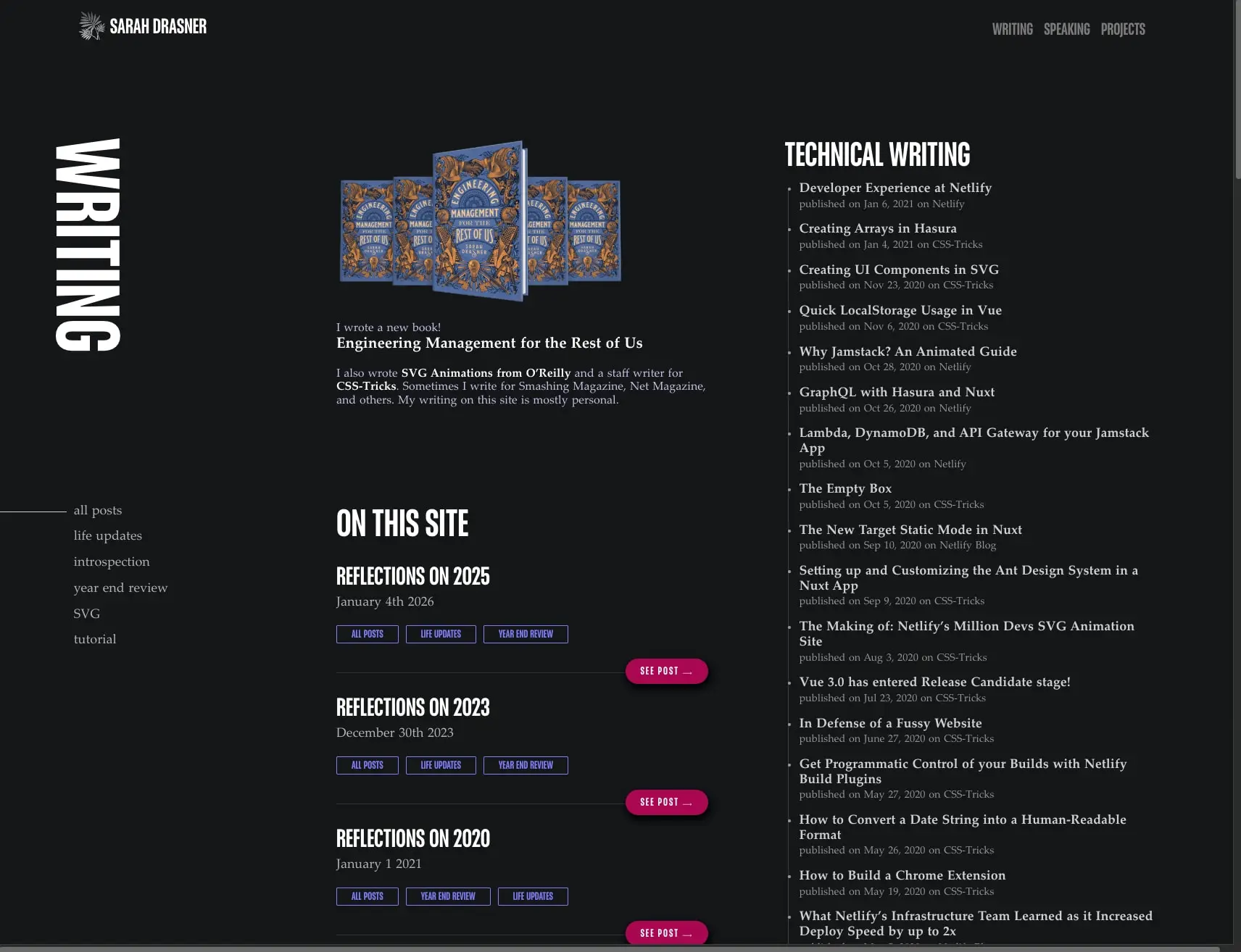
This design system captures a personal portfolio and writing archive built on theatrical contrast. The canvas is pure black, letting white and near-white typography command full attention. Display type is aggressive and vertical when it needs to be—section headings like “WRITING” rotate ninety degrees to become architectural elements on the left edge of the viewport. The body relies on classical serif forms for readability and warmth, while a single magenta accent punctuates calls to action. The overall impression is of a curated editorial space: confident, minimal, and deliberately dramatic. Content is organized into clear hierarchies—featured books, categorized personal posts, and chronological technical articles—each with distinct typographic treatment that lets visitors scan quickly or settle into reading.
Colors
| token | value | use |
|---|---|---|
| canvas | #000000 |
Page background, all surfaces |
| ink | #FFFFFF |
Primary headings, article titles, navigation, button text |
| muted-ink | #EEEEEE |
Secondary text, publication metadata, dates |
| secondary-ink | #B5B3B3 |
Sidebar category links, tertiary text |
| accent | #AA0753 |
Primary buttons, “SEE POST” actions |
| accent-hover | #7F7FF8 |
Category tag borders and text, interactive hover states |
| border-subtle | #C3C3E5 |
Delicate dividers, tag borders |
The palette is strictly dichromatic with one warm accent. Black and white establish maximum contrast for the theatrical display typography. The magenta accent is used sparingly and only for interactive commitment—buttons that advance to full articles. The periwinkle accent-hover appears on category tags as a cooler alternative that signals secondary interactivity. No gradients appear in the interface; all color transitions are flat and decisive. Photography and book covers bring their own color worlds into the composition, but the UI never competes with them.
Typography
| token | family | size | weight | leading | tracking | use |
|---|---|---|---|---|---|---|
| hero-display | Placard Next | 6.61rem | 500 | 1.15 | normal | Vertical page title (“WRITING”) |
| section-display | Placard Next | 2.8125rem | 500 | 1.15 | normal | Section headings (“ON THIS SITE”) |
| subsection-display | Placard Next | 1.875rem | 500 | 1.15 | normal | Post titles (“Reflections on 2025”) |
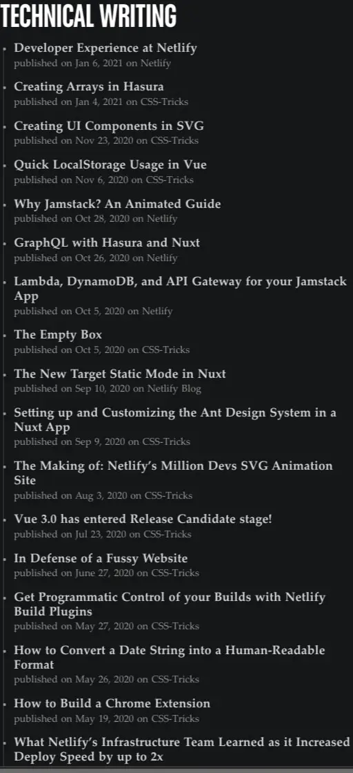
| list-heading | Placard Next | 2.5rem | 500 | 1.15 | normal | Column headings (“TECHNICAL WRITING”) |
| navigation | Placard Next | 1.25rem | 500 | 1.15 | normal | Top nav, sidebar links |
| label | Placard Next | 0.8125rem | 400 | 1.15 | 0.15em | Button text, category tags |
| body | Palatino Linotype | 1.125rem | 400 | 1.15 | normal | Article titles, descriptions |
| body-small | Palatino Linotype | 1rem | 400 | 1.15 | normal | Compact body, captions |
| body-strong | Palatino Linotype | 1.3rem | 700 | 1.15 | normal | Emphasized inline text |
| metadata | Mercury A | 1rem | 400 | 1.15 | normal | Dates, publication sources |
Placard Next serves as the sole display typeface, delivering compressed, high-impact headings with a slightly industrial character. Its Medium weight carries all display roles from the monumental vertical hero to compact button labels. Palatino Linotype, designed by Hermann Zapf and provided by Monotype Imaging Inc., handles all body reading with classical proportions and open counters. Palatino Linotype Roman, also designed by Hermann Zapf and provided by Monotype Imaging Inc., appears in the technical writing list at 18px for article titles. Mercury A, unattributed in available records, appears only for metadata and secondary captions. Verify licensing for these families before production use.
Layout
The page employs a split-composition layout with a persistent left sidebar and a wider right content area. The left column contains the vertical hero heading, a filtered category navigation, and featured promotional content. The right column carries chronological lists and technical writing archives. This asymmetry creates visual tension—the heavy left anchor against the flowing right content.
Vertical rhythm is established through consistent section padding of 1.875rem top and bottom within content blocks, with larger 6rem gaps between major page regions. The left sidebar navigation sits flush with generous left margins, while the right content maintains comfortable reading measure through restrained line lengths.
The vertical “WRITING” heading is a distinctive spatial element: rotated ninety degrees counter-clockwise, positioned at the left edge, and scaled to dominate the viewport height. This treatment transforms a functional label into a graphic device that reinforces the page’s editorial ambition.
List structures throughout use 0.9375rem vertical spacing between items, with 0.875rem left indentation for bullet markers. The overall grid is loose and editorial rather than rigidly mathematical, prioritizing content hierarchy over strict alignment.
Visual language
The visual language balances theatrical display with classical restraint. The black canvas creates a gallery-like environment where content appears to float. Typography does the heavy lifting: Placard Next’s compressed forms shout for attention, while Palatino Linotype’s serifs invite sustained reading.
Imagery appears selectively—a book cover promotion receives center placement with surrounding whitespace, treated as an artifact rather than decoration. No borders or frames contain images; they sit directly on the black ground.
Interactive elements follow a clear temperature logic: warm magenta for primary advancement, cool periwinkle for secondary categorization. Buttons are fully rounded pills with subtle shadow elevation, while category tags are sharp rectangles with hairline borders. This shape contrast reinforces the hierarchy—pills demand action, rectangles offer filtering.
The absence of decorative lines, background textures, or gradient overlays keeps focus on content and typography. The design trusts its type choices and spacing to create interest rather than applying additional visual noise.
Components
Primary button
- Anatomy: Text label with right-pointing arrow, contained in a pill shape
- Surface: Solid magenta (
{colors.accent}) background - Typography:
{typography.label}in white, uppercase with wide tracking - Shape: Full pill radius (
{rounded.pill}) - Spacing:
0.625remvertical padding,1.25remhorizontal padding - Shadow:
rgb(0, 0, 0) 2px 5px 10px 2pxfor subtle elevation - Composition: Right-aligned within its content block, creating asymmetric tension
Category tag
- Anatomy: Text label within a bordered rectangle
- Surface: Transparent background
- Typography:
{typography.label}in periwinkle ({colors.accent-hover}) - Border:
1px solidperiwinkle - Shape:
0.125remcorner radius - Spacing: Compact internal padding
- Composition: Horizontal row of multiple tags, left-aligned beneath post titles
Article list item
- Anatomy: Linked title with metadata line below
- Typography: Title uses
{typography.body}in white; metadata uses{typography.metadata}in muted gray - Spacing:
0.9375remvertical gap between items - Composition: Bullet marker at left, title and metadata stacked vertically
- States: Hover state should shift title toward periwinkle or apply underline
Vertical section heading
- Anatomy: Single word or short phrase rotated ninety degrees
- Typography:
{typography.hero-display}in white - Composition: Positioned at left viewport edge, reading bottom-to-top
- Surface: No background, text sits directly on black canvas
Navigation header
- Anatomy: Logo mark with text, plus horizontal link row
- Typography: Site name in
{typography.navigation}, nav links in same family at matching size - Composition: Logo left-aligned, navigation right-aligned in top bar
- Color: All elements in white
Featured book promotion
- Anatomy: Stacked book cover image, descriptive paragraph, title
- Typography: Title uses
{typography.subsection-display}, body uses{typography.body-small} - Composition: Centered in left column with generous surrounding space
Responsive behavior
The split-column layout should collapse to single-column on narrower viewports, with the vertical hero heading rotating to horizontal placement above content. The left sidebar navigation can become a horizontal scroll or collapsible menu. Article lists maintain their bullet structure but may reduce to single-column with full-width items.
The large hero display size of 6.61rem should scale down proportionally—target approximately 3rem on tablet and 2rem on mobile to prevent overflow. Section headings at 2.8125rem can reduce to 2rem and then 1.5rem across breakpoints.
Button touch targets should maintain minimum 44px height on mobile despite the compact desktop padding. Category tags may wrap to multiple rows rather than horizontal scroll.
Practical implementation guidance
Preserve
- The stark black-and-white contrast as the foundational palette
- Placard Next for all display and UI text; Palatino Linotype for all body reading
- The vertical heading treatment as a signature spatial element
- Magenta buttons as the sole warm accent, used only for primary advancement
- Periwinkle tags as the secondary interactive color, never competing with magenta
Avoid
- Adding background colors or gradients behind content blocks
- Using Placard Next for body paragraphs—its compressed forms fatigue at length
- Introducing additional accent colors that dilute the magenta/periwinkle pairing
- Rounding corners on category tags—keep them sharp to distinguish from buttons
- Centering body text; maintain left alignment for the editorial rhythm
Recommended build order
- Establish the black canvas and white text defaults
- Implement Placard Next at hero, section, and label sizes
- Add Palatino Linotype for body and article lists
- Build the split-column grid with left sidebar and right content
- Create the vertical heading as a rotated absolute-positioned element
- Style article lists with bullet markers and metadata stacking
- Implement magenta pill buttons with shadow elevation
- Add periwinkle category tags with hairline borders
- Refine spacing and vertical rhythm across all sections
Accessibility
- White text on black exceeds WCAG AAA contrast for normal text
- Ensure the vertical heading has appropriate
aria-labelor is hidden from screen readers if decorative - Button text should remain readable if custom fonts fail to load—specify system serif and sans-serif fallbacks
- The magenta accent on black should be tested for non-text contrast on focus indicators
- Consider
prefers-reduced-motionfor any hover transitions on the rotated heading
Scope note
This guide covers the writing and archive pages of sarah.dev as visible in the captured images. The technical writing list, personal post archive, book promotion, and navigation header are fully described. Footer content, additional interior pages, mobile layouts, form states, and animation behavior are not represented in the available material. Measurements are drawn from the exact values recorded for this domain.
Sites change, so a screenshot can differ from the guide.
Loading…Similar designs

This guide describes the public website and isn't an official sarah.dev design system. Not affiliated with sarah.dev.