Overview
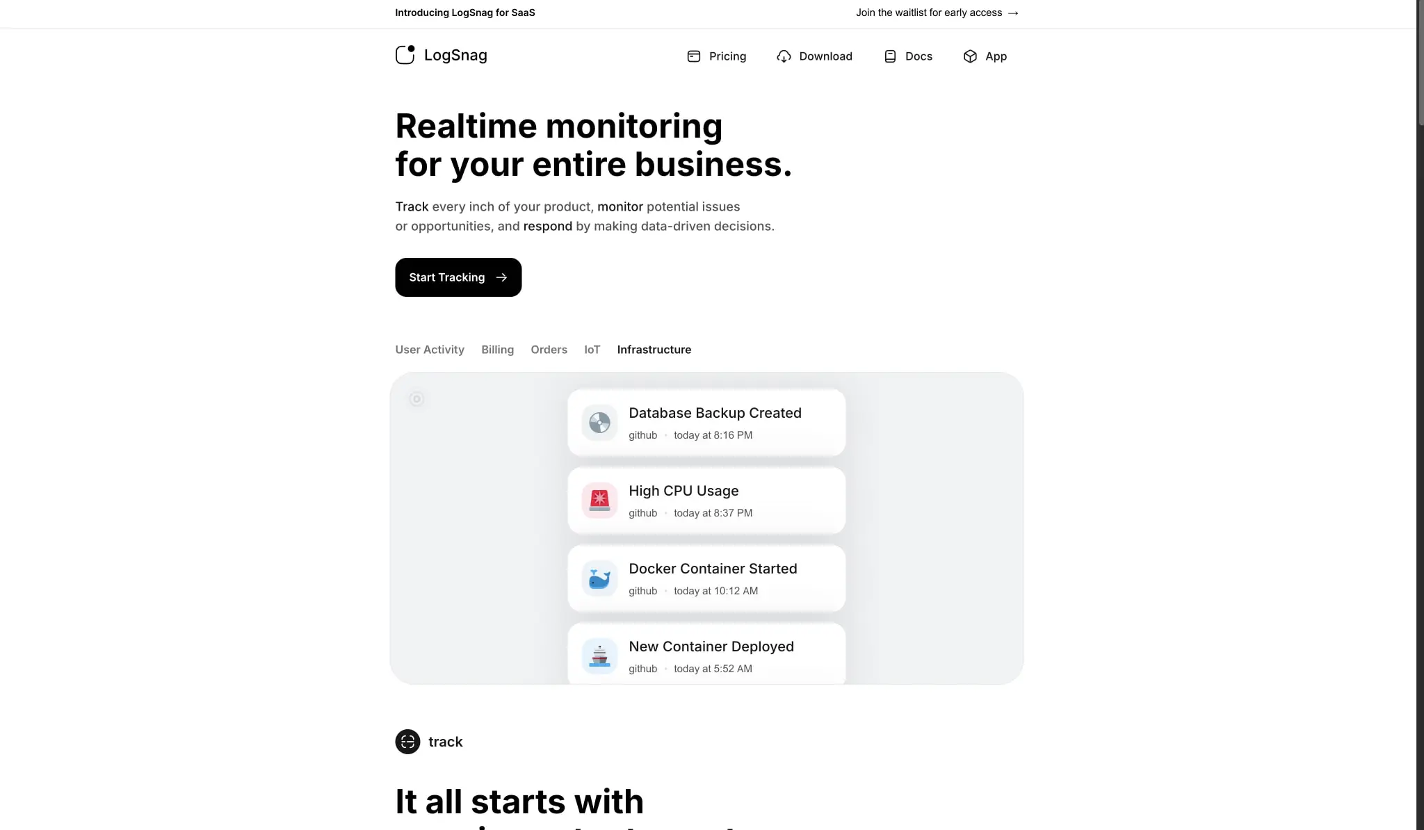
LogSnag presents a disciplined, modern SaaS aesthetic built on extreme contrast: near-black canvas surfaces against crisp white content areas, with restrained color accents reserved for functional signals and interactive states. The visual system prioritizes clarity and density management for technical users who need to scan event streams, pricing tiers, and monitoring dashboards quickly. Typography is exclusively Inter, deployed with careful weight differentiation that creates hierarchy without size inflation. Rounded corners are generous on cards and panels but restrained on buttons, producing a friendly yet precise character. The layout relies on centered content containers with ample horizontal padding, creating breathing room around dense information displays. Component surfaces are predominantly flat with subtle border definitions rather than shadows, reinforcing the clean, utilitarian personality of an infrastructure monitoring tool.
Colors
The palette operates in a near-monochrome mode with strategic accent injections. The foundational relationship pairs absolute black canvas areas with white elevated surfaces, using a controlled gray scale for text and borders. The purple accent appears in promotional labels and product screenshots for data visualization, while tinted status backgrounds provide subtle semantic coloring for message surfaces.
| token | value | use |
|---|---|---|
| canvas | #000000 |
Primary page background, hero sections, dark surfaces |
| surface | #FAFAFA |
Subtle off-white for alternating sections, tab backgrounds |
| surface-elevated | #FFFFFF |
Cards, panels, notification items, pricing tiers |
| ink | #171717 |
Primary headings, bold display text, active tab text |
| ink-secondary | #525252 |
Body text, descriptions, secondary content |
| ink-tertiary | #737373 |
Timestamps, metadata, disabled states |
| border | #E5E5E5 |
Card outlines, dividers, pricing card borders |
| border-subtle | #F0F2F4 |
Inner panel divisions, table row separators |
| action | #000000 |
Primary button fills, CTA backgrounds |
| action-text | #FFFFFF |
Text on primary buttons, inverted surfaces |
| accent-purple | #A855F7 |
Promotional highlights, “2 months free” labels, chart accents |
| status-info | #EBF3F9 |
Light blue tinted backgrounds for info blocks |
| status-success | #E8F4FD |
Very light blue for success message surfaces |
| status-error | #FBE9EC |
Light pink-tinted error message backgrounds |
The color philosophy separates content into three modes: the dark hero mode for impact and brand presence, the light functional mode for readable long-form content and dashboards, and the accent mode for data visualization and status communication within the product interface. Purple functions as the brand accent, appearing sparingly in promotional contexts and chart data. The gray scale is intentionally cool-neutral, avoiding warmth to maintain technical precision. Product screenshots in the interface show additional functional colors in charts and event icons, but these are part of the application UI rather than the marketing site design system.
Typography
The type system uses Inter exclusively across all weights and sizes, creating a unified, engineered appearance appropriate for developer-facing tooling. Hierarchy is established through weight and size rather than family variation, with bold display sizes for hero statements and medium weights for interactive elements.
| token | family | size | weight | leading | tracking | use |
|---|---|---|---|---|---|---|
| hero-display | Inter | 3rem | 700 | 1.15 | -0.02em | Page headlines, hero statements |
| section-display | Inter | 1.875rem | 700 | 1.2 | -0.01em | Section headings, feature titles |
| card-title | Inter | 1.5rem | 700 | 1.33 | normal | Pricing tier names, card headers |
| body-large | Inter | 1.125rem | 400 | 1.75 | normal | Lead paragraphs, feature descriptions |
| body | Inter | 1rem | 400 | 1.5 | normal | Default paragraph text, UI labels |
| body-medium | Inter | 1rem | 500 | 1.5 | normal | Button text, navigation, emphasized body |
| label | Inter | 0.875rem | 500 | 1.5 | normal | Small labels, tags, metadata |
| navigation | Inter | 1rem | 500 | 1.5 | normal | Header links, tab text |
Display sizes use tight negative tracking for visual density and impact, while body sizes maintain neutral spacing for extended reading. The 48px hero size creates substantial presence without overwhelming the layout, and the 30px section size bridges between hero and body scales. Weight 600 appears in button contexts for semibold emphasis, and weight 700 is reserved for display and card titles. Verify licensing for these families before production use.
Layout
The layout follows a centered container model with generous horizontal margins that scale with viewport width. Content maxes out at approximately 64rem, creating focused reading columns that prevent line-length fatigue. Vertical rhythm is spacious, with section spacing at 4rem to 6rem and inter-element gaps using a 0.25rem base unit.
The header navigation sits at the top with a logo mark and text lockup on the left, primary navigation links centered or right-aligned, and utility actions at the far right. A promotional banner may appear above the header for product announcements, using the same dark background as the hero.
Hero sections stack vertically: headline at maximum width, supporting description with constrained width for readability, followed by a primary call-to-action. Below the hero, tab interfaces allow content switching, with tab labels arranged horizontally and active states indicated by background fills rather than underlines.
Content sections alternate between dark and light backgrounds, with dark sections typically containing product demonstrations or screenshots, and light sections presenting feature explanations, pricing, or textual content. Cards are arranged in grids with consistent gaps, typically 1.5rem to 2rem between items.
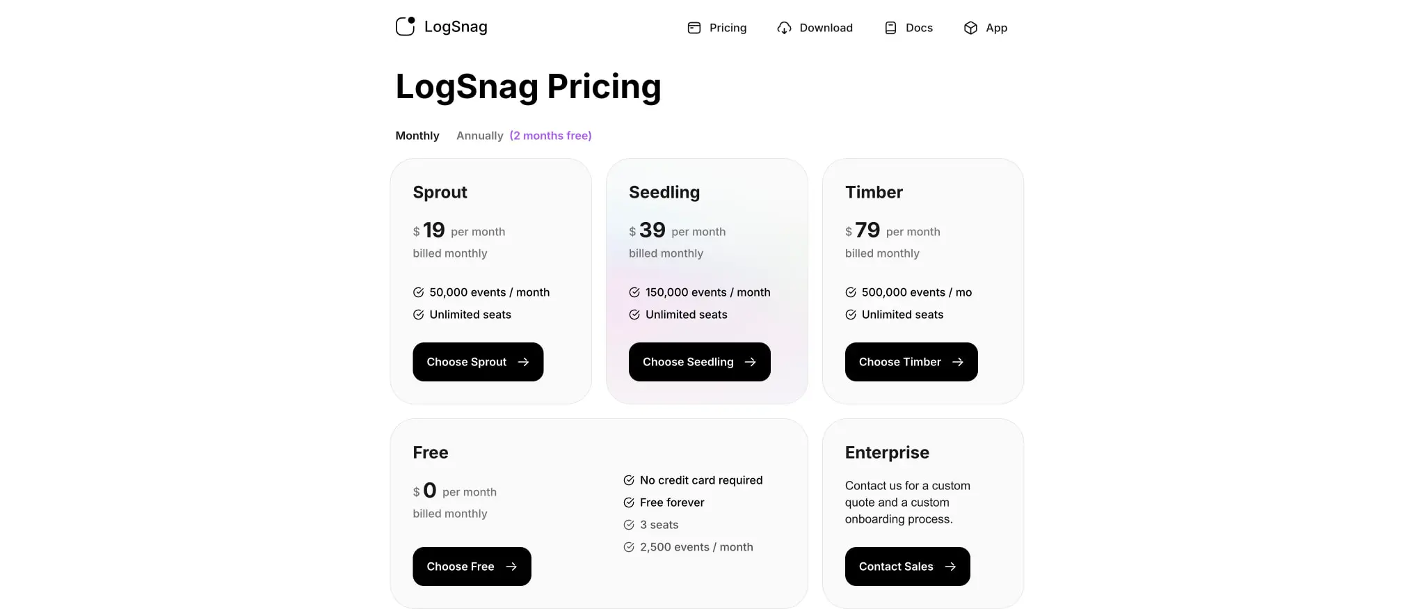
The pricing page uses a multi-column grid that collapses from five tiers to fewer on narrower viewports, with featured or recommended tiers receiving no special visual distinction beyond position. Notification feeds and event lists use vertical stacking with consistent item spacing and left-aligned iconography.
Visual language
The visual character balances technical credibility with approachable simplicity. Surfaces are predominantly flat, with depth communicated through background color changes rather than shadows. The near-black hero areas create dramatic contrast that draws attention to white or light-colored product screenshots floating within them.
Iconography is simple and functional, using filled circles with single-letter or minimal symbols for category indicators, and small colored squares or rounded rectangles for event type badges. Product screenshots within the interface show the actual application UI, complete with realistic data, charts, and notification streams, serving as both demonstration and visual interest.
The rounded corner vocabulary is consistent: buttons use 1rem, cards and notification items use slightly larger radii around 1.125rem, and major panels or pricing cards use 2.25rem for a softer presence. Full pills appear for toggle-style tabs and category filters.
Motion and interaction are implied through state changes: tab backgrounds shift on selection, buttons maintain their solid fills without gradient shifts, and links show minimal decoration. The overall impression is of a tool that values clarity and speed over ornamentation.
Components
Primary button
- Anatomy: Text label with optional arrow icon on the right
- Surface: Solid black fill (
{colors.action}) - Typography:
{typography.body-medium}, white text ({colors.action-text}) - Shape: Rounded rectangle with
{rounded.button}corners - Spacing: Padding
0.75rem 1.25rem, internal gap0.5rembetween text and icon - Composition: Inline-flex with centered alignment
- Variants: May include right-pointing arrow for forward actions; width adapts to content
Secondary button
- Anatomy: Text label on light background
- Surface: White or near-white fill (
{colors.surface-elevated}), subtle border ({colors.border}) - Typography:
{typography.body-medium}, dark text ({colors.ink}) - Shape: Same rounded rectangle as primary
- Spacing: Identical padding to primary button
- Composition: Used adjacent to primary buttons for alternative actions
Pricing card
- Anatomy: Tier name, price display with currency and period, feature list with check icons, call-to-action button
- Surface: White background (
{colors.surface-elevated}), subtle border ({colors.border}) - Typography: Tier name uses
{typography.card-title}, price uses{typography.section-display}with weight 700 for the numeric value, features use{typography.body} - Shape: Large rounded corners (
{rounded.panel}) - Spacing: Padding
2reminternally, feature list items spaced0.75remapart vertically - Composition: Vertical stack with consistent left alignment; button anchors to bottom
- Variants: Free tier and Enterprise tier follow same structure with adjusted content density
Tab pill group
- Anatomy: Horizontal row of selectable labels, with active state indicated by background fill
- Surface: Transparent default, light gray fill (
{colors.surface}) for active item - Typography:
{typography.label}for all items, active item uses darker color ({colors.ink}) - Shape: Full pill (
{rounded.pill}) for each tab - Spacing: Internal padding
0.5rem 1rem, gap between items0.25rem - Composition: Inline-flex row, items are equal height
- States: Active shows filled background; inactive shows transparent with muted text
Notification card
- Anatomy: Icon or avatar, event title, source label, timestamp
- Surface: White background (
{colors.surface-elevated}) - Typography: Title uses
{typography.body-medium}, metadata uses{typography.label}with{colors.ink-tertiary} - Shape: Rounded corners (
{rounded.card}) - Spacing: Padding
1rem 1.25rem, internal gap0.75rembetween icon and text block - Composition: Horizontal flex with icon left, text stack right; may include action menu on far right
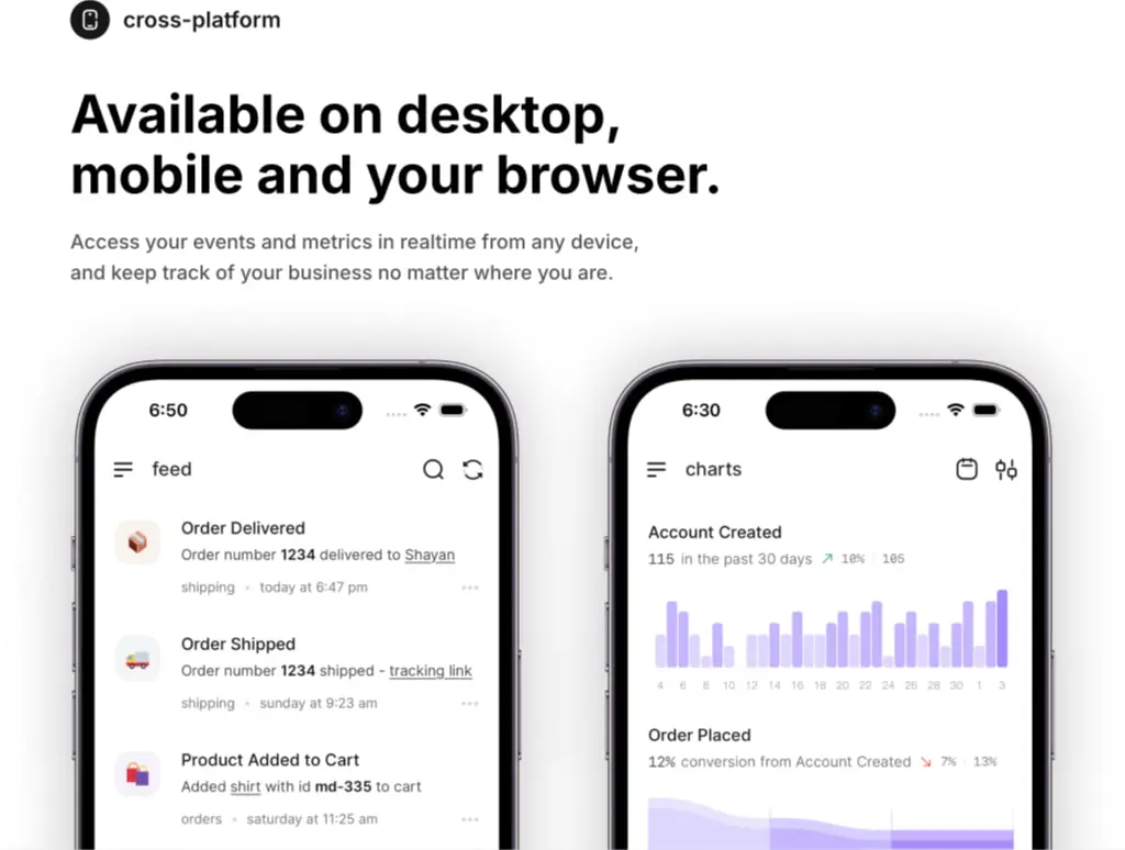
Feature section with device mockup
- Anatomy: Section label with icon, large display heading, descriptive paragraph, device frame containing app screenshot
- Surface: Dark background (
{colors.canvas}) for section, light content within device frame - Typography: Label uses
{typography.label}with icon, heading uses{typography.hero-display}, description uses{typography.body-large} - Shape: Device frame uses realistic phone proportions with rounded corners and thin bezel
- Spacing: Generous vertical padding, device mockup bleeds or centers below text content
- Composition: Text left-aligned or centered above, device mockup prominently displayed below
Responsive behavior
The design maintains its centered container approach across viewports, with horizontal padding reducing on narrower screens. The navigation collapses to a simplified set or hamburger menu on mobile, though the exact breakpoint is not visible in the captured pages. Pricing cards transition from multi-column grids to stacked single columns, maintaining internal spacing and readability.
Hero headlines may reduce in size on smaller viewports, though the proportional relationship between display and body text should be preserved. Device mockups in feature sections scale down proportionally, potentially switching from side-by-side arrangements to stacked single devices.
Tab pill groups remain horizontally scrollable if space is constrained, rather than wrapping to multiple lines. Notification cards maintain their horizontal layout but may reduce internal padding. Touch targets for buttons and navigation items should maintain minimum 44px height for accessibility.
Practical implementation guidance
Preserve
- The stark black-to-white contrast ratio in hero and dark sections; this is central to brand recognition
- Inter’s weight 700 for all display and heading purposes; substituting a different bold weight changes the character
- Generous border radius on cards (2.25rem) versus buttons (1rem); this hierarchy of roundness is intentional
- The muted gray scale for secondary text; avoid introducing warmer grays that would clash with the cool technical palette
- Left-aligned iconography in lists and notification cards; the visual rhythm depends on this consistent anchor
Avoid
- Adding drop shadows to cards or panels; the design uses flat surfaces and border definitions exclusively
- Using the purple accent (
{colors.accent-purple}) for primary actions; it is reserved for promotional and data visualization contexts - Centering body text in feature descriptions; the visible system uses left alignment for readability
- Introducing additional font families; the single-family approach is a core constraint
- Making buttons fully rounded (pills); the 1rem radius is specifically not a pill shape
Recommended build order
- Establish the color tokens and apply canvas/surface backgrounds to page sections
- Set up Inter with weights 400, 500, 600, 700 and implement the type scale
- Build the centered container with max-width and responsive horizontal padding
- Implement primary and secondary button components with exact padding and radius
- Create the card component with large radius and border treatment
- Build the tab pill group for content switching interfaces
- Implement notification card with icon-text-horizontal layout
- Add pricing card grid with tier-specific content structures
Accessibility
- Ensure white text on black backgrounds meets WCAG AAA contrast; the current values do
- Verify that
{colors.ink-secondary}on{colors.surface-elevated}meets AA standards for body text - Provide visible focus indicators for tab pills and buttons; the current design implies state changes but focus visibility must be added
- Use semantic heading hierarchy: hero-display as h1, section-display as h2, card-title as h3
- Include alt text for all product screenshots and device mockups that convey functional information
- Ensure interactive elements have minimum 44px touch targets when implemented for touch devices
Scope note
This guide covers the LogSnag marketing site homepage and pricing page as visible in desktop viewport captures. Mobile layouts, breakpoint-specific behavior, form interactions, authentication flows, and the actual application dashboard interface are not represented in the captured pages. Animation, hover states, and loading skeletons are not documented. Measurements are derived from the exact values provided in the captured styles.
Sites change, so a screenshot can differ from the guide.
Loading…Similar designs
This guide describes the public website and isn't an official logsnag.com design system. Not affiliated with logsnag.com.