Overview
Pencil’s design system presents a tool built for designers who code. The visual language balances creative warmth with engineering precision through a restrained palette, generous whitespace, and typographic contrast between a geometric sans-serif display face and a lighter, more open body face. The interface avoids decorative excess, letting product screenshots and UI demonstrations speak directly. Surfaces shift between warm off-white, subtle tinted backgrounds, and occasional high-saturation accent fields that signal interactivity or section breaks. Every interactive element uses full pill rounding, creating a friendly, approachable rhythm that softens the technical density of the product’s feature set.
Colors
The color system operates on a principle of near-monochrome neutrality with selective warm and cool tints for spatial organization. Dark values carry all headline and primary content weight. Mid-gray handles body copy and secondary information. Surfaces remain light and warm, with occasional pastel fields marking distinct functional zones.
| token | value | use |
|---|---|---|
| ink | #0A0A0A | Primary headlines, display type, high-emphasis content |
| muted-ink | #141414 | Secondary headings, icon strokes, active UI elements |
| body | #666666 | Body copy, descriptions, footer links, captions |
| canvas | #F5F5F5 | Default page background, feature card fills |
| surface | #FFFFFF | Elevated cards, input backgrounds, button fills on tinted sections |
| surface-warm | #FBF2FF | Warm tinted section backgrounds, download page atmosphere |
| surface-blue | #F2F8FF | Cool blue section backgrounds |
| surface-indigo | #F2F5FF | Indigo-tinted section backgrounds |
| border | #000000 | Primary button outlines, input borders, structural dividers |
| border-subtle | #EECCFF | Warm section borders, card outlines on light backgrounds |
| border-blue | #B1D6FF | Blue-themed section borders |
| border-indigo | #C2CDFF | Indigo-themed section borders |
| accent-orange | #FFD900 | Primary action buttons, brand highlights, warm emphasis |
| accent-teal | #2A4F78 | Cool accent for status indicators, secondary brand moments |
| accent-purple | #674578 | Purple accent for variant status or category markers |
| accent-slate | #3B4678 | Slate accent for additional variant differentiation |
The system uses background tinting as a primary navigation cue. Sections flow from warm to cool tints, with borders matching the tint family to create cohesive zones without heavy shadow or elevation changes. The near-black ink against warm off-white creates a Scandinavian clarity that keeps focus on product imagery and interface demonstrations.
Typography
Two families create the typographic hierarchy. Dm Sans 9 Pt carries all display and heading weight with a tight, geometric confidence. Rubik Light provides body copy with open apertures and generous spacing that aids readability at smaller sizes. The contrast between the two—heavy and tight versus light and open—establishes clear information hierarchy without size alone doing all the work.
| token | family | size | weight | leading | tracking | use |
|---|---|---|---|---|---|---|
| hero-display | Dm Sans 9 Pt | 7rem | 600 | 1.05 | -0.02em | Homepage hero headlines, maximum impact statements |
| section-display | Dm Sans 9 Pt | 5rem | 600 | 1.1 | -0.028em | Section headlines, feature introductions |
| feature-heading | Dm Sans 9 Pt | 1.5rem | 600 | 1.5 | normal | Feature card titles, sub-section headers |
| card-heading | Dm Sans 9 Pt | 1.25rem | 600 | 1.5 | -0.056em | Download card titles, compact headings |
| body | Rubik | 1rem | 400 | 1.5 | normal | Default body copy, navigation, footer links |
| body-large | Rubik | 1.25rem | 400 | 1.4 | normal | Lead paragraphs, feature descriptions |
| label | Rubik | 0.875rem | 400 | 1.5 | normal | Buttons, badges, status indicators |
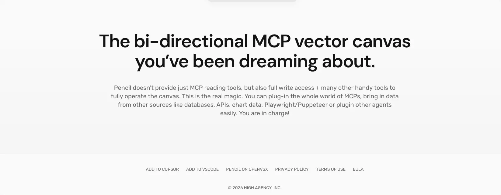
| legal | Rubik | 0.875rem | 400 | 1.5 | normal | Copyright, terms links, fine print |
Dm Sans 9 Pt uses negative tracking at display sizes to maintain visual density and prevent headline looseness. Rubik Light remains neutral in tracking across all sizes. The 100px display size seen in some hero contexts scales to 6.25rem, maintaining the same tight leading and tracking relationship. Verify licensing for these families before production use. Rubik is designed by Hubert And Fischer and available through Google Fonts.
Layout
The layout system relies on generous horizontal gutters and substantial vertical section spacing to create breathing room around dense product content. Content sits within a centered container that respects consistent side margins across all breakpoints shown.
Horizontal rhythm uses 40px gutters as the standard page inset, creating a comfortable margin that keeps content from feeling cramped against viewport edges. Internal card padding varies by context: 24px for compact information density, 40px for standard cards, and 64px or 80px for major section containers that need to feel expansive.
Vertical spacing follows a section-based model. Standard sections receive 64px vertical padding. Major hero or feature sections expand to 80px or 120px to create dramatic pause. Between major content blocks, 105px to 120px bottom margins establish clear territorial separation without visible divider lines.
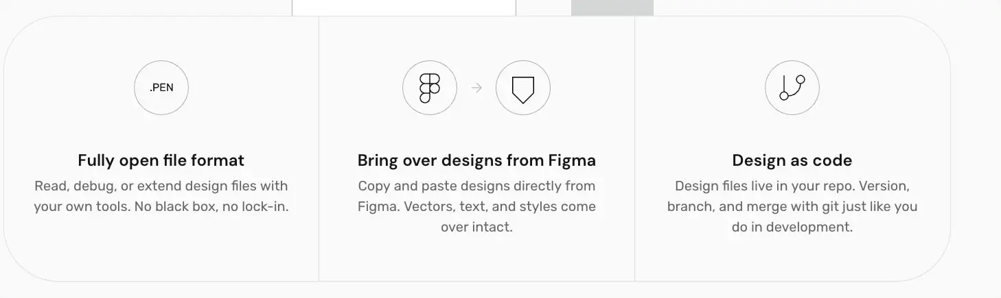
The grid system visible in feature sections uses equal-width columns with 1px hairline borders between cells, creating subtle separation without additional spacing overhead. This approach works particularly well for the three-column feature grid where icons, headings, and descriptions align vertically across columns.
Cards and containers use 40px corner rounding as a signature shape language. This substantial radius appears on download cards, feature containers, and section backgrounds. The rounding is large enough to feel intentional and friendly, yet restrained enough to maintain professional credibility for a developer tool.
Visual language
The visual identity centers on precision and openness. Line-art icons in circular containers communicate technical concepts with minimal weight. The icon style uses single-weight strokes, geometric simplification, and no fill—matching the system’s overall restraint.
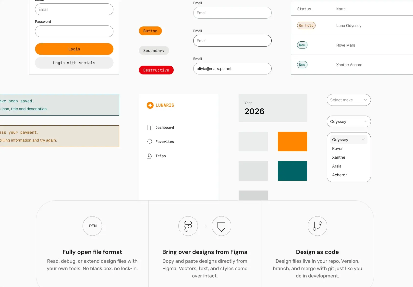
Photography and screenshots appear without heavy framing, often bleeding to container edges or sitting on subtle tinted backgrounds that separate them from page canvas. The product UI demonstrations show actual interface states: form inputs, dropdown menus, data tables, and navigation patterns. This transparency reinforces the “no black box” messaging.
Motion and interaction are implied through the pill-shaped buttons and inputs. Every interactive surface uses full rounding, creating a consistent tactile expectation. The orange accent appears sparingly, reserved for primary actions and brand moments, preventing fatigue in a tool meant for extended use.
The feature grid demonstrates the system’s approach to information architecture: icon at top, bold heading, then muted description. This three-part vertical stack repeats across contexts, training users to scan efficiently. Borders between grid cells are 1px solid lines in colors matching the section’s tint family.
Components
Primary action button
- Anatomy: Text label centered within a fully rounded container
- Surface: Background fills with accent-orange (#FFD900), text in ink (#0A0A0A)
- Typography: label token, Rubik at 0.875rem
- Shape: 9999px border radius creating a complete pill
- Spacing: 0px 24px horizontal padding, implicit vertical centering
- Composition: Appears standalone or in card footers, always left-aligned within its container
Secondary action button
- Anatomy: Text label within outlined pill
- Surface: Transparent or white fill, 1px solid border in border color (#000000)
- Typography: label token
- Shape: 9999px border radius
- Spacing: 0px 24px horizontal padding
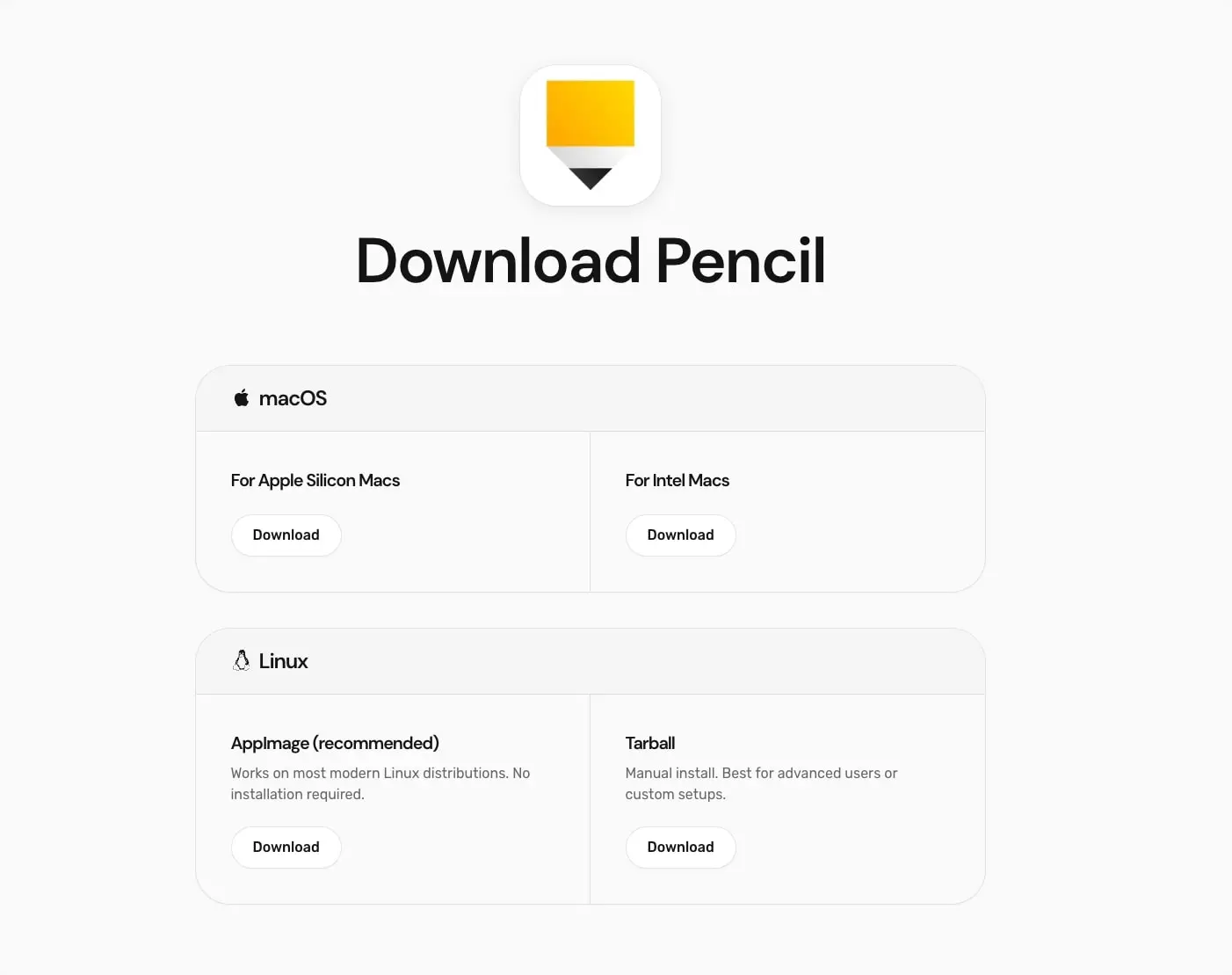
- Variants: Download buttons on the downloads page use this treatment
Destructive action button
- Anatomy: Text label in filled pill with warning color
- Surface: Red fill (#FF0000), white text
- Typography: label token
- Shape: 9999px border radius
- Use: Critical irreversible actions, shown in component documentation
Feature card
- Anatomy: Circular icon container, heading, description paragraph
- Surface: Canvas background (#F5F5F5) or transparent within larger rounded container
- Typography: feature-heading for title, body for description
- Shape: Parent container uses 40px radius; icon containers are circular with 1px borders
- Spacing: Comfortable internal padding, generous gap between icon and text
- Composition: Three cards in equal columns with 1px vertical dividers
Download card
- Anatomy: OS icon and name header, two-column content area with platform variants
- Surface: White fill, subtle warm border
- Typography: card-heading for platform names, body for descriptions
- Shape: 40px border radius
- Spacing: 40px padding, internal sections separated by light rules
- Composition: Full-width within content column, stacked vertically by OS
Form input
- Anatomy: Label text above, rounded text field below
- Surface: White fill, 1px border
- Typography: body for input text, label for field labels
- Shape: 9999px border radius for the input field
- Spacing: 16px vertical gap between label and input, comfortable internal padding
Status badge
- Anatomy: Text label in compact pill
- Surface: Transparent with colored border matching status type
- Typography: label token
- Shape: 9999px border radius
- Spacing: 2px 12px padding
- Variants: Teal border for “New”, warm border for “On hold”, purple variants for other states
Section container
- Anatomy: Full-width background with internal content grid
- Surface: Tinted backgrounds (warm, blue, indigo, or canvas)
- Spacing: 64px to 120px vertical padding, 40px horizontal gutters
- Composition: Centered content with maximum width constraint, often containing stacked text blocks or feature grids
Responsive behavior
The system shows a desktop-first approach with generous fixed spacing values. Content containers maintain 40px side gutters across contexts. At narrower viewports, the three-column feature grid should collapse to a single column with maintained vertical rhythm. The large display type scales down proportionally: 112px hero becomes 80px or 60px at intermediate breakpoints, maintaining the tight leading relationship.
Download cards with two-column internal layouts should stack vertically on smaller screens, preserving the platform selection logic. Pill buttons maintain their shape but may receive reduced horizontal padding to prevent overflow with longer labels.
The circular icon containers in feature cards scale down with the grid but maintain their stroke weight and proportional relationship to heading text. Hairline borders between grid cells should disappear in single-column layout, replaced by vertical spacing.
Practical implementation guidance
Preserve
- The strict two-family typographic hierarchy: Dm Sans 9 Pt for all headings and display, Rubik for all body and interface text
- Full pill rounding on every interactive element without exception
- The 40px container radius as a signature shape for cards and sections
- Generous vertical section spacing that lets content breathe
- The near-black ink against warm off-white as the default reading experience
- 1px hairline borders in tint-matching colors for grid separation
Avoid
- Introducing additional border radius values between pill and 40px container
- Using the orange accent for non-interactive elements or backgrounds
- Mixing body text weights—Rubik Light carries all body copy
- Adding drop shadows to cards or containers; rely on spacing and tint for elevation
- Reducing the display type tracking; the tightness is intentional
Recommended build order
- Establish the typographic foundation with both families loaded and base sizes set
- Implement the color tokens, particularly ink, body, canvas, and surface
- Build the pill button system with primary, secondary, and destructive variants
- Create the section container with standard padding and tint options
- Implement the feature card pattern with circular icon containers
- Add the download card with its two-column internal layout
- Polish with status badges, form inputs, and footer patterns
Accessibility
- Ensure the 3:1 contrast ratio between body text (#666666) and canvas backgrounds meets WCAG AA for large text; consider darkening body text if small sizes are needed
- The ink (#0A0A0A) on surface (#FFFFFF) exceeds 7:1 contrast for all text sizes
- Pill buttons should maintain visible focus indicators; the current design relies on shape consistency but may need additional focus states
- Form inputs need clear focus borders distinct from the default state
- Icon-only containers require aria-labels or adjacent text equivalents
Scope note
This guide covers the marketing homepage and downloads page surfaces visible in the captured images. Component documentation, pricing, documentation, and authenticated application interfaces are not represented. Mobile breakpoint behavior, loading states, form validation feedback, and motion design are not covered and should be validated against live implementation.
Sites change, so a screenshot can differ from the guide.
Loading…Similar designs
This guide describes the public website and isn't an official pencil.dev design system. Not affiliated with pencil.dev.