Overview
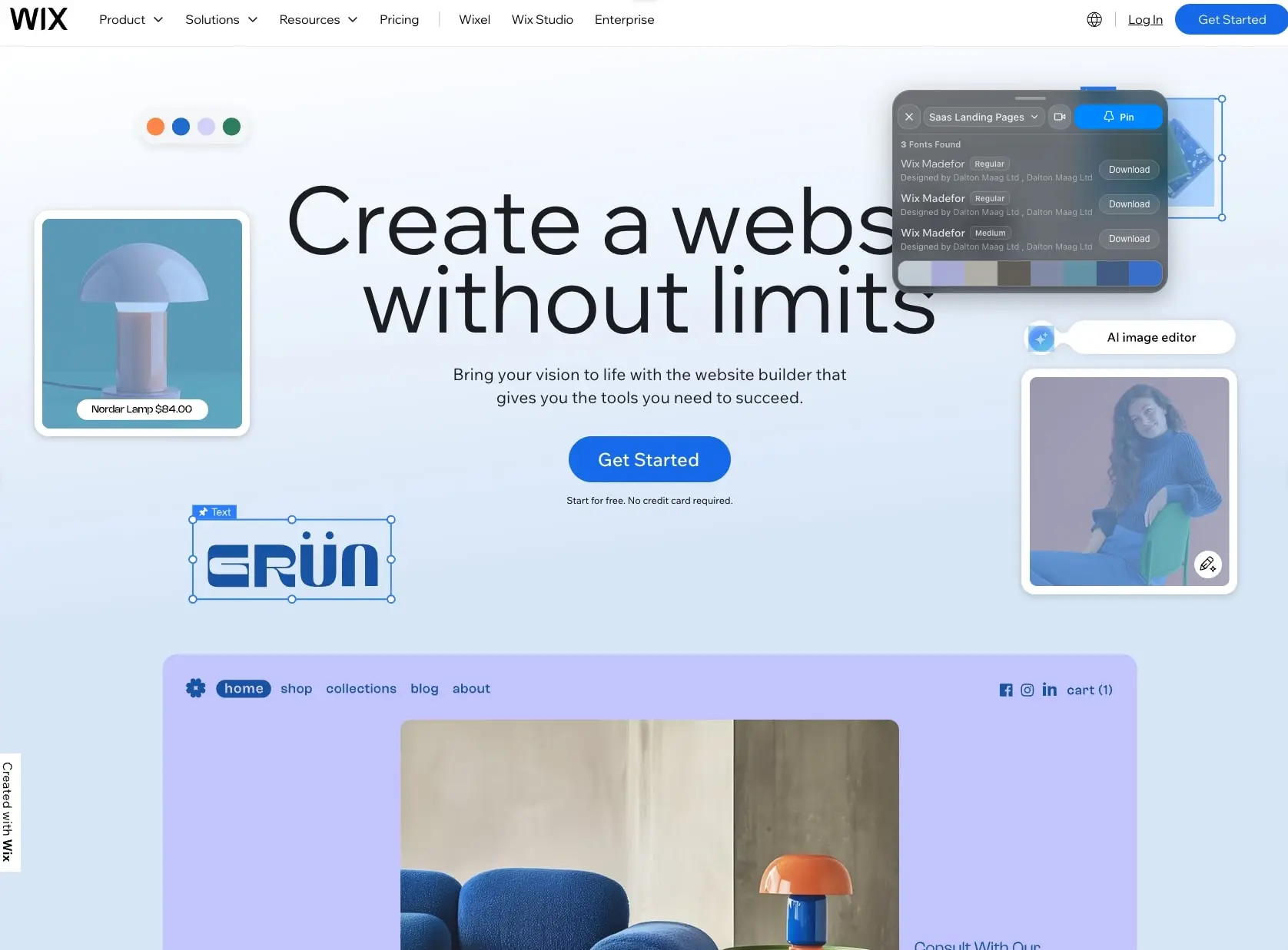
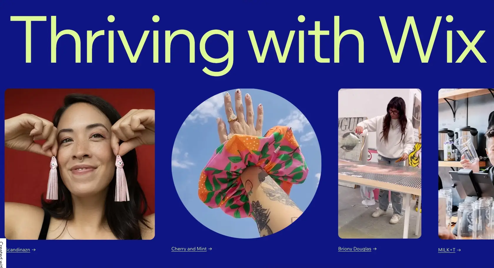
Wix.com presents a confident, approachable brand identity built for a creative audience. The system alternates between dramatic, saturated moments and airy, minimal layouts. Deep indigo and electric blue establish trust and technological credibility, while a distinctive soft lime green injects warmth and creative energy. The visual language is intentionally varied: some sections use immersive color fields with oversized display type, while others retreat to white space with careful typographic hierarchy. Photography of real entrepreneurs and makers humanizes the platform, appearing in circular crops and rounded rectangles that soften the digital experience. The overall impression is of a powerful tool that remains accessible and friendly.
Colors
The palette operates in two modes: a bold, saturated mode for impact and engagement, and a restrained, neutral mode for information density and readability.
| token | value | use |
|---|---|---|
| action | #116DFF | Primary buttons, links, and interactive accents |
| action-hover | #0052CC | Hover state for primary actions |
| ink | #000000 | Body text, headings, and strong emphasis |
| ink-primary | #0C0C0C | Near-black for primary headings |
| ink-secondary | #2D2D2D | Secondary text and descriptions |
| canvas | #FFFFFF | Page backgrounds and card surfaces |
| surface | #F3F6FF | Light blue-tinted section backgrounds |
| surface-accent | #D4F5A4 | Soft lime for feature cards and hero accents |
| surface-warm | #FFF4E6 | Warm cream for alternate section backgrounds |
| border | #E0E0E0 | Dividers and structural lines |
| border-subtle | #EBEBEB | Hairline rules and faint separators |
The deep indigo hero sections use a custom background approximately #0A0A5C with lime text at #D4F5A4, creating maximum contrast and brand recognition. The pricing and support pages shift to white backgrounds with dark navy text, using the lime as a contained accent within cards rather than a dominant field color. Blue action elements appear consistently across both modes, anchoring the brand identity. Photography introduces warm skin tones, product colors, and environmental hues that are not part of the core UI palette but enrich the visual experience.
Typography
The system relies on a single variable font family, Wix Madefor Vf, designed by Dalton Maag Ltd. This creates cohesion while allowing weight and width variation for expressive display settings and restrained body settings. The typeface features clean geometric construction with subtle humanist warmth, suitable for both large headlines and dense interface text.
| token | family | size | weight | leading | tracking | use |
|---|---|---|---|---|---|---|
| hero-display | Wix Madefor Vf | 6rem | 400 | 1 | -0.03em | Homepage hero headlines |
| section-display | Wix Madefor Vf | 3.5rem | 400 | 1.1 | -0.02em | Section headings and page titles |
| body-large | Wix Madefor Vf | 1.25rem | 400 | 1.5 | 0 | Lead paragraphs and descriptions |
| body | Wix Madefor Vf | 1rem | 400 | 1.5 | 0 | General content and card text |
| label | Wix Madefor Vf | 0.875rem | 400 | 1.4 | 0.01em | Buttons, tags, and small labels |
| navigation | Wix Madefor Vf | 0.875rem | 400 | 1 | 0 | Top-bar menu items |
Display sizes use tight negative tracking for visual impact, while body sizes maintain neutral tracking for readability. The variable font allows optical sizing without loading additional files. Verify licensing for these families before production use.
Layout
The layout system alternates between full-bleed immersive sections and contained, centered content blocks. Maximum content width appears to be approximately 1200px for text-heavy pages, while homepage heroes may extend to full viewport width.
Section spacing follows a generous rhythm, with 6rem vertical padding between major content areas. The homepage hero stacks a large headline above a multi-column photography grid, with images in varying aspect ratios and circular crops creating organic visual interest. Support and pricing pages use stricter grid alignment: three-column layouts for feature groups, with consistent gutters of 2rem.
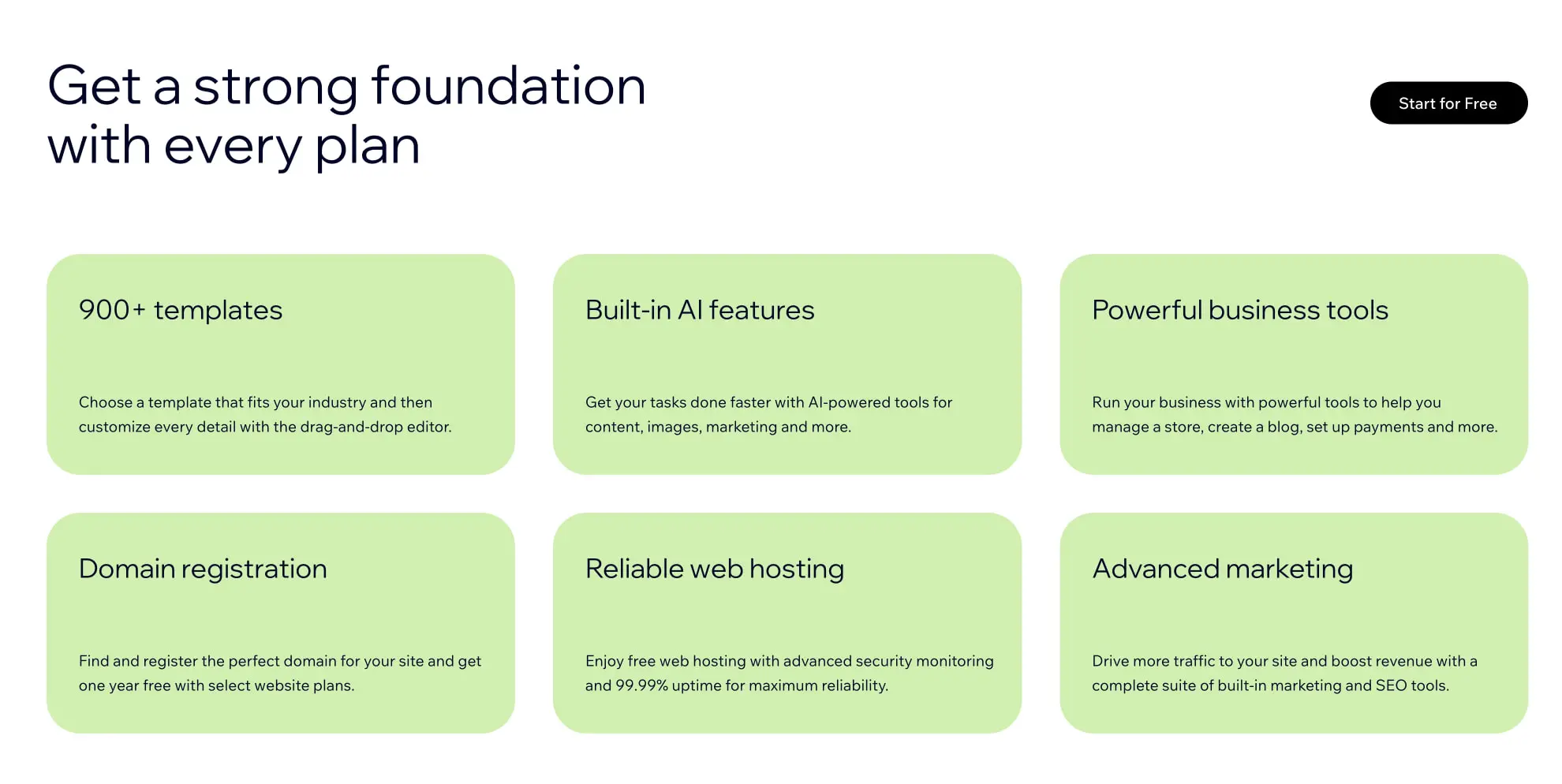
Cards and panels use substantial internal padding of 2rem, creating breathing room around content. The feature grid on the pricing page arranges six cards in a 3x2 formation, each with rounded corners and soft lime backgrounds. Navigation sits in a fixed top bar with logo left, menu center-left, and actions right.
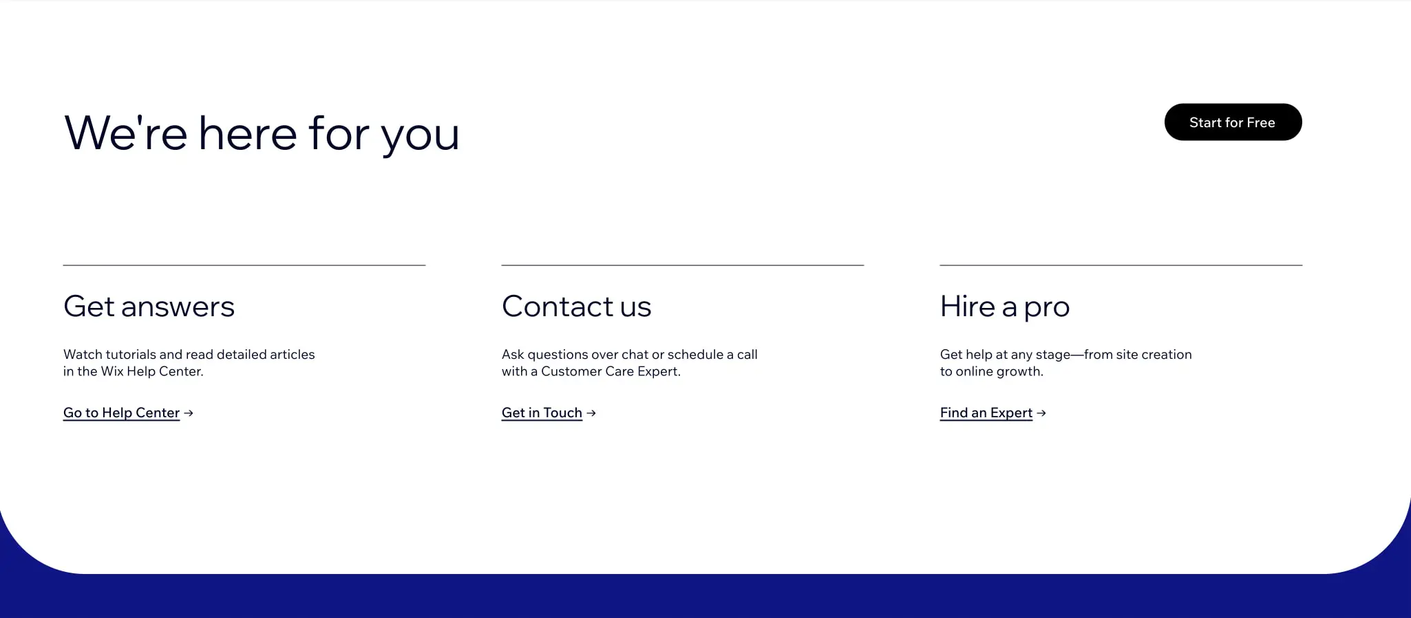
Curved shapes appear at section boundaries: the support page shows a navy curved base that softens the transition between white content and dark footer. This creates a fluid, non-linear rhythm that distinguishes the brand from rigid grid systems.
Visual language
Photography treatment emphasizes authenticity and creative diversity. Images show real people in their work environments: a jewelry maker, a screen printer, a café owner. Circular crops and rounded rectangles replace sharp corners, reinforcing the approachable brand character. Product shots in the editor interface use soft shadows and light backgrounds to suggest depth without heaviness.
Iconography and UI chrome are minimal and functional. The editor interface shown in screenshots uses small colored dots for template selection, simple arrows for navigation, and clean toggle switches. Decorative elements are restrained: the system prefers color fields and typography scale to create visual interest rather than ornamental graphics.
Motion and interaction are implied through the editor screenshots, which show floating panels, selection states with blue outlines, and draggable elements. The visual language suggests a direct-manipulation environment where content is tangible and responsive.
Components
Primary Action Button
- Anatomy: Rounded pill shape with centered text label
- Surface: Solid action blue background (#116DFF) with white text
- Typography: Label token, 0.875rem, weight 400
- Shape: Full pill border radius (9999px)
- Spacing: 0.75rem vertical padding, 1.5rem horizontal padding
- Composition: Appears centered below hero text or inline in navigation bar
- Variants: Dark variant with black background and white text for secondary contexts
Feature Card
- Anatomy: Rounded rectangle containing heading and description text
- Surface: Soft lime background (#D4F5A4) with dark ink text
- Typography: Section-display size for headings (approximately 1.75rem), body size for descriptions
- Shape: 1.5rem border radius
- Spacing: 2rem internal padding, generous vertical space between heading and description
- Composition: Grid arrangement with 2rem gutters, typically 3 columns on desktop
- Variants: May appear on white backgrounds with subtle borders for alternate contexts
Section Divider
- Anatomy: Horizontal hairline rule
- Surface: Subtle gray (#E0E0E0 or #EBEBEB)
- Shape: 1px height, full width of content column
- Spacing: Appears above grouped content blocks, with 2-3rem vertical margin
- Composition: Used in support sections to separate header from three-column content
Navigation Bar
- Anatomy: Fixed top bar with logo, dropdown menus, utility links, and action button
- Surface: Transparent or white background depending on scroll state
- Typography: Navigation token for menu items, label token for actions
- Composition: Logo left-aligned, primary navigation center-left, secondary actions right-aligned
- Variants: Dark variant for hero sections with light text
Hero Section
- Anatomy: Full-width background with centered or left-aligned headline, optional subhead, and call-to-action
- Surface: Deep indigo (#0A0A5C) with lime text, or light blue (#F3F6FF) with dark text
- Typography: Hero-display token for main headline, body-large for supporting text
- Shape: May include curved bottom edge or transition to next section
- Spacing: Generous vertical padding, typically 6rem or more
- Composition: Headline dominates upper portion, supporting elements centered below
Responsive behavior
The system should adapt from multi-column desktop layouts to stacked single-column arrangements on smaller viewports. The three-column support section and six-card feature grid should collapse to single columns with maintained internal card padding. Hero headlines should scale down from 6rem to approximately 2.5rem on mobile, preserving line breaks where possible. Navigation should collapse to a hamburger menu or simplified utility bar. The circular photography crops in the homepage hero may resize proportionally or scroll horizontally as a carousel. Curved section transitions should maintain their character at all widths, possibly simplifying to gentler arcs on narrow screens.
Practical implementation guidance
Preserve
- The distinctive lime-on-indigo color combination for hero moments; this is the most recognizable brand expression
- Generous border radius on cards and buttons; the soft shapes are central to the friendly brand character
- The single font family approach; variable font usage creates cohesion across all text
- Authentic photography of diverse creators; avoid generic stock imagery
- Subtle section curves as transition elements between color fields
Avoid
- Sharp 90-degree corners on interactive elements; they conflict with the rounded visual language
- Pure black backgrounds; the system prefers deep indigo or navy for dark sections
- Dense text blocks without adequate line height; the open leading is part of the readable, friendly character
- Multiple competing accent colors; lime and blue should remain the primary accents
Recommended Build Order
- Establish the type scale with Wix Madefor Vf at all sizes
- Implement the color tokens, starting with action blue and the two mode backgrounds (indigo and white)
- Build the button component with full pill radius
- Create the feature card with lime background and 1.5rem radius
- Implement section layouts with proper spacing rhythm and curved transitions
- Add photography treatment with circular crops and rounded rectangles
Accessibility
- Ensure lime text on indigo backgrounds meets WCAG contrast requirements; the combination appears to pass for large text but may need adjustment for body sizes
- Provide visible focus states on all interactive elements, using the action blue or a complementary outline
- Maintain touch targets of at least 44px for mobile navigation and buttons
- Use semantic heading hierarchy despite the visual similarity of some sizes
Scope note
This guide covers the homepage and pricing page surfaces visible in the captured images. Footer content, mobile layouts, checkout flows, and the full editor interface are not represented. Motion behavior, hover states, and form components are inferred from static images and should be validated against live implementation. Measurements are practical adaptation targets based on visual estimation from the captured screenshots.
Sites change, so a screenshot can differ from the guide.
Loading…Similar designs

This guide describes the public website and isn't an official wix.com design system. Not affiliated with wix.com.