Overview
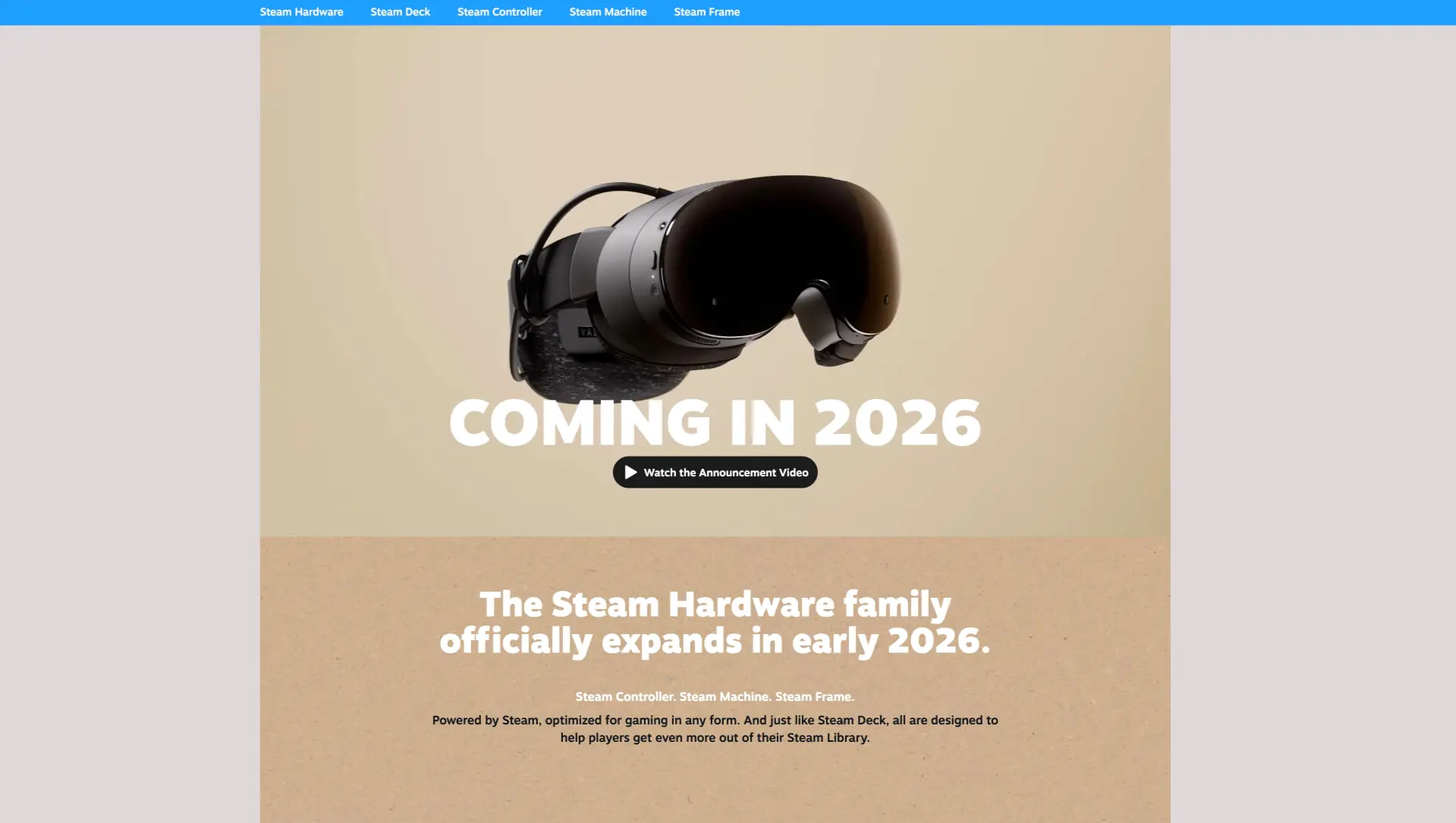
The Steam Hardware page presents a product-forward, editorial approach to consumer electronics marketing. The design strips away the dense information architecture typical of game store pages in favor of spacious, photography-driven layouts that let industrial hardware products command attention. A warm beige environment unifies disparate devices—VR headsets, handheld consoles, controllers, and living-room PCs—into a cohesive family narrative. The visual system balances Valve’s established Steam blue brand equity with an unexpected, tactile materiality: tan backgrounds evoke craft paper and cardboard packaging, while matte black hardware photography feels premium and approachable. Typography is bold and direct, with large display settings that read confidently across the generous negative space. The overall impression is of a mature hardware ecosystem that values simplicity, compatibility, and physical presence over technical complexity.
Colors
The palette is intentionally restrained, built from a warm neutral foundation with a single vibrant accent and strong contrast for readability.
| token | value | use |
|---|---|---|
| canvas | #E8DCC8 |
Primary page background; warm beige for hero and product arrangement sections |
| surface | #D4C4A8 |
Secondary background for content bands; tan cardboard texture for announcement messaging |
| ink | #111111 |
Primary text on light backgrounds; button fills; hardware product color |
| action | #1A9FFF |
Navigation bar background; Steam brand blue for wayfinding and interactive emphasis |
| ink-inverse | #FFFFFF |
Text on dark or colored backgrounds; hero headlines; button labels |
The canvas and surface colors create a warm, material hierarchy. Canvas serves as the default environment, while surface introduces subtle elevation change for content bands without breaking the tonal continuity. The action blue appears only in functional contexts—specifically the fixed navigation bar—where it provides immediate brand recognition and wayfinding clarity. Ink-inverse ensures legibility against both the action blue and the warm neutrals, appearing in hero typography and interactive elements. The near-black ink grounds body copy and defines the matte hardware aesthetic in photography.
Typography
The type system is built on a single family with weight and size differentiation creating clear hierarchy. Motiva Sans, designed by Rodrigo Saiani and available from Plau, provides a contemporary geometric sans-serif with sufficient character for display settings and clarity at text sizes.
| token | family | size | weight | leading | tracking | use |
|---|---|---|---|---|---|---|
| hero-display | Motiva Sans | 5rem | 700 | 1 | -0.02em | Major announcements; product launch headlines |
| section-display | Motiva Sans | 3rem | 700 | 1.1 | -0.01em | Section headers; family expansion messaging |
| body | Motiva Sans | 1.25rem | 400 | 1.5 | 0 | Descriptive paragraphs; product compatibility copy |
| label | Motiva Sans | 1rem | 500 | 1.2 | 0.02em | Button text; small emphasis; category labels |
| navigation | Motiva Sans | 1rem | 500 | 1 | 0 | Primary navigation links |
The display sizes employ tight tracking and leading to create compact, impactful headlines that sit confidently within large image areas. Body copy relaxes into more generous proportions for sustained reading. The weight distinction between Regular (400) and Medium (500) is subtle but functional, reserving Medium for interactive and navigational elements where slightly stronger presence aids scannability. Verify licensing for these families before production use.
Layout
The page employs a centered, single-column content model with full-bleed background bands. Maximum content width appears constrained to a readable measure, approximately 80 characters for body text, with display headlines allowed to expand wider for visual impact.
The navigation bar spans the full viewport width at the top, fixed or statically positioned, with horizontal link distribution. Below this, the hero section occupies substantial vertical space—roughly 60-70% of initial viewport height—dedicating the majority of the area to product photography with overlaid typography positioned in the lower third.
Content sections alternate between the canvas and surface backgrounds, creating rhythmic vertical progression without introducing additional colors. Each section maintains generous internal padding, with section spacing of 6rem providing clear separation between narrative beats. The product arrangement section uses a scattered, editorial composition rather than grid alignment, with hardware items positioned at natural angles suggesting casual placement on a studio surface.
The lower content band narrows the visual field, centering text tightly within the surface-colored area while maintaining the same maximum content width as upper sections. This creates a sense of conclusion and focus for the announcement messaging.
Visual language
Photography treatment is central to the system’s identity. Hardware products are rendered in matte black finishes against the warm beige environment, creating high contrast in value but harmony in temperature. Products appear as physical objects with real material properties—soft-touch plastics, textured fabrics, reflective lenses—rather than as rendered illustrations. Scale relationships between devices are preserved, allowing viewers to understand the handheld nature of Steam Deck relative to the living-room Steam Machine.
The warm neutral environment serves multiple functions: it differentiates hardware marketing from the dark, information-dense Steam store experience; it evokes unboxing and physical retail presence; and it provides consistent, predictable backgrounds that make product photography feel cohesive even when shot separately.
Typography interacts with photography through direct overlay, with white display text positioned over image areas where background luminance remains sufficiently high for legibility. No scrims, shadows, or text boxes interrupt the photographic field—the design trusts the image composition to provide adequate contrast.
Iconography is minimal and functional, limited to a simple play indicator for video content. The visual system avoids decorative elements, relying instead on the inherent form of the hardware products and the confident scale of the typography to create visual interest.
Components
Navigation bar
- Anatomy: Horizontal row of text links spanning full viewport width
- Surface: Solid action blue background (
{colors.action}) - Typography: Navigation token, white text (
{colors.ink-inverse}) - Spacing: Compact vertical padding, links distributed with consistent horizontal gaps
- Composition: Left-aligned link cluster; no logo or home indicator visible within the hardware section context
- Variants: Links correspond to hardware product categories (Steam Hardware, Steam Deck, Steam Controller, Steam Machine, Steam Frame)
Hero section
- Anatomy: Full-width background image with centered headline and call-to-action button
- Surface: Canvas background (
{colors.canvas}) visible around and behind product photography - Typography: Hero-display token for announcement text; label token for button
- Shape: No border radius on section; pill-shaped button (
{rounded.pill}) - Spacing: Generous vertical padding above and below content cluster
- Composition: Product image dominates upper portion; text cluster positioned below, centered; button sits directly beneath headline with minimal gap
Video button
- Anatomy: Pill-shaped container with play icon and text label
- Surface: Ink fill (
{colors.ink}) with white text ({colors.ink-inverse}) - Typography: Label token
- Shape: Full pill radius (
{rounded.pill}) - Spacing: Comfortable internal padding, approximately 1rem horizontal and 0.75rem vertical
- Composition: Icon left, text right, centered within pill
Content band
- Anatomy: Full-width section with centered text block
- Surface: Surface background (
{colors.surface}) with subtle texture suggesting cardboard or kraft paper - Typography: Section-display token for headline; body token for supporting description
- Spacing: Substantial vertical padding, maintaining section spacing
- Composition: Headline and body stacked and centered; headline may break to multiple lines
Product arrangement section
- Anatomy: Full-width canvas background with scattered hardware photography and centered text overlay
- Surface: Canvas background (
{colors.canvas}) - Typography: Section-display or body tokens for overlay text
- Composition: Products positioned in loose, non-grid arrangement; text centered in upper portion; no bounding containers around individual products
Responsive behavior
The single-column, centered content model adapts naturally to narrower viewports. Display typography should scale down proportionally, with hero-display potentially reducing to section-display size on small screens to prevent excessive line breaks. The navigation bar may collapse to a horizontal scroll or hamburger menu when link text cannot fit comfortably within viewport width.
Product photography in the hero and arrangement sections should maintain aspect ratio while scaling to fit available width. On very narrow viewports, the scattered product composition may benefit from simplified stacking, showing fewer devices simultaneously to prevent visual clutter.
The warm neutral backgrounds remain constant across breakpoints, preserving the material identity. Text contrast against both canvas and surface backgrounds should be verified at all sizes, as the relatively light values of these neutrals may require careful attention for accessibility compliance.
Practical implementation guidance
Preserve
- The warm beige environment as the defining differentiator from standard Steam store pages
- Large, confident display typography with tight tracking for headlines
- Direct photography-to-text relationships without intervening containers or scrims
- The single accent color restricted to functional navigation contexts
- Matte black hardware photography with preserved material textures
Avoid
- Introducing additional accent colors that compete with the established Steam blue
- Dark backgrounds that would contradict the unboxing/retail materiality
- Dense information architecture typical of game store pages
- Decorative elements that distract from product photography
- Grid-aligned product arrangements that feel catalog-like rather than editorial
Recommended build order
- Establish canvas and surface background colors with full-width section structure
- Implement Motiva Sans with display and body size tokens
- Build fixed navigation bar with action blue background
- Create hero section with product photography and overlay typography
- Add pill-shaped video button component
- Develop alternating content bands with appropriate background colors
- Implement product arrangement section with editorial composition
Accessibility
- Ensure text overlay on photography meets contrast minimums; the beige backgrounds generally provide adequate contrast with black text, but verify against specific image areas
- Provide text alternatives for product photography that convey hardware relationships
- Maintain keyboard accessibility for navigation links and video button
- Consider reduced motion preferences for any scroll-triggered animations
- Verify touch target sizes for navigation links on mobile viewports
Scope note
This guide covers the Steam Hardware marketing page surface visible in the captured images, specifically the hero announcement and product family arrangement sections. Global Steam store navigation, footer elements, checkout flows, and interactive states such as hover, focus, loading, and error conditions are not represented. Motion behavior, responsive breakpoints, and additional hardware product pages are not documented. Measurements are practical adaptation targets.

Sites change, so a screenshot can differ from the guide.
Loading…Similar designs


This guide describes the public website and isn't an official store.steampowered.com design system. Not affiliated with store.steampowered.com.