Overview
Range presents a premium wealth-management experience built on confident contrast and warm, approachable accents. The visual system pairs near-black surfaces with bright yellow highlights to signal optimism and financial growth without sacrificing sophistication. Large rounded cards organize content into digestible, tactile units that feel contemporary and trustworthy. The design language speaks to high-income households through generous whitespace, restrained typography, and deliberate color blocking rather than dense information architecture. Every element reinforces clarity: dark panels for emphasis, light surfaces for readability, and a consistent geometric vocabulary of rounded rectangles that soften the technical subject matter. The result is a system that feels both institutional and personal—precise enough for financial data, warm enough for human advisory relationships.
Colors
The Range palette operates on a principle of maximum contrast with selective warmth. Dark surfaces dominate hero and feature sections, while white and off-white provide breathable reading environments. Yellow functions as the singular accent, appearing in gradients, buttons, and highlight cards to draw attention to calls-to-action and key value propositions.
| token | hex | use |
|---|---|---|
| ink | #1D1D1F | Primary text on light backgrounds, dark card backgrounds |
| ink-secondary | #595959 | Secondary text, subdued labels |
| muted | #6E6E73 | Tertiary information, footer links, captions |
| canvas | #FFFFFF | Page background, modal surfaces, text on dark panels |
| surface | #FAFAFC | Subtle off-white for cards and contained sections |
| surface-dark | #000000 | Deep feature cards, hero panels, high-contrast moments |
| accent-yellow | #FEDC5D | Primary action buttons, gradient endpoints, highlight cards |
| accent-yellow-light | #FFF980 | Gradient start, hover states, brighter accents |
| accent-green | #2C7A4A | Positive indicators, chart elements, success states |
| accent-blue | #0066CC | Links, interactive text, secondary actions |
| action-primary | #0071E3 | Active navigation, focused interactive elements |
| border-light | #AFAFAF | Dividers, subtle separators on light surfaces |
| border-dark | #1F1F1F | Borders on dark surfaces, hairline definitions |
The system employs two distinct modes: a light mode for documentation, FAQs, and reading-heavy pages, and a dark mode for impact sections like pricing and product features. The yellow accent bridges both modes, maintaining brand recognition across contexts. Gradients typically flow from accent-yellow-light to accent-yellow at approximately 158 degrees, creating warm horizontal energy on dark backgrounds.
Typography
Range uses Plus Jakarta Sans exclusively, designed by Gumpita Rahayu and distributed by Tokotype. Verify licensing for this family before production use. The type system ranges from an 80px hero display to an 11px caption scale, with Semibold (600) reserved for headlines and navigation, and Regular (400) for body content.
| token | family | size | weight | leading | tracking | use |
|---|---|---|---|---|---|---|
| hero-display | Plus Jakarta Sans | 5rem | 600 | 1.05 | -0.02em | Homepage hero, major value statements |
| section-display | Plus Jakarta Sans | 4rem | 600 | 1.06 | -0.02em | Section headers, dark panel headlines |
| headline-large | Plus Jakarta Sans | 2.5rem | 600 | 1.2 | -0.01em | Feature introductions, card titles |
| headline | Plus Jakarta Sans | 2.1875rem | 600 | 1.37 | normal | Subsection headers, modal titles |
| body-large | Plus Jakarta Sans | 1.3125rem | 400 | 1.5 | normal | Lead paragraphs, expanded descriptions |
| body | Plus Jakarta Sans | 1rem | 400 | 1.5 | normal | Standard paragraphs, lists, UI text |
| label | Plus Jakarta Sans | 0.875rem | 400 | 1.43 | normal | Small UI labels, metadata |
| caption | Plus Jakarta Sans | 0.6875rem | 400 | 1.4 | normal | Fine print, legal disclaimers, footnotes |
| navigation | Plus Jakarta Sans | 1rem | 600 | 1.5 | normal | Nav links, primary buttons |
Tight negative tracking on display sizes creates a compact, authoritative presence appropriate for financial services. Line heights remain generous at body sizes for readability of complex information. The 21px and 26px intermediate sizes appear in feature card contexts where slightly larger than body text aids scanning without reaching headline scale.
Layout
The Range layout system relies on generous fixed gutters and section spacing to establish premium breathing room. Content sits within a centered container with 56px horizontal page gutters on desktop, expanding to 160px vertical padding for major section breaks.
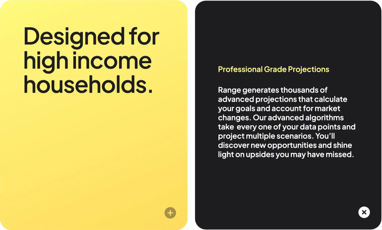
Grid and containment. Cards function as the primary content unit, typically appearing at full container width or in two-column splits. Dark feature cards use 40px internal padding with 40px border-radius, creating substantial rounded rectangles that feel almost app-like. The split-card pattern places a yellow accent card beside a dark content card, each occupying roughly half the available width with a narrow gap between.
Section rhythm. Major sections separate with 160px vertical padding, creating dramatic pauses between content types. Internal card sections use 64px to 80px vertical spacing. The header maintains a compact 16px vertical padding with 56px horizontal gutters, keeping navigation present but unobtrusive.
Responsive considerations. The card-based architecture suggests a natural stacking behavior on narrower viewports: split cards become vertical sequences, maintaining their internal padding and border radius. The 56px desktop gutter should compress to 24px on tablet and 16px on mobile to preserve content proportion.
Zonal organization. Dark panels signal feature depth and pricing importance, while white surfaces handle explanatory and legal content. This alternation creates visual rhythm across long scrolls, preventing monotony and guiding attention to conversion moments.
Visual language
The Range visual identity balances geometric precision with warmth. Rounded corners appear at three scales: 24px for smaller panels and modals, 40px for primary feature cards, and 100px for pill buttons. This consistent rounding family unifies disparate components into a coherent tactile system.
Card surfaces. Cards are the dominant visual element—large, rounded, and materially distinct through color rather than shadow. Dark cards use pure black with white text; yellow cards use warm gradient fills with near-black text. A subtle gradient overlay (linear from transparent to rgba(102, 127, 255, 0.3)) occasionally appears on dark surfaces, adding dimensional depth without visual noise.
Iconography and marks. Small circular buttons with plus and close icons appear at card corners, suggesting expandable or dismissible content. These use 24px or 40px circular containers with simple line icons, maintaining the rounded geometric vocabulary.
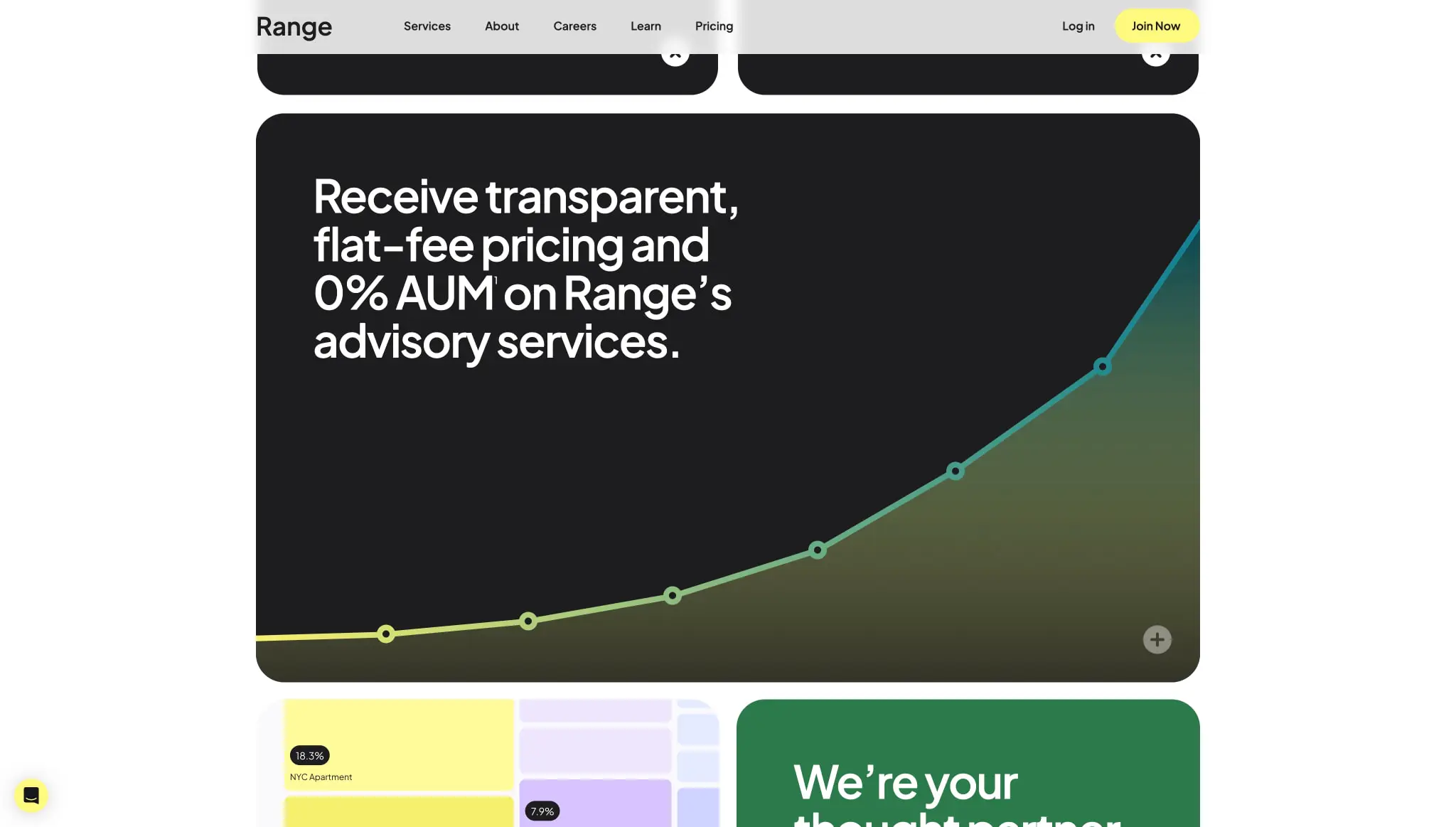
Data visualization. Charts appear as line graphs with gradient strokes transitioning from yellow through green, plotted on dark backgrounds. Data points use hollow circles along the line, with filled accent color for emphasis. This treatment makes financial projections feel approachable rather than clinical.
Photography and illustration. The system avoids literal photography in favor of abstract color fields, geometric patterns, and data representations. When imagery appears, it uses soft gradients and rounded containment that echo the card architecture.
Components
Navigation bar
- Anatomy: Logo mark left, text links center-right, utility links far right, primary action button far right
- Surface: White background (#FFFFFF) with near-black text
- Typography: Navigation token for links, body token for utility text
- Spacing: 16px vertical padding, 56px horizontal gutters
- Composition: Flex row with space-between alignment, logo receiving additional right padding (80px) to separate from link cluster
- Variants: Transparent variant over dark hero sections with inverted text
Primary button
- Anatomy: Text label centered in pill container
- Surface: Accent-yellow fill (#FEDC5D) with ink text (#1D1D1F)
- Typography: Navigation token, Semibold weight
- Shape: 100px border radius creating full pill
- Spacing: 12px vertical padding, 16px to 24px horizontal padding depending on context
- States: Standard and compact variants for nav versus content contexts
Feature card (dark)
- Anatomy: Rounded rectangle containing headline, body text, optional chart or imagery
- Surface: Pure black (#000000) with white or yellow text
- Typography: Section-display or headline-large for titles, body-large for descriptions
- Shape: 40px border radius, 2px white border on some variants
- Spacing: 40px internal padding, often 40px top padding with asymmetric bottom spacing
- Composition: Left-aligned text with right-side visual element; gradient overlays for depth
Feature card (yellow accent)
- Anatomy: Rounded rectangle with large display text
- Surface: Solid accent-yellow (#FEDC5D) or gradient from #FFF980 to #FEDC5D
- Typography: Section-display in ink color, tight leading for impact
- Shape: 40px border radius matching dark card counterpart
- Spacing: 40px internal padding
- Composition: Minimal content—often a single powerful statement with small circular action button at bottom-right
FAQ accordion
- Anatomy: Question header with expand/collapse icon, expandable answer region
- Surface: White background with ink text
- Typography: Headline token for questions, body for answers, bullet lists for structured content
- Spacing: 16px bottom margin on question headers, 24px left padding on list items
- Composition: Full-width within content column, separated by subtle borders or whitespace
- States: Expanded with visible answer and close icon; collapsed with plus icon
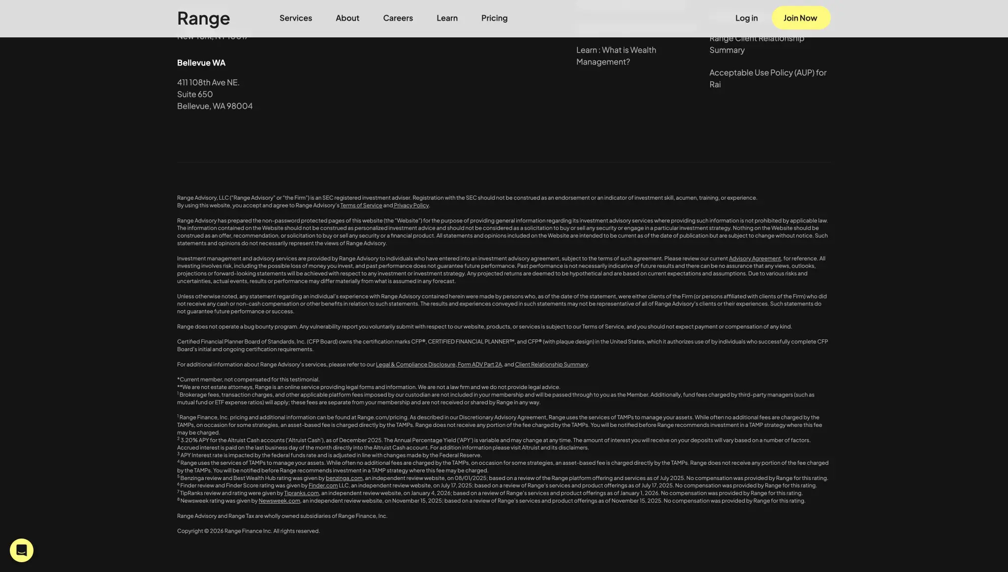
Footer
- Anatomy: Multi-column link grid above dense legal text block
- Surface: Dark background (#000000) with muted and secondary text colors
- Typography: Caption for legal disclaimers, body-small for link columns
- Spacing: 64px top padding, 56px horizontal gutters, generous bottom padding for legal density
- Composition: Asymmetric columns with location information left, link clusters right, full-width legal text below separated by visual break
Modal/overlay
- Anatomy: Centered card with close button, scrollable content region
- Surface: White fill with subtle shadow or backdrop blur
- Typography: Headline for title, body for content
- Shape: 16px to 24px border radius
- Spacing: 32px to 40px internal padding
Responsive behavior
The card-centric layout adapts through stacking and scaling rather than complex grid reflow. On narrower viewports, split-card compositions should stack vertically with the yellow accent card preceding the dark content card to maintain visual momentum. Display typography scales down proportionally: the 80px hero becomes approximately 48px on tablet and 40px on mobile, preserving line breaks and impact.
Navigation collapses to a hamburger menu or simplified utility row, with the primary “Join Now” button remaining visible as a persistent action. Footer columns should collapse to two-column then single-column arrangements, with legal text remaining full-width but increasing in size slightly for mobile readability.
Chart and data visualization elements require horizontal scroll or simplified rendering on small screens—the gradient line treatment should remain visible at minimum widths of 320px. Card internal padding reduces from 40px to 24px on mobile, maintaining the rounded corner scale for brand consistency.
Practical implementation guidance
Preserve
- The strict two-mode color system: dark panels for impact, light surfaces for reading
- Generous border radius on cards (40px) and buttons (pill shapes)
- Tight negative tracking on display headlines for authoritative presence
- Yellow-to-yellow gradient accents at approximately 158 degrees
- Plus Jakarta Sans as the sole type family across all weights
Avoid
- Introducing additional accent colors beyond the yellow-green-blue trio
- Reducing card padding below 24px or border radius below 16px
- Using shadows as primary depth indicators—rely on color contrast instead
- Mixing light and dark card types in the same horizontal row without clear hierarchy
- Body text smaller than 16px for primary content
Recommended build order
- Establish color tokens and typography scale with Plus Jakarta Sans
- Build card components (dark, light, yellow accent) with 40px radius and consistent padding
- Implement navigation with transparent and solid variants
- Create split-card layout patterns for feature sections
- Add FAQ accordion with expand/collapse behavior
- Build footer with dark surface and dense legal text handling
- Polish with gradient overlays and chart styling
Accessibility
- Ensure yellow accent text on dark backgrounds meets WCAG AA contrast (the 26px yellow on black appears to satisfy this, but verify with exact values)
- Provide focus indicators for pill buttons that work on both light and dark surfaces
- Maintain semantic heading hierarchy despite visual size variations
- Consider reduced-motion preferences for gradient and chart animations
- Ensure FAQ accordions are keyboard-navigable with clear expanded/collapsed state announcements
Scope note
This guide covers the Range.com homepage and visible landing sections including navigation, feature cards, pricing panels, FAQ interactions, and footer. Interior application screens, authenticated dashboards, and mobile-specific layouts are not represented in the captured pages. Motion behavior, form validation states, and additional breakpoint refinements should be developed from live site analysis.

Sites change, so a screenshot can differ from the guide.
Loading…Similar designs

This guide describes the public website and isn't an official range.com design system. Not affiliated with range.com.