Overview
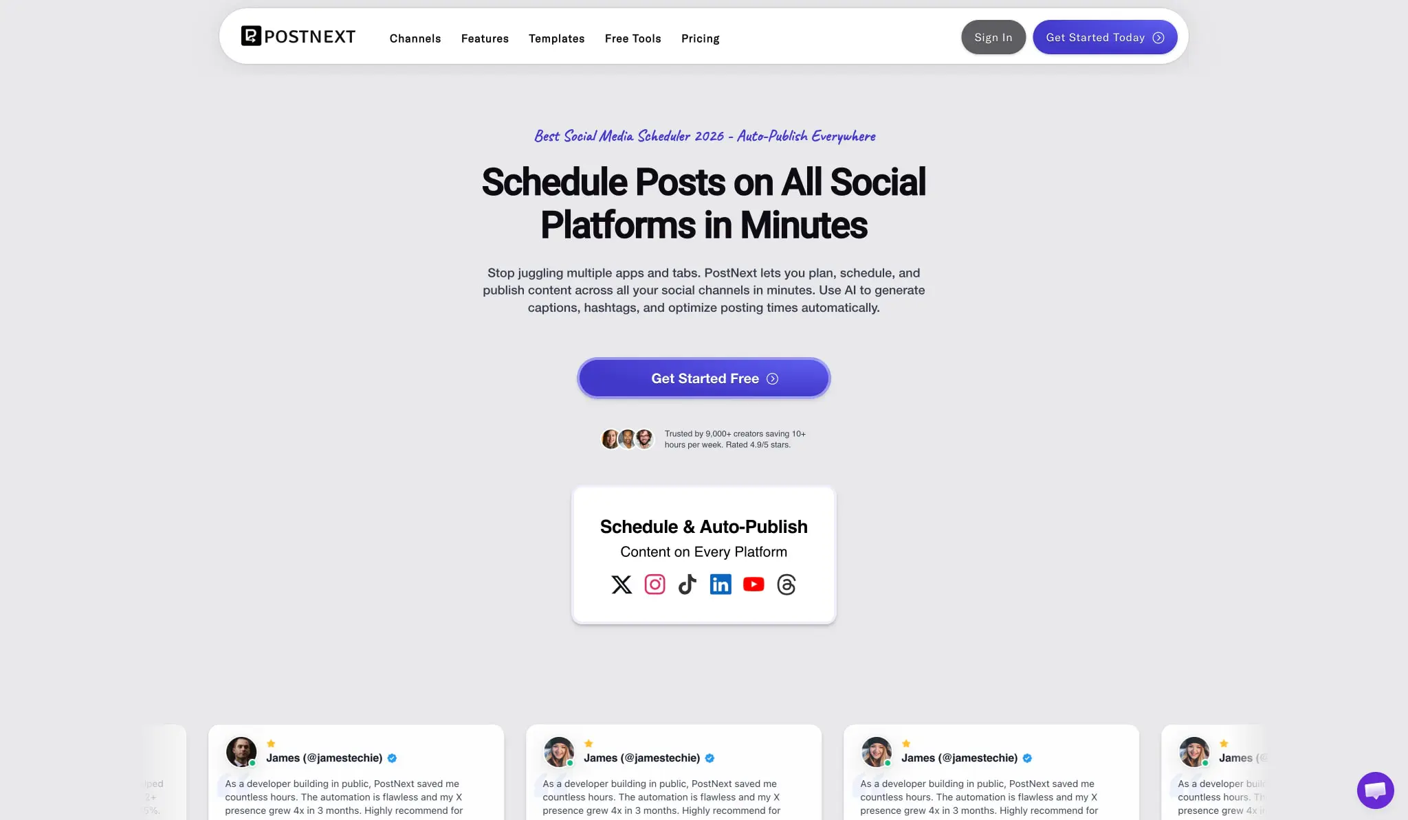
PostNext presents a contemporary SaaS aesthetic built for social media creators and marketers. The visual system balances professional credibility with approachable personality through a distinctive typographic pairing: clean geometric sans-serifs for structure and readability, complemented by handwritten script faces for category labels and playful accents. The interface rests on a light gray canvas that keeps attention on content, while purple-blue gradient buttons provide clear action hierarchy. Cards serve as the primary content container, appearing with subtle borders and generous rounded corners that soften the technical nature of a scheduling platform. The overall density is moderate—content breathes with ample section spacing, yet information remains scannable through consistent typographic rhythm and clear visual grouping.
Colors
The palette centers on a near-black ink family against warm light grays, with a vibrant purple-blue gradient as the singular action color. Green appears sparingly as a positive accent for savings indicators and toggle states.
| token | hex | use |
|---|---|---|
| action | #5D5FEF | Primary buttons, links, featured borders, brand accents |
| action-gradient-start | #5D5FEF | Gradient origin for CTAs |
| action-gradient-end | #4338CA | Gradient destination for CTAs |
| ink | #0D0D12 | Primary headings, body text on light surfaces |
| ink-secondary | #111827 | Secondary headings, emphasized content |
| ink-tertiary | #374151 | Supporting text, descriptions |
| muted-ink | #5D647B | Placeholder text, disabled states |
| canvas | #E5E5E5 | Page background, section fills |
| surface | #FFFFFF | Cards, modals, elevated panels |
| surface-elevated | #FAFAFA | Subtle variation for nested cards |
| border | #E5E7EB | Card outlines, dividers, structural borders |
| border-subtle | #E8E8EA | Feature card borders, hairline separators |
| success | #137613 | Positive indicators, checkmarks |
| accent-green | #D0FF99 | Annual savings badges, toggle active state |
| accent-coral | #8C3857 | Rare warm accent for visual variety |
The system operates in a light mode exclusively across visible surfaces. The purple gradient serves as the only chromatic action element, creating strong contrast against the neutral canvas. Green accents function as semantic highlights for pricing incentives rather than interactive elements. Photography and platform icons introduce their own color, but the UI itself maintains disciplined restraint.
Typography
PostNext employs a multi-family approach that mixes Swiss-influenced geometric sans-serifs with expressive handwritten scripts. Roboto and Inter handle display and structural text, while Akkurat Std carries body content. Caveat and Covered By Your Grace provide personality for labels and decorative accents.
| token | family | size | weight | leading | tracking | use |
|---|---|---|---|---|---|---|
| hero-display | Roboto | 3.375rem | 700 | 1.15 | -0.028em | Hero headlines, major page titles |
| section-display | Inter | 3rem | 500 | 1.08 | -0.02em | Section headings, pricing page titles |
| headline | Inter | 3.375rem | 500 | 0.96 | -0.02em | Large display text with tight leading |
| subheadline | Roboto | 1.125rem | 500 | 1.4 | normal | Secondary headings, category labels |
| body | Akkurat Std | 1rem | 300 | 1.5 | normal | Paragraphs, descriptions, UI text |
| body-emphasis | Akkurat Std | 1.125rem | 700 | 1.56 | 0.056em | Lead paragraphs, important descriptions |
| label | Akkurat Std | 1.25rem | 600 | 1.4 | normal | Card titles, feature names |
| caption | Akkurat Std | 0.75rem | 400 | 1.33 | normal | Fine print, metadata, legal text |
| script-accent | Caveat | 1.5rem | 700 | 1.5 | normal | Category labels, feature section headers |
| script-display | Covered By Your Grace | 1.75rem | 400 | 1.5 | 0.05em | Decorative pricing plan names, playful accents |
| navigation | Gt America | 1rem | 600 | 4.48 | 0.05em | Nav links with generous vertical padding |
| button | Roboto | 1.375rem | 700 | 2.36 | normal | CTA button text |
| price | Inter | 3rem | 600 | 1.5 | -0.042em | Pricing figures |
Gt America is designed by Noël Leu and published by Grilli Type GmbH. Noto Sans is designed by the Monotype Design Team and published by Monotype Imaging Inc. Roboto credits include Google and Christian Robertson. Verify licensing for these families before production use.
Layout
The layout follows a centered single-column pattern for marketing content, with maximum content widths that create comfortable reading measure. Sections stack vertically with generous breathing room, typically 5rem to 6rem between major content blocks. The navigation bar spans full width with internal horizontal padding, floating above the hero with a subtle shadow that separates it from the canvas.
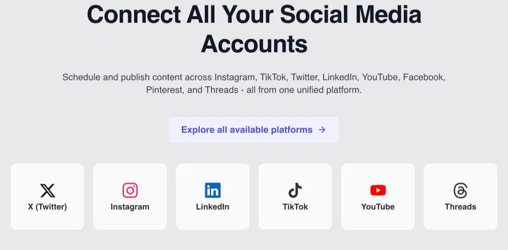
Content alignment is predominantly center-justified for headlines and descriptive text, creating a calm, symmetrical presentation. Cards and grids introduce left-aligned text within their containers while maintaining overall centering of the card groups themselves. The platform grid in particular demonstrates this: six equal cards arranged horizontally with centered icons and labels, the group centered on the page.
Spacing follows a 2px base unit system, with practical values clustering around 16px for internal padding, 32px for card gaps, and 80px for section margins. Card padding varies by component role: feature cards use asymmetric padding with more left indent (28px left, 14px elsewhere), while pricing cards receive generous uniform padding of 36px to 56px horizontal and 64px bottom.
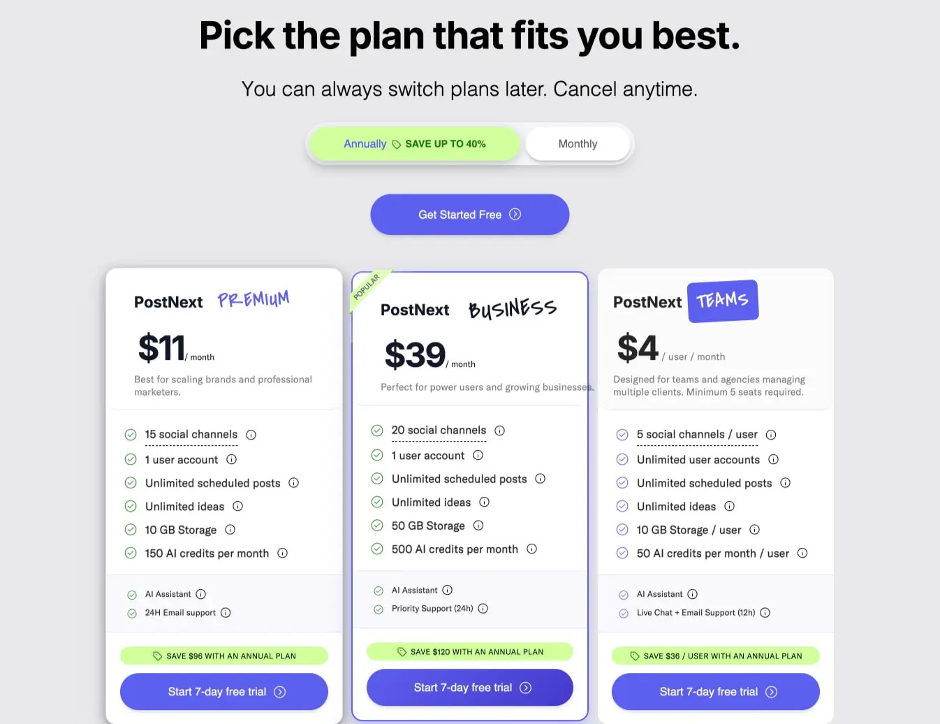
The pricing page introduces a three-column layout at desktop widths, with the center column elevated through a thicker border and “POPULAR” ribbon. This is the most complex layout visible, with cards of equal height and internal feature lists that align across tiers.
Visual language
The visual personality balances SaaS professionalism with creator-friendly warmth. The handwritten script elements—Caveat for functional labels, Covered By Your Grace for decorative plan names—prevent the interface from feeling sterile without undermining credibility. These scripts appear in purple to maintain color discipline, never competing with the black structural typography.
Cards are the fundamental surface unit, appearing with 12px to 16px border radius and subtle 1px borders in light gray. Elevation is minimal: a soft shadow appears on the navigation bar and occasional featured elements, but most cards rely on border definition rather than depth. The platform cards in particular are remarkably flat—white rectangles with rounded corners, no border visible, separated by gutter spacing alone.
Iconography is functional and platform-native: social media logos appear in their brand colors within neutral cards, while UI icons use simple line style. The checkmark in feature lists uses a green circle with white check, providing the only color in otherwise monochrome lists.
The gradient CTA buttons are the most visually energetic elements, shifting from bright purple (#5D5FEF) to deeper indigo (#4338CA) at 135 degrees. These appear with fully rounded pill shapes, creating a button family distinct from the squarer cards. A small arrow icon consistently accompanies button text, reinforcing forward motion.
Components
Navigation bar
Anatomy: Logo mark and wordmark left, horizontal link list center-right, two action buttons far right.
Surface: White background with subtle shadow (rgba(0, 0, 0, 0.1) 0px 4px 6px -1px), full width with internal horizontal padding.
Typography: Links use {typography.navigation} in near-black; active or emphasized states may use {colors.action}.
Shape: Bar height accommodates generous vertical padding; buttons use 8px radius for secondary actions, 999px pill for primary.
Composition: Flex row with space-between alignment; links spaced with 20px gaps.
Hero section
Anatomy: Script accent label, large display headline, descriptive paragraph, primary CTA button, social proof row with avatar stack and rating text, product preview card.
Surface: Light gray canvas background; preview card is white with rounded corners and subtle shadow.
Typography: Label uses {typography.script-accent} in purple; headline uses {typography.hero-display}; body uses {typography.body} at 18px with muted ink color.
Shape: Preview card uses 16px radius; CTA button is full pill.
Spacing: Generous vertical padding between elements; avatar stack overlaps horizontally with small negative margins.
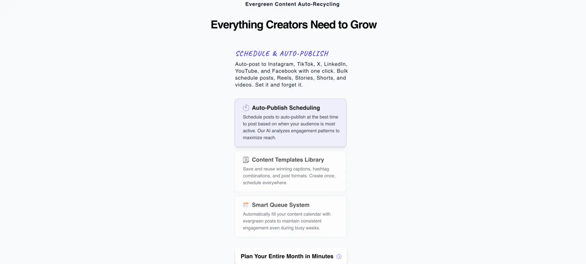
Feature cards
Anatomy: Icon or emoji prefix, bold title, descriptive paragraph.
Surface: White background with 1px border in {colors.border-subtle}; 12px border radius.
Typography: Title uses {typography.label}; body uses {typography.body} in muted ink.
Spacing: Asymmetric padding with 28px left, 14px top/right, 0px bottom; internal gap of approximately 12px between title and body.
Variants: Active or highlighted cards may receive purple left border (4px) or full purple border for featured state.
Platform grid cards
Anatomy: Platform icon centered above platform name.
Surface: White background, 12px radius, no visible border; separated by gutter spacing.
Typography: Platform name uses {typography.body} centered, weight 600.
Composition: Six cards in horizontal row at desktop; equal width with consistent internal padding of 24px.
Pricing cards
Anatomy: Plan name with script accent, price figure with period suffix, description, feature list with checkmarks, savings badge, CTA button.
Surface: White background, 16px radius, 1px border; featured variant uses 4px purple border and “POPULAR” ribbon.
Typography: Plan name combines {typography.label} for “PostNext” with {typography.script-display} for tier name; price uses {typography.price}; features use {typography.body} at 16px weight 500.
Shape: CTA buttons are full pill with gradient background; savings badges are pill-shaped with green background.
Spacing: Generous internal padding (36px-56px horizontal, 64px bottom); feature list items separated by 4px negative margin overlap technique or tight vertical spacing.
Toggle switch
Anatomy: Two-option segmented control with active indicator.
Surface: Active option uses {colors.accent-green} background; inactive uses white with border.
Typography: Label text uses {typography.body} weight 500.
Shape: Full pill radius (100px); compact padding of 8px vertical, 12px horizontal per option.
Primary action button
Anatomy: Text with right arrow icon.
Surface: Purple gradient background ({components.primary-action.background}); white text.
Typography: {typography.button}.
Shape: Full pill (999px radius); generous horizontal padding of 50px.
States: Standard and hover inferred from gradient richness; no disabled state visible.
Responsive behavior
The visible desktop layouts suggest a single breakpoint strategy for smaller viewports. The platform grid of six cards should collapse to three-across on tablets and two-across or stacked on mobile. Pricing cards, currently three-across, would stack vertically with the featured card maintaining center position.
Typography scales down proportionally: hero display at 54px desktop may reduce to 40px on tablet and 32px on mobile. Section display at 48px follows similar reduction. Body text remains at 16px across breakpoints for readability.
Navigation collapses to a hamburger menu on mobile, with the full link list hidden behind a toggle. The two action buttons may reduce to a single primary CTA or icon-only variant.
Card padding reduces by approximately 30% on mobile: pricing card padding from 56px horizontal to 24px, feature card left indent from 28px to 16px.
Practical implementation guidance
Preserve
- The distinctive script-and-sans typographic pairing; it defines brand personality
- Purple gradient buttons as the sole chromatic action element
- Generous section spacing (80px+) that lets content breathe
- Asymmetric feature card padding with left indent
- Green savings accents limited to pricing incentives and positive indicators
- Platform icon cards with their clean, borderless white treatment
Avoid
- Adding additional accent colors beyond the purple-green pairing
- Making script fonts smaller than 16px; they lose legibility and character
- Using the gradient on non-interactive elements; it dilutes action hierarchy
- Borders heavier than 1px except for featured pricing card emphasis
- Center-aligned body text beyond headlines and short descriptions
Recommended build order
- Establish the 2px base unit and spacing scale
- Implement typography with all five families and their roles
- Build the navigation bar with shadow and button variants
- Create the hero section with script label, display headline, and gradient CTA
- Develop card components: feature, platform, and pricing variants
- Implement the pricing page with three-column layout and toggle
- Add responsive collapse behavior for grids and navigation
Accessibility
- Ensure gradient buttons maintain 4.5:1 contrast ratio; the purple-to-indigo shift may require testing at lighter stops
- Script fonts should never carry critical information alone; always provide plain-text equivalent
- Platform icons require text labels for screen reader context
- Pricing toggle needs clear focus states and keyboard operability
- Card borders at 1px in #E5E7EB may be too subtle for low-vision users; consider 1.5px minimum or additional shadow
Scope note
This guide covers the marketing homepage and pricing page surfaces visible in the captured images. Dashboard interfaces, mobile navigation patterns, form validation states, loading skeletons, and dark mode are not represented. Measurements are practical adaptation targets derived from the documented pixel values. Motion, micro-interactions, and hover states require additional research beyond static view.
Sites change, so a screenshot can differ from the guide.
Loading…Similar designs
This guide describes the public website and isn't an official postnext.io design system. Not affiliated with postnext.io.