Overview
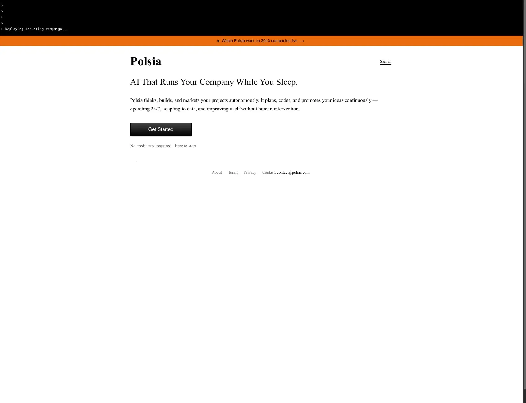
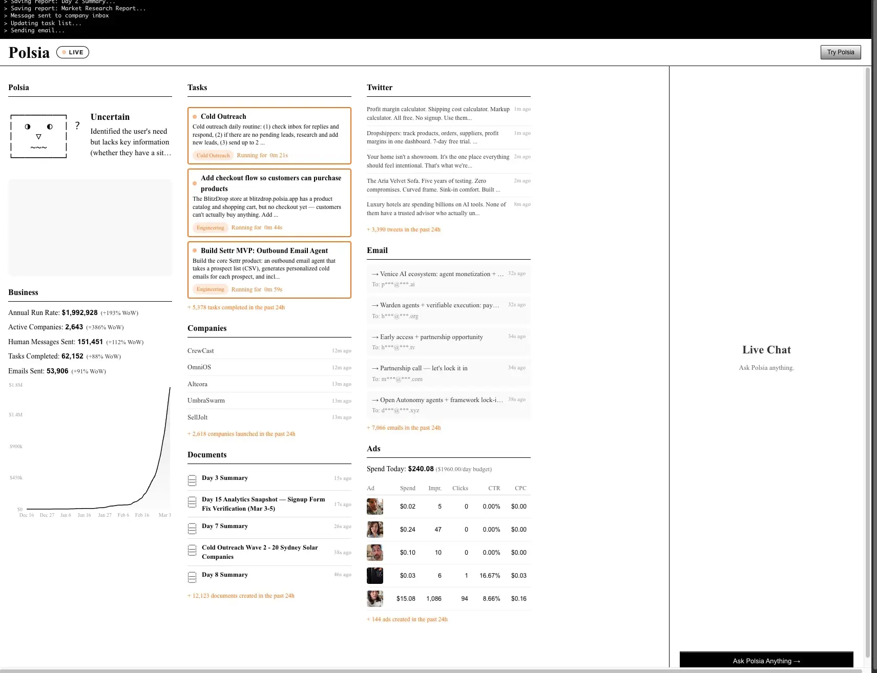
Polsia presents a deliberately austere visual system that contrasts classical editorial typography with the raw aesthetic of a live terminal interface. The design philosophy centers on radical simplicity: black ink on white canvas, a single warm orange accent for live-state indicators, and an uncluttered information hierarchy that lets data breathe. The homepage opens with a stark black terminal header showing system logs, followed by an urgent orange banner announcing live company activity. Below, a spacious white field carries a large serif headline and minimal call-to-action, creating an almost manifesto-like landing experience. The live dashboard transforms this restraint into dense information architecture—task cards with orange borders, scrolling social feeds, email queues, and advertising metrics arranged in a disciplined multi-column grid. The system feels like a financial newspaper crossed with a developer console: authoritative, unembellished, and obsessively focused on operational transparency.
Colors
| token | value | use |
|---|---|---|
| ink | #000000 | Primary text, terminal backgrounds, button fills, section underlines |
| ink-secondary | #333333 | Body text in dense content areas, secondary headings |
| ink-tertiary | #444444 | Tertiary labels, metadata timestamps |
| ink-muted | #555555 | Footer links, inactive navigation, subdued captions |
| ink-faint | #666666 | Placeholder text, disabled states, chart axis labels |
| ink-ghost | #888888 | Very subtle dividers, inactive tab indicators |
| ink-subtle | #999999 | Rare tertiary metadata, hover-muted text |
| canvas | #FFFFFF | Primary page background, card surfaces, input fields |
| surface | #FAFAFA | Subtle alternate backgrounds, table row alternation |
| surface-warm | #F8F8F8 | Warm gray for metric badge backgrounds, terminal highlight bands |
| accent | #F97316 | Live indicators, task card borders, active tags, banner backgrounds, running timers |
| accent-live | #F97316 | Pulsing or animated live-state dots, real-time counters |
The color system operates in strict monochrome with a single functional accent. Black dominates as both text and surface—terminal headers use pure black backgrounds with white monospace text, while the main canvas remains white with black typography. The orange accent (#F97316) carries all interactive and stateful meaning: it borders running tasks, highlights real-time metrics, fills the live banner, and colors active category tags. This creates an immediate visual grammar—orange means “happening now.” Grays from #333333 to #999999 form a stepped desaturation ladder for information hierarchy, with darker values for primary content and lighter values for timestamps, footers, and secondary metadata. No gradients appear in the interface except for the subtle button treatment on the homepage.
Typography
| token | family | size | weight | leading | tracking | use |
|---|---|---|---|---|---|---|
| hero-display | Times New Roman | 2.5rem | 700 | 1.0 | 0em | Homepage headline, major page titles |
| section-display | Times New Roman | 1.75rem | 400 | 1.2 | 0em | Dashboard section headers, large subheads |
| body-large | Times New Roman | 1.125rem | 400 | 1.75 | 0em | Hero description paragraphs, featured content |
| body | Times New Roman | 1rem | 400 | 1.6 | 0em | Standard paragraphs, card descriptions, feed items |
| body-small | Times New Roman | 0.875rem | 400 | 1.5 | 0em | Task card descriptions, table cells, dense lists |
| label | Times New Roman | 0.8125rem | 500 | 1.5 | 0em | Navigation links, footer links, category tags |
| caption | Times New Roman | 0.75rem | 400 | 1.4 | 0em | Timestamps, metadata, small annotations |
| mono-label | Sf Mono | 0.6875rem | 400 | 1.3 | 0em | Terminal output, system logs, code references |
| button | Helvetica | 1rem | 400 | 1.0 | 0em | Primary CTA buttons, form submit actions |
| nav | Arial | 0.8125rem | 500 | 1.6 | 0em | Top navigation, utility links, banner text |
The typographic system anchors on Times New Roman as the editorial voice, used in weights from 400 to 700 across all content hierarchies. This classical serif choice lends institutional authority to a product about autonomous business operations. Helvetica serves utilitarian button text with neutral clarity. Arial handles navigation and banner messaging at a slightly smaller scale. Sf Mono—designed by Apple Inc.—provides the terminal aesthetic for system logs and live indicators, grounding the product in developer culture. Verify licensing for these families before production use. Line heights remain generous for readability in dense dashboard views, with the hero display compressed to a tight 1.0 for impact. No letter-spacing adjustments are applied, preserving the natural rhythm of each typeface.
Layout
The layout system alternates between extreme minimalism and dense information architecture. The homepage uses a centered single-column composition with generous whitespace: content sits in a narrow reading column approximately 640px wide, flanked by vast white margins. The terminal header spans full-width with fixed-height black band, followed by a full-width orange banner. Below, the hero section floats with substantial vertical breathing room—roughly 2.5rem between elements—before a thin horizontal rule separates the primary content from a compact footer.
The live dashboard explodes into a multi-column grid: left sidebar for business metrics and chart, central column for task cards and company lists, right column for social feeds, email, and advertising data, with a far-right panel for live chat. Column gutters appear tight at approximately 1.5rem, with internal card padding at 1rem. Section headers use a consistent pattern: bold label with full-width hairline underline in black, creating modular dividers that allow rapid scanning. The terminal aesthetic carries through with monospace status indicators and timestamp columns aligned to the right edge of each content block.
Spacing follows a base-2px system (0.125rem unit), with practical increments at 0.5rem, 0.75rem, 1rem, 1.5rem, and 2.5rem. Cards and containers use 1rem internal padding. Section vertical rhythm sits at 2.5rem between major blocks. The live chat panel fixes to the viewport bottom-right with a dark input bar, creating a persistent utility layer over the scrollable dashboard.
Visual language
The visual language merges three distinct aesthetic registers: editorial authority, terminal utility, and live operational urgency. The editorial register appears in the classical serif typography, generous line heights, and restrained color palette—reminiscent of financial newspapers and academic journals. The terminal register surfaces in the black header with green-tinged system logs, monospace timestamps, and the “>” prompt aesthetic. The live register activates through orange: pulsing dots, running timers, active borders, and the persistent banner announcing real-time company counts.
Imagery and photography appear minimal—dashboard cards use small avatar thumbnails for ad creatives, while the homepage carries no imagery beyond typographic form. The system privileges data visualization over decoration: a single line chart in the business section shows exponential growth with a thin black stroke on white, axis labels in faint gray. Icons are absent or extremely rare; the interface relies on text labels, color coding, and spatial grouping for wayfinding.
Borders function as structural and stateful elements. Black hairlines (1px) separate footer sections and underline headers. Orange borders (2px) activate around running tasks, creating a glow-like emphasis without shadows. The only shadow treatment appears on primary buttons: a subtle inset white highlight suggesting dimensional depth on the dark gradient surface.
Components
Terminal Header
- Anatomy: Full-width black band with left-aligned monospace log output
- Surface: Background
{colors.ink}, text{colors.canvas} - Typography:
{typography.mono-label}in Sf Mono - Spacing: Compact vertical padding, approximately 0.75rem
- Composition: Sequential log lines with “>” prompt prefix, latest entry showing deployment status
Live Banner
- Anatomy: Full-width orange strip with centered text and right arrow indicator
- Surface: Background
{colors.accent}, text{colors.ink} - Typography:
{typography.nav}in Arial, medium weight - Shape: No border radius, sharp rectangular band
- States: Static on homepage, likely dynamic on dashboard with live company count updates
Primary Button
- Anatomy: Rectangular button with centered label
- Surface: Background
{colors.ink}, text{colors.canvas}, border{colors.ink}1px solid - Typography:
{typography.button}in Helvetica - Shape: Border radius
{rounded.button}(2px), subtle gradient from #444444 to #000000 - Shadow: Inset white highlight at 40% opacity on top edge, creating beveled depth
- Spacing: Padding 0.75rem 1.5rem
- States: Default shows gradient; hover and active states not visible in still images
Task Card
- Anatomy: Bordered container with title, description, category tag, and running timer
- Surface: Background
{colors.canvas}, border{colors.accent}2px solid, border radius{rounded.card}(8px) - Typography: Title in
{typography.body-small}bold, description in{typography.body-small}regular, tag in{typography.caption}with{colors.accent}text - Spacing: Internal padding 1rem, tag with pill padding 0.5rem horizontal
- Composition: Left margin for status dot, stacked vertical arrangement with tag and timer on shared row
Section Header
- Anatomy: Bold label with full-width underline rule
- Surface: Transparent background, border-bottom
{colors.ink}1px solid - Typography:
{typography.section-display}or{typography.label}depending on hierarchy - Spacing: Padding-bottom 0.5rem, margin-bottom 1rem to subsequent content
Metric Badge
- Anatomy: Inline pill with category label and running duration
- Surface: Background
{colors.surface-warm}, border radius{rounded.pill}(10px) - Typography:
{typography.caption}in{colors.accent} - Spacing: Horizontal padding 0.5rem, vertical padding 0.25rem
Live Chat Panel
- Anatomy: Fixed right-side panel with header, prompt text, and input bar
- Surface: Panel background
{colors.canvas}, input bar background{colors.ink} - Typography: Header in
{typography.section-display}, prompt in{typography.body-small}muted, input text in{typography.body}white - Composition: Header top-aligned, generous empty center, dark input bar anchored to bottom with arrow indicator
Footer
- Anatomy: Centered horizontal rule with inline link cluster
- Surface: Transparent on white canvas, rule in faint gray
- Typography: Links in
{typography.label}with{colors.ink-muted}, email link underlined - Spacing: Generous top margin, compact horizontal spacing between links
Responsive behavior
The captured images show desktop layouts exclusively. The homepage’s narrow centered column suggests natural adaptation to smaller viewports—maintaining the reading width while reducing side margins. The dashboard’s multi-column grid would require significant reorganization on mobile: the left sidebar with business metrics and chart should stack above the central task feed, with social and email modules collapsing into accordion sections or tabbed interfaces. The live chat panel, fixed on desktop, should become a floating action button expanding to full-screen overlay on mobile.
The terminal header and live banner should remain full-width across all breakpoints, with banner text potentially truncating or wrapping. Typography scales should maintain hierarchy: the 2.5rem hero display may reduce to 1.75rem on small screens, while body text holds at 1rem for readability. Touch targets for task cards and buttons should expand to minimum 44px height on mobile devices.
Practical implementation guidance
Preserve
- The stark black-white-orange palette as the complete color story—resist adding secondary accents
- Times New Roman as the dominant editorial voice across all content hierarchies
- The terminal header aesthetic with monospace system logs as a persistent brand signature
- Orange borders as the exclusive indicator of live, running, or active state
- Generous whitespace on the homepage versus information density on the dashboard
- The 2px base unit for spacing and the stepped gray scale for text hierarchy
Avoid
- Rounded corners beyond the minimal 2px-8px range—no soft or playful shapes
- Drop shadows on cards or containers—the system uses flat color and border for depth
- Multiple accent colors that would dilute the orange live-state meaning
- Sans-serif body text that would break the editorial authority
- Decorative imagery or illustrations that compete with data density
- Gradient backgrounds except for the subtle button treatment
Recommended Build Order
- Establish the color tokens and typographic scale with Times New Roman as primary
- Build the terminal header and live banner as persistent global elements
- Implement the homepage hero section with centered column and primary button
- Create the section header component with underline rule for modular dashboard sections
- Develop task card with orange border state and metric badge pill
- Assemble the multi-column dashboard grid with sidebar, main feed, and right panels
- Add live chat panel with fixed positioning and dark input bar
- Implement footer with horizontal rule and inline link pattern
Accessibility
- Ensure terminal header log text meets contrast ratios against black background—Sf Mono at 11px may require increased weight or size for WCAG AA
- The orange accent (#F97316) on white fails contrast for small text; reserve it for borders, large text, or non-text indicators only
- Provide keyboard navigation for the dense dashboard grid, with focus indicators that respect the minimal aesthetic
- Add
aria-liveregions for terminal output and real-time metric updates - Ensure the “Get Started” button’s gradient maintains sufficient contrast across its range
- Consider a reduced-motion preference that disables any pulsing or animated live indicators
Scope note
This guide covers the Polsia homepage and live dashboard as visible in desktop screenshots. Mobile breakpoints, tablet layouts, form validation states, loading skeletons, error pages, and authentication flows are not represented. Motion design for live indicators, real-time data updates, and terminal log scrolling are implied but not documented. The System-Systemui and Arial typefaces appear in limited utility roles; their full range is not exercised in the visible surfaces.
Sites change, so a screenshot can differ from the guide.
Loading…Similar designs
This guide describes the public website and isn't an official polsia.com design system. Not affiliated with polsia.com.