Overview
The Google Pay design system spans two distinct environments: a dense, task-oriented business console for developers and merchants, and bold, expressive marketing pages for consumer audiences. The console prioritizes information hierarchy and efficient navigation through a persistent sidebar, card-based content organization, and restrained color usage. Marketing pages shift to high-contrast dark sections, oversized display typography, and immersive photography. Both surfaces share a common foundation in Google’s typographic system—Google Sans for headlines and UI elements, Roboto for supporting text, and Arial for certain button contexts—and a blue-forward accent palette rooted in Google’s brand identity. The system balances familiarity with functional clarity, using elevation, spacing, and rounded corners to create visual rhythm without decorative excess.
Colors
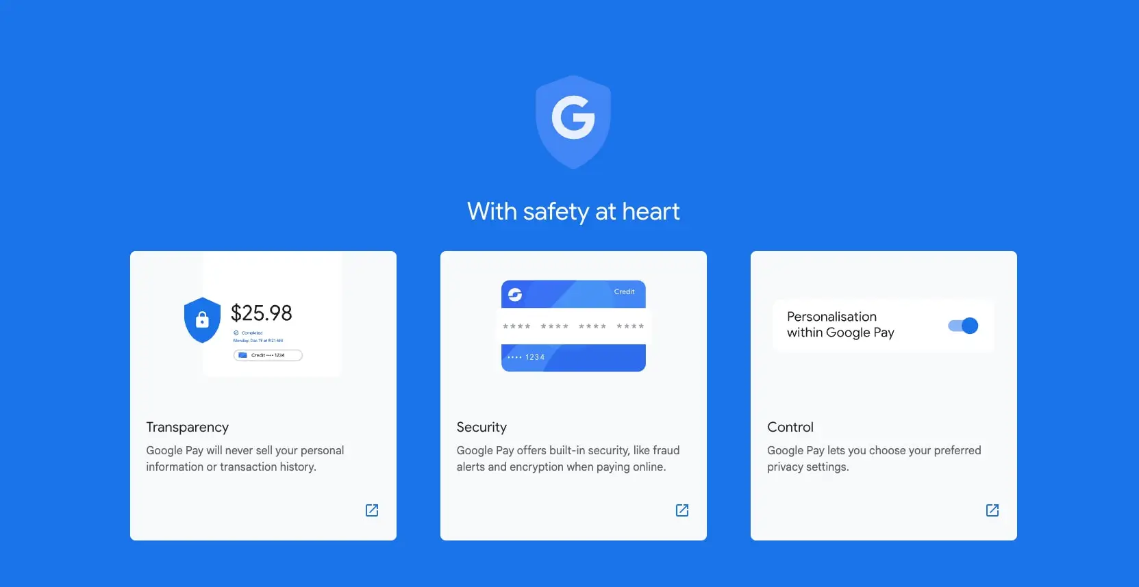
The palette is built on a near-white canvas with cool grays for text hierarchy and Google’s signature blue family for interactive elements. Dark sections on marketing pages use charcoal backgrounds with white text for dramatic contrast.
| token | hex | use |
|---|---|---|
| action | #1A73E8 | Primary buttons, active navigation, links |
| action-hover | #185ABC | Button hover states |
| action-active | #174EA6 | Button pressed states |
| ink | #202124 | Primary headings, body text on light surfaces |
| ink-secondary | #3C4043 | Secondary text, inactive navigation |
| muted-ink | #5F6368 | Tertiary text, captions, metadata |
| canvas | #FFFFFF | Page backgrounds, elevated cards |
| surface | #F8F9FA | Card backgrounds, subtle section fills |
| surface-elevated | #F1F3F4 | Hover states, secondary surfaces |
| border | #D8D8D8 | Dividers, input borders |
| border-subtle | #E8F0FE | Active navigation background, subtle separators |
| error | #B3261E | Alert icons, error text |
| error-surface | #FCE8E6 | Error alert backgrounds |
| warning-surface | #FEDFC8 | Warning chip backgrounds |
| inverse-ink | #FFFFFF | Text on dark or colored backgrounds |
| inverse-surface | #1F1F1F | Dark section backgrounds |
| accent-blue | #2962FF | Marketing emphasis, gradient endpoints |
| accent-blue-light | #4285F4 | Icon fills, decorative elements |
The console uses a predominantly light mode with white canvas and gray surfaces. Marketing pages alternate between white sections and dark charcoal (#1F1F1F) hero areas. Blue appears consistently as the action color across both contexts, with lighter tints used for hover feedback and selection states. Error and warning surfaces are used sparingly for system alerts and status indicators.
Typography
The system uses Google Sans for display headlines and UI labels, Google Sans 18 Pt for medium-weight headings and navigation, Roboto for body text and captions, and Arial for certain button elements. Product Sans appears exclusively for the Google Pay wordmark in headers. System and System-Sansserif appear in header contexts as fallback faces.
| token | family | size | weight | leading | tracking | use |
|---|---|---|---|---|---|---|
| hero-display | Google Sans | 6.5rem | 400 | 1.02 | -0.05em | Marketing page hero headlines |
| section-display | Google Sans 18 Pt | 2.25rem | 400 | 1.25 | -0.015em | Section headings on marketing pages |
| heading-large | Google Sans 18 Pt | 2rem | 500 | 1.25 | 0em | Console page titles |
| heading-medium | Google Sans 18 Pt | 1.75rem | 500 | 1.29 | 0em | Card titles, feature headings |
| heading-small | Google Sans 18 Pt | 1.375rem | 500 | 1.27 | 0em | Subsection headings |
| body | Google Sans | 1rem | 400 | 1.5 | 0.006em | Default body text |
| body-large | Google Sans | 1.125rem | 400 | 1.56 | 0em | Lead paragraphs, descriptions |
| label | Google Sans 18 Pt | 0.875rem | 500 | 2 | 0em | Buttons, chips, status labels |
| navigation | Google Sans 18 Pt | 1rem | 500 | 1.5 | 0.006em | Active sidebar items, tabs |
| navigation-secondary | Roboto | 0.9375rem | 400 | 1.07 | 0em | Inactive sidebar items |
| caption | Roboto | 0.75rem | 400 | 1.33 | 0.025em | Timestamps, metadata |
| product-brand | Product Sans | 1.375rem | 400 | 2 | 0em | Google Pay wordmark |
Verify licensing for these families before production use. Google Sans and Product Sans are proprietary Google typefaces. Roboto is available under the Apache 2.0 license. Arial is a proprietary Microsoft typeface. System and System-Sansserif are platform-dependent fallback families.
Layout
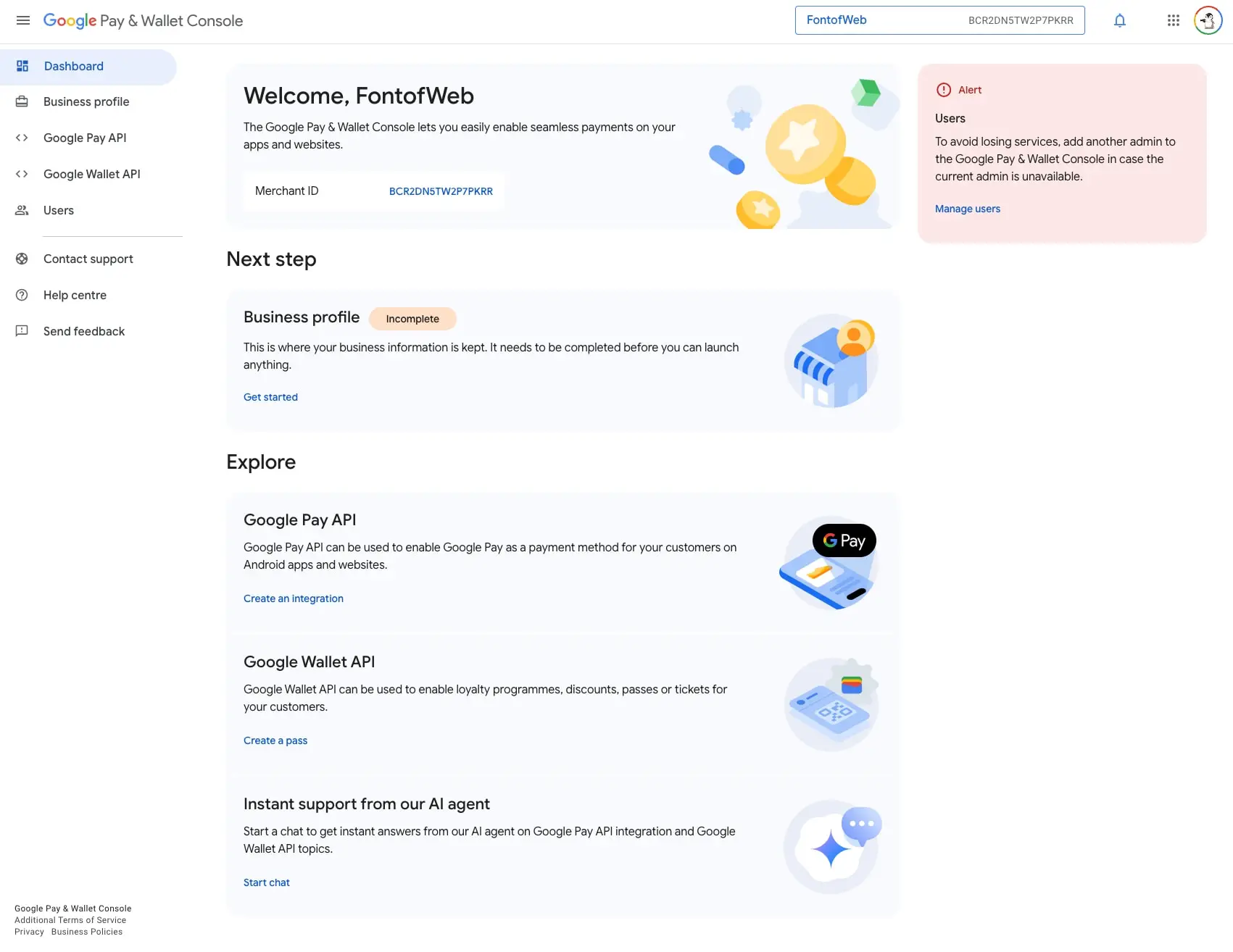
The console employs a fixed left sidebar with a fluid main content area. The sidebar spans approximately 256px and contains primary navigation with icon-and-label pairs. The main area uses generous horizontal padding (36px to 56px) and vertical section spacing (24px to 36px between content blocks). Cards within the main area typically appear in single-column stacks with internal padding of 24px.
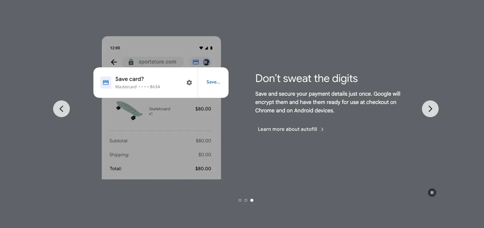
Marketing pages use full-bleed sections with centered content containers. Hero sections employ asymmetric layouts with device mockups on one side and text on the other, or centered text over dark backgrounds. Content sections maintain a maximum readable width with generous vertical padding (120px to 180px) to create breathing room between topics.
The grid system relies on consistent spacing multiples of 8px (0.5rem), with key structural values at 16px, 24px, 36px, and 56px. Card grids on marketing pages use 20px gutters. The console’s card-based explore sections stack vertically with 12px to 24px gaps.
Visual language
Illustrations and iconography follow Google’s modern flat style with soft gradients and rounded geometric forms. Console cards feature colorful spot illustrations—coins, devices, and abstract shapes—against light gray backgrounds. Marketing pages use realistic device photography and UI mockups with subtle shadows.
The visual tone shifts between contexts: the console is utilitarian and information-dense, while marketing pages are bold and emotive. Dark sections use deep charcoal (#1F1F1F) with white text and blue accent links. Blue gradients appear in marketing hero sections, transitioning from #F8F9FA to #1A73E8.
Rounded corners are a consistent signature. Cards use 20px radius, buttons are fully pill-shaped, and the active navigation item in the sidebar uses an asymmetric right-side radius (29px) creating a distinctive tab-like appearance. Chips and tags use 29px radius for a soft capsule shape.
Components
Sidebar Navigation
- Anatomy: Icon (24px), label text, and optional expand/collapse chevron
- Surface: Transparent background for inactive items, #E8F0FE fill for active state
- Typography: Inactive items use Roboto 15px Regular in #3C4043; active items use Google Sans 18 Pt 16px Medium in #1A73E8
- Shape: Active item has 0px 29px 29px 0px border radius (right-side pill)
- Spacing: 4px vertical padding, 24px left padding, 16px icon-to-label gap
- Composition: Items stack vertically with 8px section spacing; section headers use 8px top margin
Content Cards
- Anatomy: Optional illustration, heading, description text, and action link
- Surface: #F8F9FA background on console, #FFFFFF on marketing pages
- Typography: Heading uses Google Sans 18 Pt 22px Medium in #202124; body uses Google Sans 16px Regular in #3C4043; action link uses Roboto 16px Regular in #1A73E8
- Shape: 20px border radius
- Spacing: 24px internal padding; 12px to 24px between text elements
- Composition: Horizontal layout with text left and illustration right, or vertical stack
Primary Button
- Anatomy: Text label with optional icon
- Surface: #1A73E8 background, #FFFFFF text
- Typography: Google Sans 18 Pt 14px Medium
- Shape: 12px border radius (slightly rounded rectangle) or 9999px (pill in marketing)
- Spacing: 16px horizontal padding, 12px to 16px vertical padding
- Variants: Marketing variant uses full pill shape; console variant uses 12px radius
Text Button / Link
- Anatomy: Text with optional arrow icon
- Surface: Transparent background
- Typography: Google Sans 18 Pt 16px Medium in #1A73E8
- Spacing: 8px to 12px padding
- Composition: Often appears below card descriptions or as inline actions
Alert Banner
- Anatomy: Icon, heading, description, and action link
- Surface: #FCE8E6 background for errors, #FEDFC8 for warnings
- Typography: Heading uses Google Sans 18 Pt 16px Medium; body uses Roboto 16px Regular
- Shape: 20px border radius
- Spacing: 24px padding
Status Chip
- Anatomy: Text label only
- Surface: #FEDFC8 background for incomplete/warning states
- Typography: Roboto 12px Regular in #3C4043
- Shape: 29px border radius (capsule)
- Spacing: 4px to 8px horizontal padding, 2px to 4px vertical
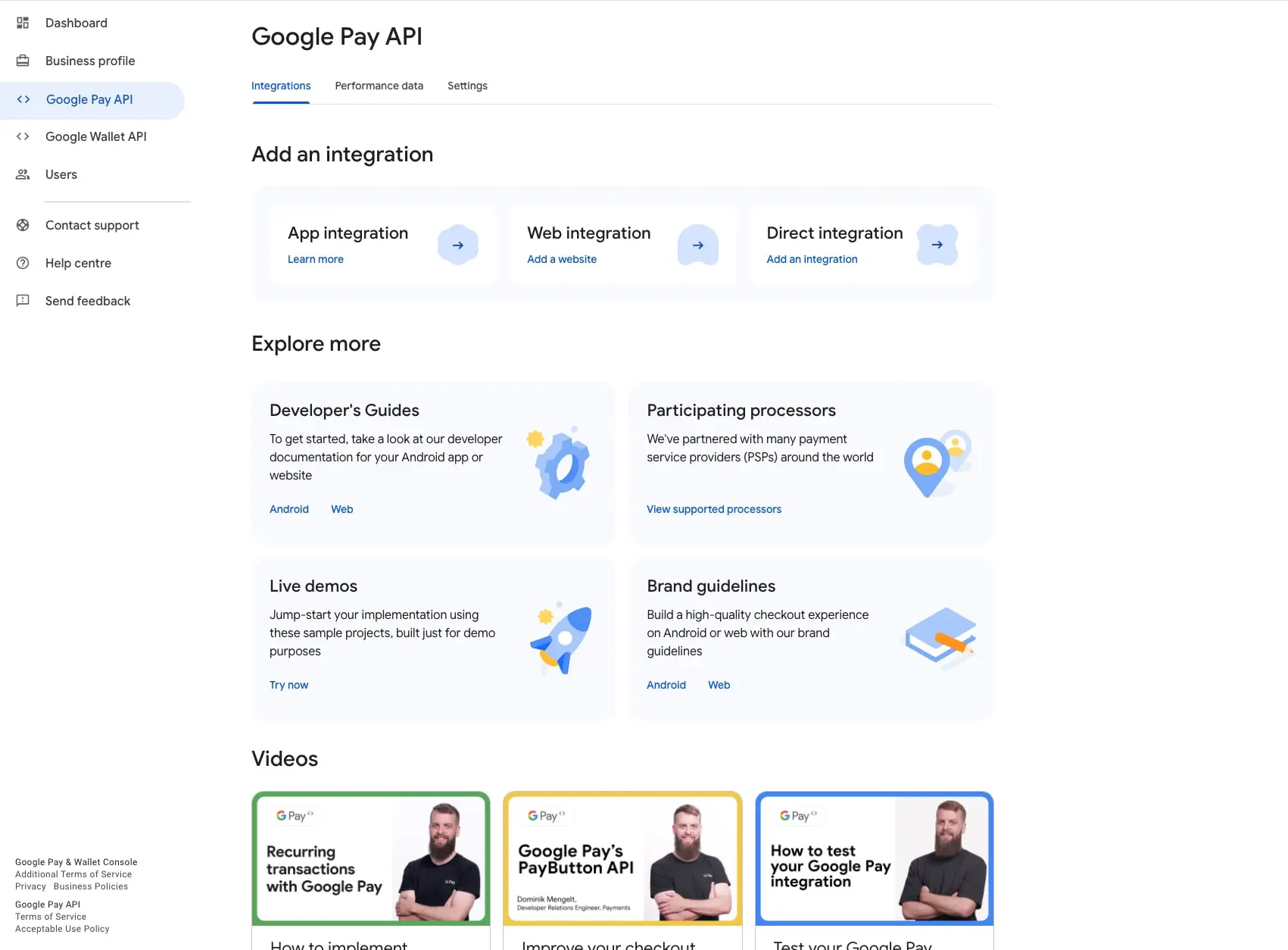
Tab Navigation
- Anatomy: Text labels with active underline indicator
- Surface: Transparent background
- Typography: Google Sans 18 Pt 16px Medium; active state uses #1A73E8 with 2px bottom border
- Spacing: 16px to 24px between tabs, 8px to 12px vertical padding
Video Card
- Anatomy: Thumbnail image, title text, and optional metadata
- Surface: #FFFFFF background with colored top border (green, yellow, or blue)
- Typography: Google Sans 18 Pt 16px Medium for title
- Shape: 16px border radius
- Spacing: 24px internal padding
Responsive behavior
The console sidebar collapses to an icon-only rail on narrower viewports, expanding to full width on hover or tap. Main content padding reduces from 56px to 24px and finally to 16px on small screens. Card grids in the explore section transition from single column to two columns at medium breakpoints.
Marketing pages stack hero content vertically on mobile, with device mockups moving above text. Display typography scales down proportionally: the 104px hero reduces to 60px, then 36px. Section padding compresses from 180px to 120px to 80px vertical. Navigation collapses to a hamburger menu with the Google Pay wordmark centered.
Touch targets maintain a minimum 44px height throughout. Button padding increases slightly on mobile to accommodate finger tapping.
Practical implementation guidance
Preserve
- The asymmetric sidebar active state with right-side pill radius; this is a distinctive Google console pattern
- The 8px spacing grid and its multiples throughout both console and marketing surfaces
- The strict typographic hierarchy: Google Sans for headlines and UI, Roboto for supporting text
- The blue accent family’s consistent application for all interactive elements
- Card-based information architecture in the console; it reduces cognitive load for complex workflows
Avoid
- Using Product Sans for anything other than the Google Pay wordmark
- Applying dark section backgrounds in the console; keep the console strictly light mode
- Mixing pill and rounded-rectangle buttons within the same context; match the surface’s established pattern
- Reducing sidebar width below 256px when text labels are visible; it causes unwanted wrapping
Recommended build order
- Establish the 8px spacing grid and core color tokens
- Implement Google Sans and Roboto with the complete type scale
- Build the sidebar navigation with active/hover states
- Create the card component with flexible illustration placement
- Add button variants (primary, secondary, text) for both console and marketing contexts
- Implement marketing page sections with dark/light mode switching
- Add alert and status components for console feedback
Accessibility
- Ensure all interactive elements meet 4.5:1 contrast ratios; the #1A73E8 on white combination achieves this
- Provide visible focus indicators that match the active state styling in navigation
- Use aria-current for the active sidebar item and active tab
- Maintain logical tab order through the sidebar before main content
- For dark marketing sections, verify white text on #1F1F1F meets WCAG AA standards
- Include skip links for keyboard navigation past the sidebar on console pages
Scope note
This guide covers the Google Pay & Wallet Console dashboard and API pages, plus the consumer-facing marketing site. It does not include mobile app interfaces, checkout flow UIs, email templates, or animation specifications. Motion design, dark mode for the console, and form components beyond buttons are not documented here. Measurements reflect the desktop viewport state captured in the source images.
Sites change, so a screenshot can differ from the guide.
Loading…Similar designs
This guide describes the public website and isn't an official pay.google.com design system. Not affiliated with pay.google.com.