Overview
Open Collective’s design system presents a financial platform that balances institutional trust with approachable warmth. The visual language centers on deep navy authority paired with organic watercolor textures, creating a distinctive identity that separates it from sterile fintech competitors. The homepage architecture moves visitors through a clear narrative: a bold value proposition, transparent product demonstration, network social proof, and community engagement. Every surface reinforces the core brand promise of financial transparency through literal dashboard previews, open statistics, and clean information hierarchy. The system employs a single type family at multiple weights, generous whitespace, and rounded pill-shaped actions to feel both professional and accessible. Watercolor illustrations and textured backgrounds soften the technical subject matter, suggesting human care behind the financial infrastructure.
Colors
The palette operates in three distinct modes: a light primary interface, dark immersive sections, and warm photographic moments.
| token | value | use |
|---|---|---|
| action | #0C2D66 | Primary buttons, key headlines, active navigation, brand emphasis |
| action-hover | #0C2764 | Button hover states, gradient endpoints |
| ink | #141415 | Primary body text, strong headings |
| muted-ink | #323334 | Secondary text, descriptions, inactive states |
| secondary-ink | #4D4F51 | Tertiary labels, metadata, subtle UI elements |
| canvas | #FFFFFF | Page background, card surfaces, button fills |
| surface | #F8FAFC | Footer background, alternate section grounds |
| surface-warm | #F1F5F9 | Subtle section differentiation |
| border | #E2E8F0 | Card outlines, input borders, dividers |
| border-subtle | #DCDDE0 | Hairline separators, inactive button borders |
| accent-navy | #0C2D66 | Deep immersive backgrounds, network visualization |
| accent-teal | #45556C | Supporting dark tones, footer link hover |
| footer-surface | #F8FAFC | Footer primary background |
| footer-ink | #62748E | Footer body text, descriptive copy |
| footer-link | #45556C | Footer navigation links |
The light mode dominates the experience, with white canvas providing maximum clarity for financial data presentation. Dark navy sections create dramatic contrast for social proof and network visualization, allowing white typography to command attention. The watercolor photography introduces warm pinks and soft textures that appear in specific engagement sections, creating emotional resonance without interfering with functional readability. All interface colors maintain sufficient contrast for accessibility, with the deep navy action color serving as the consistent anchor across both light and dark contexts.
Typography
The system uses Inter as its sole type family, leveraging weight and size variation to establish hierarchy rather than introducing additional families. This creates a cohesive, modern technical aesthetic appropriate for financial software.
| token | family | size | weight | leading | tracking | use |
|---|---|---|---|---|---|---|
| hero-display | Inter | 4.5rem | 900 | 1.1 | 0.054em | Homepage hero headline |
| section-display | Inter | 3.25rem | 700 | 1.08 | -0.04em | Section headlines, feature titles |
| sub-section-display | Inter | 2rem | 700 | 1.25 | -0.025em | Card titles, medium headings |
| body | Inter | 1rem | 400 | 1.5 | normal | Default paragraph text |
| body-large | Inter | 1.25rem | 400 | 1.4 | -0.008em | Lead paragraphs, descriptions |
| body-strong | Inter | 1.25rem | 700 | 1.4 | -0.008em | Emphasized inline text |
| label | Inter | 0.875rem | 500 | 1.43 | normal | Form labels, metadata |
| button-primary | Inter | 1rem | 500 | 1.25 | -0.025em | Primary action buttons |
| button-secondary | Inter | 1rem | 500 | 1.25 | -0.025em | Secondary action buttons |
| button-small | Inter | 0.875rem | 500 | 1.43 | normal | Compact buttons, tags |
| navigation | Inter | 1rem | 400 | 1.5 | normal | Header links, menu items |
| legal-copy | Inter | 0.875rem | 400 | 1.43 | normal | Footer links, fine print |
Display sizes employ tight negative tracking for impactful headlines, while body sizes use normal spacing for extended reading. The 900-weight hero display creates immediate visual authority, stepping down through 700-weight section headings to 500-weight interactive elements and 400-weight body copy. Verify licensing for these families before production use.
Layout
The layout follows a centered content model with maximum width constraints and generous vertical breathing room. The header maintains a fixed navigation bar with logo left, dropdown menus center, and authentication actions right. Content sections stack vertically with consistent padding rhythm, alternating between full-bleed immersive backgrounds and contained white surfaces.
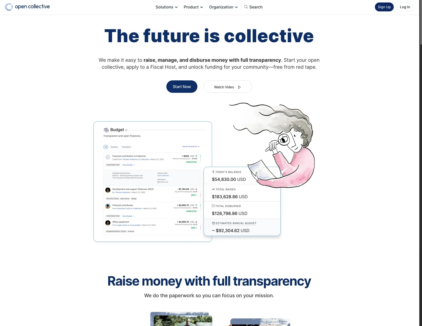
Horizontal margins use a responsive approach: 1rem minimum gutters expanding to 2rem at comfortable widths, with content maxing out around a central column. Section spacing employs 5rem vertical padding as the standard rhythm, with 2.5rem for tighter groupings and 8rem for major section breaks. The hero section centers its headline and subhead with a two-button action row, followed by an asymmetric product preview that offsets a dashboard screenshot against a watercolor illustration.
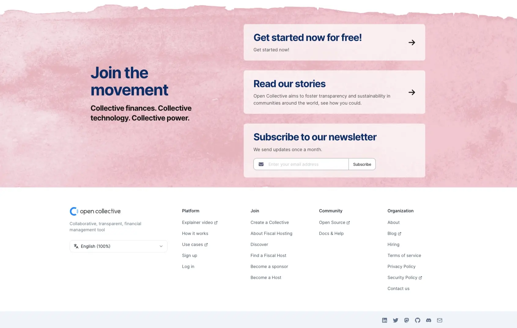
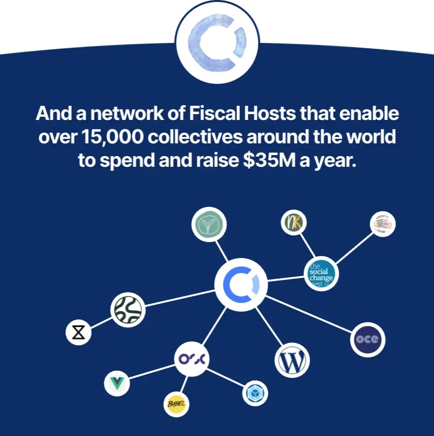
The network visualization section breaks from the light pattern, using full-bleed dark navy with centered content and a radial logo arrangement. Footer content returns to light surfaces with multi-column link organization and a bottom social icon row. Cards within sections use consistent internal padding of 1.5rem vertical and 2rem horizontal, with subtle border-radius creating approachable corners without excessive roundness.
Visual language
The visual identity merges financial credibility with human warmth through three distinctive elements: watercolor textures, transparent data presentation, and network connectivity visualization.
Watercolor illustrations appear as soft, organic background washes in pink and neutral tones, often behind engagement cards or alongside product imagery. These hand-rendered textures contrast deliberately with the precise UI elements, suggesting that behind the technical infrastructure lies human care and creativity. The illustrations feature loose brushwork and muted palettes that never compete with foreground content.
Product transparency manifests literally through dashboard screenshots and financial data previews embedded directly in the marketing surface. Rather than abstract claims, the design shows actual interface elements—budget tables, transaction histories, balance summaries—rendered at full fidelity. This “show, don’t tell” approach reinforces the brand promise of openness.
The network visualization uses a constellation metaphor: a central Open Collective logo node radiates connections to diverse collective logos, each contained in circular frames. White lines on dark navy create a clean, technical diagram aesthetic that communicates scale and interconnectedness without clutter. Circular frames and connecting lines become recurring motifs suggesting community and relationship.
Components
Primary Action Button
- Anatomy: Text label centered within a pill-shaped container
- Surface: Solid action navy background with white text
- Typography: button-primary token, medium weight for clear affordance
- Shape: Fully rounded pill, 6.25rem border-radius
- Spacing: 0.875rem vertical padding, 1.5rem horizontal padding
- Composition: Inline with sibling buttons, separated by 1.5rem gap
- Variants: Default state with solid fill; hover transitions to slightly darker action-hover
Secondary Action Button
- Anatomy: Text label with optional icon (play arrow, external link)
- Surface: White background with subtle border
- Typography: button-secondary token
- Shape: Fully rounded pill matching primary actions
- Border: 1px solid border token
- Spacing: Identical padding to primary for visual pairing
- Composition: Appears alongside primary as alternative path
Ghost Button
- Anatomy: Compact text label for subtle actions
- Surface: Transparent with light border
- Typography: button-small token
- Shape: Fully rounded pill
- Border: 1px solid border-subtle
- Spacing: Reduced padding for dense contexts
Feature Card
- Anatomy: Title, description, optional action link with arrow icon
- Surface: Semi-transparent white over watercolor backgrounds, or solid surface on white
- Typography: sub-section-display for title, body for description
- Shape: 0.625rem border-radius
- Spacing: 1.5rem top/bottom, 2rem left/right internal padding
- Composition: Stacked vertically with consistent gaps, arrow icon right-aligned
Dashboard Preview
- Anatomy: Embedded product interface showing actual financial data
- Surface: White card with subtle shadow, containing realistic UI elements
- Typography: Inherits product UI typography at smaller scale
- Shape: 0.5rem border-radius for outer container
- Composition: Positioned asymmetrically with illustration overlap
Footer Navigation
- Anatomy: Logo and tagline left, multi-column link groups right
- Surface: Light surface background
- Typography: label for column headers, legal-copy for links
- Spacing: 2rem column gaps, 1rem row gaps within columns
- Composition: Five-column grid collapsing responsively, social icons bottom-right
Newsletter Subscription
- Anatomy: Heading, description, email input with inline submit button
- Surface: Semi-transparent card over watercolor
- Typography: sub-section-display for heading, body for description
- Shape: Input field with 0.5rem radius, button integrated or adjacent
- Composition: Horizontal input/button pair on wider cards
Responsive behavior
The design should maintain its centered content model across viewports, with horizontal margins scaling from 1rem to 2rem. The hero headline should reduce from 4.5rem to 3rem on narrow viewports, preserving line breaks for readability. Two-button action rows should stack vertically on mobile with full-width buttons. The dashboard preview and illustration composition should transition from side-by-side to stacked, with the illustration appearing above or below depending on narrative priority. Footer columns should collapse from five across to two, then single column with accordion behavior if needed. The network visualization should maintain its central focus while allowing logo nodes to reposition in a scrollable or simplified arrangement. Navigation should collapse to a hamburger menu on narrow viewports, preserving the Sign Up button as a persistent action.
Practical implementation guidance
Preserve
- The single-family typography system with weight-based hierarchy
- Pill-shaped buttons with fully rounded corners for all actions
- The navy-and-white contrast as the primary brand expression
- Watercolor textures as section backgrounds, never as content overlays
- Actual product UI in marketing previews rather than stylized mockups
- Generous whitespace between sections and around content blocks
Avoid
- Introducing additional type families that dilute the technical cohesion
- Sharp-cornered buttons that contradict the approachable pill language
- Dark text on the navy network section background
- Overlapping watercolor textures with readable text without sufficient contrast
- Abstract illustrations that replace the specific dashboard transparency metaphor
- Excessive border-radius on large containers that should feel stable
Recommended build order
- Establish the type scale with Inter at all weights
- Implement the color tokens with light mode as default
- Build the pill button system with primary, secondary, and ghost variants
- Create the header navigation with dropdown and authentication pattern
- Develop the hero section with headline, description, and action pair
- Construct the dashboard preview component with realistic data presentation
- Add the dark network section with centered content and logo nodes
- Build the footer with multi-column navigation and newsletter card
- Integrate watercolor background textures as final polish
Accessibility
- Ensure the navy action color meets WCAG AA against white backgrounds
- Provide visible focus states on pill buttons with offset rings or internal highlights
- Maintain sufficient contrast for dashboard preview text at reduced sizes
- Add aria-labels to icon-only buttons and social links
- Support reduced-motion preferences for any network visualization animations
- Structure footer navigation with proper heading hierarchy for screen reader context
Scope note
This guide covers the Open Collective homepage marketing surface including hero, product preview, network visualization, engagement cards, and footer. Dashboard interface components shown in preview screenshots are representative of the actual product UI but are not fully specified here. Mobile breakpoints, form validation states, loading skeletons, and authenticated user interfaces are not included. Motion behavior for the network visualization and button interactions are not documented from still images.
Sites change, so a screenshot can differ from the guide.
Loading…Similar designs

This guide describes the public website and isn't an official opencollective.com design system. Not affiliated with opencollective.com.