Overview
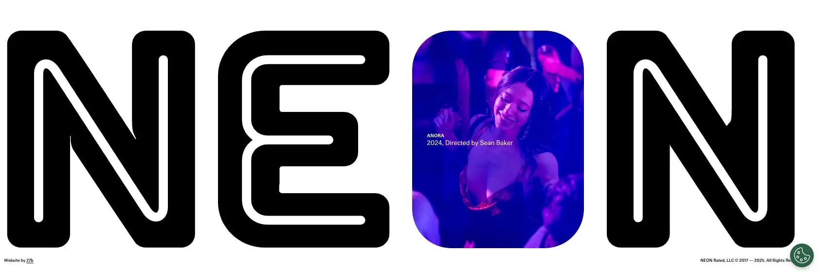
NEON’s digital presence is a film-distributor website that treats typography as architecture. The system is built on extreme scale contrasts: wordmarks and section titles swell to viewport-dominating sizes while functional text stays small and precise. The visual identity relies on a near-monochrome palette of black and white, with color arriving exclusively through film photography that is inserted into the layout through rounded portals—most dramatically in the homepage hero where the letter O of the NEON logotype becomes a window into a film still. This creates a system where the brand frame is rigid and neutral, and the emotional content comes from the films themselves. Navigation is minimal and persistent, content surfaces are clean and unadorned, and the overall impression is that of a contemporary art-house gallery rather than a conventional streaming or studio site.
Colors
The palette is deliberately reductive, using black and white as structural elements and allowing film imagery to provide all chromatic expression.
| token | value | use |
|---|---|---|
| ink | #000000 | Primary text, display type, icons, and inverse surfaces |
| canvas | #ffffff | Page background, card surfaces, and text on dark backgrounds |
| surface-inverse | #000000 | Filter bar, active buttons, and footer surfaces |
| text-inverse | #ffffff | Text on inverse surfaces and icons within dark bars |
| border-hairline | #e5e5e5 | Dividers between list rows and accordion items |
| border-inverse | #333333 | Subtle borders on dark surfaces |
The color philosophy separates brand infrastructure from film content. No accent colors compete with the posters and stills. Hairline borders in light gray create horizontal rhythm without visual weight. The inverse surface token applies only to functional chrome like the filter bar, never to large content areas. Film stills appear in their native color, whether the magenta-and-blue club lighting of Anora or the amber haze of 2073, making each image a temporary accent within the neutral frame.
Typography
Three families appear in the source files: Girott for display, Flatspot for functional text, and Flatspot Nuovo Test as an additional cut of the Flatspot family. Girott carries the brand voice through massive, tightly packed headlines with a geometric, almost constructed quality. Flatspot and Flatspot Nuovo Test provide the utilitarian layer—navigation, labels, body copy, and metadata—with clean, neutral letterforms that recede from consciousness.
| token | family | size | weight | leading | tracking | use |
|---|---|---|---|---|---|---|
| hero-display | Girott | 8rem | 700 | 0.85 | -0.02em | Homepage wordmark, page titles |
| section-display | Girott | 4rem | 700 | 0.9 | -0.01em | Section headers, category titles |
| body | Flatspot | 1rem | 400 | 1.5 | 0em | Paragraphs, accordion answers |
| label | Flatspot | 0.75rem | 500 | 1.2 | 0.02em | Film titles, metadata headers, buttons |
| navigation | Flatspot | 1rem | 400 | 1.2 | 0.01em | Menu items, category links |
Girott appears exclusively in uppercase and at sizes where its tight leading and negative tracking create solid typographic blocks. The hero-display token at 8rem produces the monumental homepage letterforms that define the brand’s first impression. Flatspot’s lighter weights maintain readability at small sizes, with the 500-weight label token used for column headers and interactive elements that need slightly more presence than body text. Verify licensing for these families before production use.
Layout
The layout system is editorial and asymmetric, favoring dramatic negative space and unexpected scale relationships over conventional grid regularity.
The homepage hero occupies the full viewport width with the NEON wordmark treated as a single graphic element. The four letters span nearly the entire width, with the O replaced by a rounded rectangular portal containing a film still. This creates a layout where typography and image are inseparable—the image is literally inside the type.
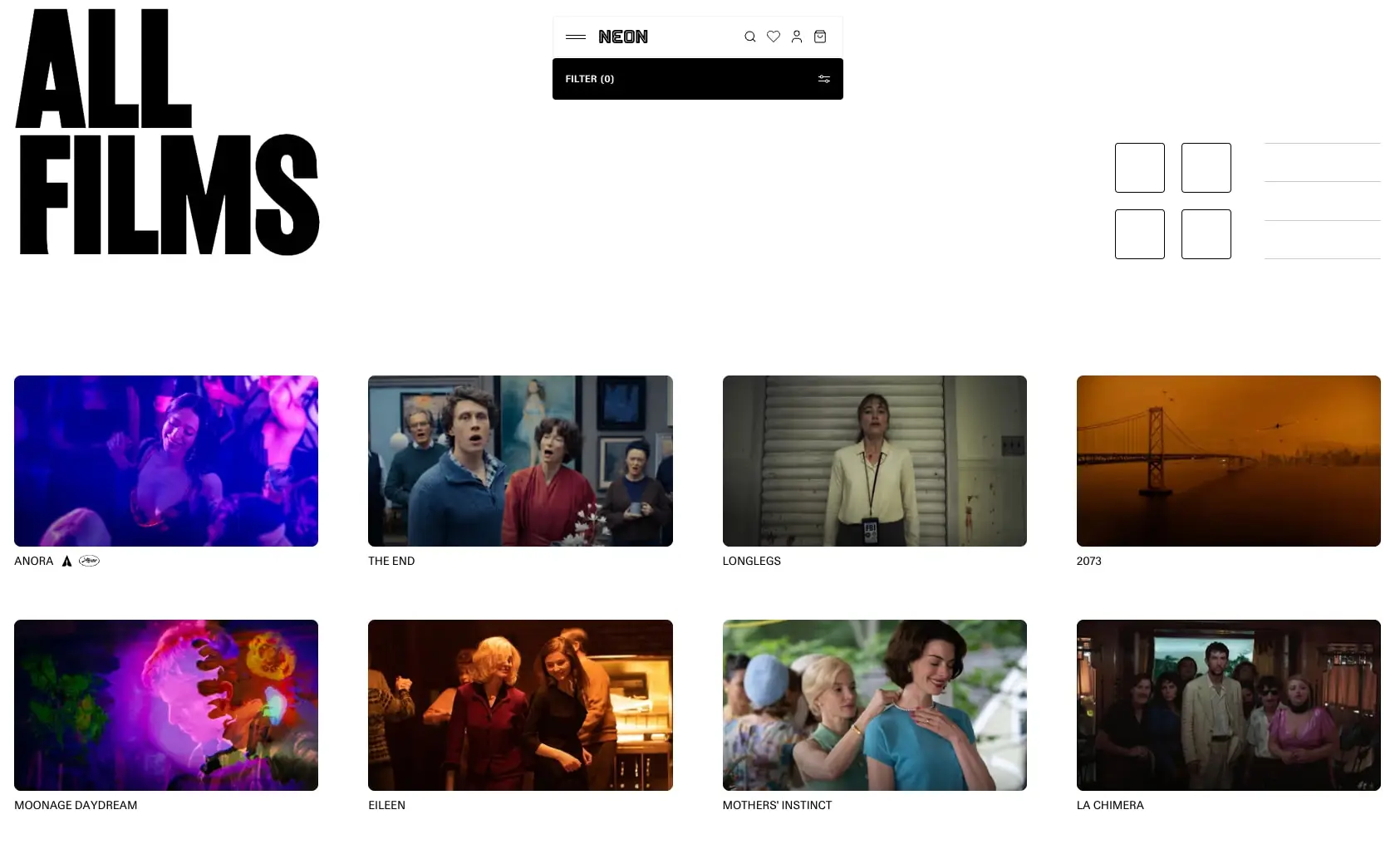
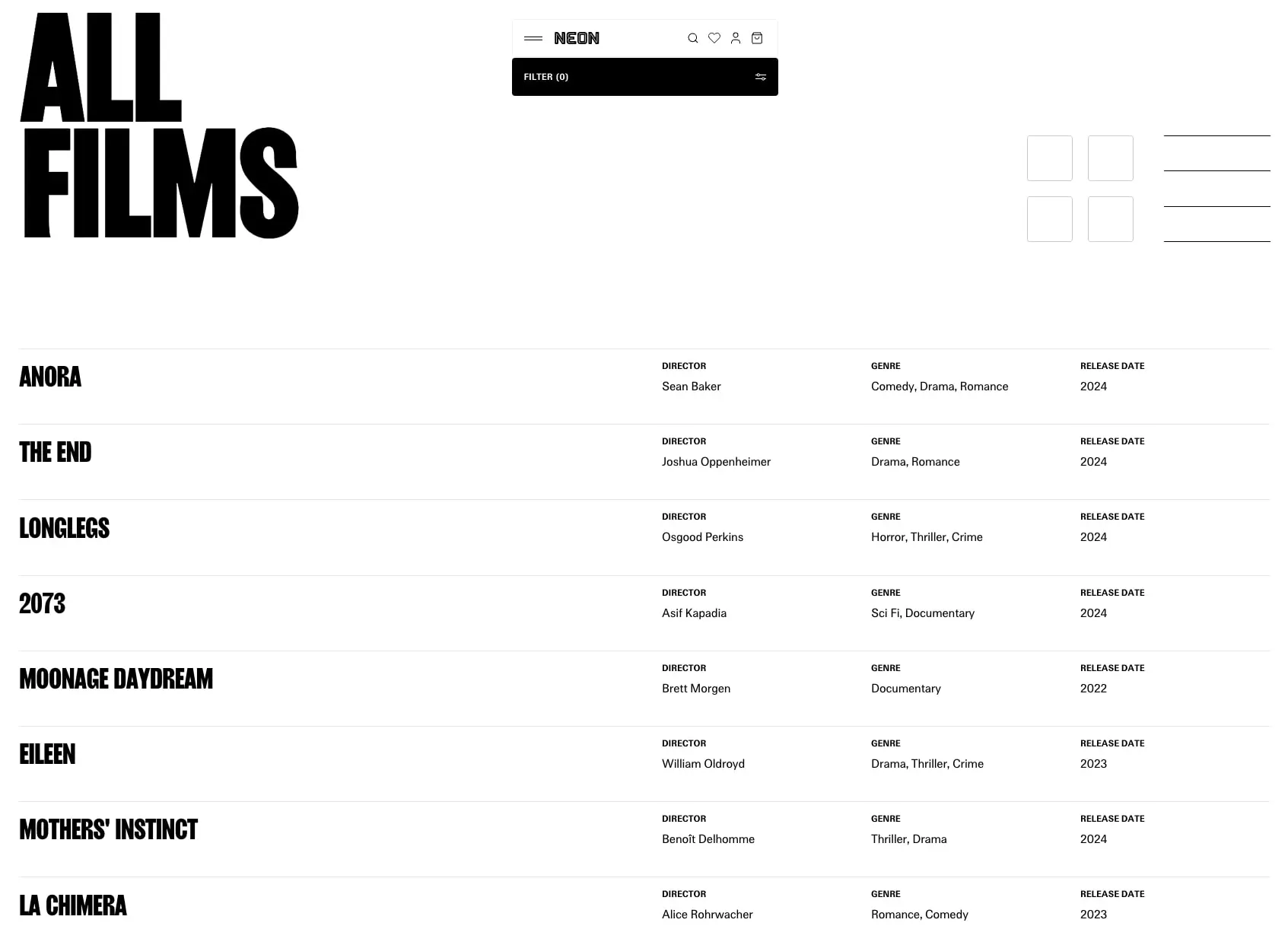
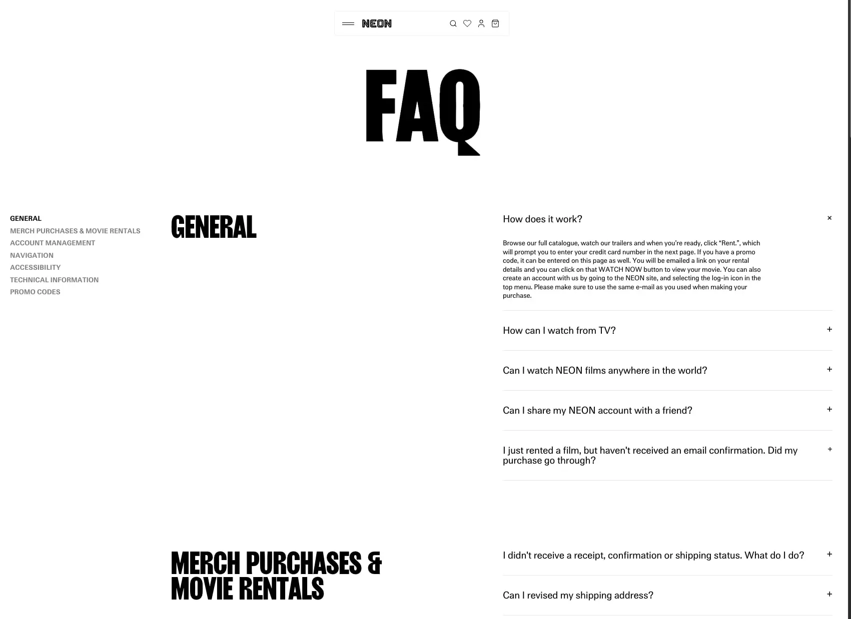
Content pages like FAQ and All Films use a split or offset composition. The FAQ page places a sticky category navigation on the left third while the right two-thirds carry accordion content. The All Films grid view presents a four-column arrangement of rounded cards with consistent aspect-ratio thumbnails, while the list view collapses to a single column of film titles with metadata columns to the right, separated by hairline rules.
Spacing follows a 0.25rem base unit. Section vertical padding is typically 6rem, creating generous breathing room around content blocks. Grid gaps between film cards are 1.5rem. The navigation bar floats centered near the top of the viewport, detached from edges, reinforcing the gallery-like presentation.
Visual language
The visual language is defined by three principles: typographic monumentality, photographic portals, and restraint.
Display type functions as image. The Girott headlines are so large that they become graphic shapes, their counters and strokes creating positive and negative space that competes with photography for attention. This is most extreme in the homepage hero, where the wordmark is the entire composition.
Rounded rectangles serve as the single shape motif. Film stills appear inside rounded portals rather than sharp rectangles, softening the interface and creating a consistent family of image containers from the hero O to the grid cards to the list-view thumbnails. The radius is substantial—2rem on the hero portal, 0.75rem on cards—giving each image a pill-like friendliness that contrasts with the sharp geometry of the typography.
The system avoids decoration. No gradients, no shadows, no background textures. The only visual complexity comes from the films themselves. This restraint makes the occasional inverse surface—like the black filter bar—feel intentional and functional rather than stylistic.
Components
Navigation bar
- Anatomy: Centered horizontal bar containing hamburger menu, NEON wordmark, search icon, favorites icon, account icon, and cart icon
- Surface: Transparent over light backgrounds, with a subtle bounding rectangle
- Typography: Wordmark uses Girott Bold at navigation size; icons are simple line strokes
- Spacing: Compact horizontal padding, icons evenly distributed after wordmark
- Composition: Floats near top center, never full-bleed, creating a floating toolbar effect
Film card
- Anatomy: Rounded rectangular thumbnail above a single-line title label; some cards show additional badges like rating icons
- Surface: White background, no border, no shadow
- Typography: Film title in label token, uppercase, Flatspot 500
- Shape: 0.75rem border radius on thumbnail
- Spacing: 1.5rem gap between cards in grid; title sits directly below thumbnail with minimal vertical space
- Composition: Four-column grid on desktop, each card an independent unit
Filter bar
- Anatomy: Full-width black rectangle containing “FILTER (0)” label and filter icon on right
- Surface: surface-inverse background with text-inverse
- Typography: label token, uppercase, white
- Shape: 0.25rem border radius
- Spacing: Generous internal padding, typically 1rem vertical
- Composition: Sits below navigation, spans content width
Accordion item
- Anatomy: Question text left-aligned with plus icon right-aligned; expanded state shows answer text below and replaces plus with close icon
- Surface: White background, no fill change on expand
- Typography: Question in body token; answer in body token at smaller effective size
- Border: 1px solid border-hairline below each item
- Spacing: Comfortable vertical padding within each item, approximately 1.5rem
- Composition: Stacked vertically, full width of content column
Film list row
- Anatomy: Film title in section-display token on left; director, genre, and release date columns on right with small column headers
- Surface: White background with border-hairline rule below each row
- Typography: Title in Girott Bold; metadata in Flatspot 400 with label-size column headers
- Spacing: Generous vertical padding, approximately 2rem per row
- Composition: Asymmetric—title dominates left, metadata is compact and aligned right
Responsive behavior
The system should maintain its typographic character across viewports while adapting composition. The homepage hero wordmark should scale down proportionally, with the O portal remaining centered and readable. The four-column film grid should collapse to two columns on tablet and single column on mobile, with cards maintaining their aspect ratio. The FAQ split layout should stack, with category navigation becoming a horizontal scroll or dropdown above the accordion. The film list view should reflow metadata below each title rather than in side columns. Touch targets for accordion icons and filter controls should expand to at least 44px on mobile.
Practical implementation guidance
Preserve
- The extreme scale of Girott display type; do not reduce hero sizes below viewport-dominating proportions
- The rounded portal treatment for all film imagery; maintain consistent radius values
- The black-and-white infrastructure with color arriving only through photography
- The floating centered navigation bar rather than a full-bleed header
Avoid
- Adding accent colors or brand gradients that compete with film imagery
- Sharp rectangular image containers; the rounded radius is essential to the soft, contemporary feel
- Decorative shadows or elevation effects; the system is flat by intention
- Generic card borders or backgrounds that would clutter the clean film presentation
Recommended build order
- Establish the 0.25rem spacing unit and set page background to canvas white
- Implement Girott at hero-display and section-display sizes with tight leading
- Build the floating navigation bar with centered composition
- Create the rounded image portal component with 2rem and 0.75rem radius variants
- Construct the film grid and list views with proper metadata alignment
- Add the accordion pattern with hairline separators and plus/close icon states
- Implement the inverse filter bar as the primary interactive surface
Accessibility
- Ensure the massive display type does not trigger motion sensitivity; respect prefers-reduced-motion
- Provide visible focus indicators on the minimal navigation icons
- Maintain sufficient contrast on metadata text; the light label size should still meet WCAG AA against white
- Make accordion controls fully keyboard operable with clear expanded/collapsed state communicated to assistive technology
- Ensure film stills in the hero portal have appropriate alt text describing the scene when the image conveys narrative content
Scope note
This guide covers the homepage hero, film catalog grid and list views, and FAQ page surfaces visible in the captured images. Footer content, mobile navigation patterns, search functionality, individual film detail pages, and checkout flows are not represented. Motion behavior, hover states, and loading sequences are not documented. Measurements are practical adaptation targets derived from visual inspection.
Sites change, so a screenshot can differ from the guide.
Loading…Similar designs
This guide describes the public website and isn't an official neonrated.com design system. Not affiliated with neonrated.com.