Overview
Morph presents a developer-tool aesthetic built on extreme contrast: near-black backgrounds against bright lime and green accents. The system serves two distinct contexts—a marketing site with bold centered headlines and a dashboard with dense sidebar navigation and code-heavy content. Goga Thin provides the primary voice with its delicate, geometric letterforms, while Berkeley Mono grounds onboarding and pricing flows in terminal authenticity. Instrument Sans handles navigation wayfinding with clean neutrality, and Cohere appears only for the brand wordmark. The result is an interface that feels precise, technical, and quietly premium—less corporate software, more craft tool.
Colors
The palette is fundamentally dark-mode with selective high-saturation accents. The canvas sits at the edge of visibility, surfaces layer with subtle warmth, and lime-green serves as the singular energetic accent across both marketing and product contexts.
| token | value | use |
|---|---|---|
| canvas | #0A0A0A | Primary page background, deepest layer |
| surface | #18181B | Cards, panels, elevated containers |
| surface-elevated | #27272A | Hover states, active selections, sidebar items |
| ink | #FAFAFA | Primary text, headings, critical labels |
| ink-secondary | #A1A1AA | Body text, descriptions, secondary content |
| ink-muted | #737373 | Placeholders, disabled text, metadata |
| accent-lime | #99D52A | Primary action buttons, success indicators, brand highlights |
| accent-green | #4ADE80 | Live status, confirmation messages, syntax highlighting |
| accent-amber | #F59E0B | Warning banners, gradient accents, attention calls |
| accent-orange | #F97316 | Gradient midpoints, heat indicators |
| border-subtle | #27272A | Default dividers, card outlines, inactive borders |
| border-active | #3F3F46 | Focused inputs, selected items, hover borders |
| success | #4ADE80 | Checkmarks, completion states, positive feedback |
| code-string | #BFF9B4 | String literals in code blocks |
| code-keyword | #80EE64 | Keywords, commands in terminal displays |
The marketing pages (MCP landing, product pages) use pure white (#FFFFFF) for hero headlines against absolute black, creating maximum impact for the value proposition. The dashboard shifts to the warmer near-black canvas with #FAFAFA ink to reduce eye strain during extended code review. Amber and orange appear exclusively in gradient contexts—banner notifications and subtle background glows—never as solid fills. The lime accent maintains consistency across buttons, indicators, and syntax highlighting, anchoring the brand identity.
Typography
Four type families serve distinct roles. Goga Thin carries the visual identity with its extremely light weight and geometric construction. Berkeley Mono provides the onboarding and pricing experience with technical authenticity. Instrument Sans handles navigation with neutral clarity. Cohere appears only as the brand mark. System-Uimonospace renders all code blocks.
| token | family | size | weight | leading | tracking | use |
|---|---|---|---|---|---|---|
| hero-display | Goga | 3rem | 600 | 1.17 | normal | Marketing page headlines |
| section-display | Goga | 2.5rem | 600 | 1.2 | normal | Section headings, pricing titles |
| heading-large | Goga | 1.875rem | 700 | 1.2 | normal | Dashboard section headers |
| heading | Goga | 1.5rem | 400 | 1.33 | normal | Card titles, feature names |
| body | Goga | 1rem | 400 | 1.5 | normal | Primary body text |
| body-medium | Goga | 1rem | 500 | 1.5 | normal | Emphasized body, button labels |
| body-small | Goga | 0.875rem | 400 | 1.43 | normal | Descriptions, metadata |
| label | Goga | 0.75rem | 500 | 1.33 | normal | Tags, badges, small labels |
| label-small | Goga | 0.5625rem | 500 | 1.5 | 0.025em | Micro labels, status pills |
| navigation | Instrument Sans | 1rem | 400 | 1.5 | normal | Primary navigation links |
| navigation-small | Instrument Sans | 0.875rem | 400 | 1.43 | normal | Secondary nav, breadcrumbs |
| code | System-Uimonospace | 0.875rem | 400 | 1.625 | normal | Code blocks, terminal output |
| brand-wordmark | Cohere | 1.125rem | 600 | 1.56 | normal | Logo text, brand mark |
| onboarding-heading | Berkeley Mono | 1.875rem | 400 | 1.2 | -0.047em | Onboarding page titles |
| onboarding-body | Berkeley Mono | 1rem | 400 | 1.5 | normal | Onboarding descriptions |
| onboarding-label | Berkeley Mono | 0.75rem | 400 | 1.33 | normal | Onboarding metadata |
Goga is designed by Andrej Sevcik (Narrow Type). Berkeley Mono is designed by Neil Panchal and published by US Graphics Company. Cohere is designed by NaN (Luke Prowse, Florian Runge, Jean Baptiste Morizot, Fátima Lázaro) and published by Pentagram. Instrument Sans is designed by Rodrigo Fuenzalida and published by Frag Type. Verify licensing for these families before production use.
Layout
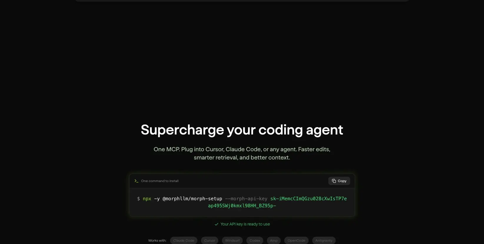
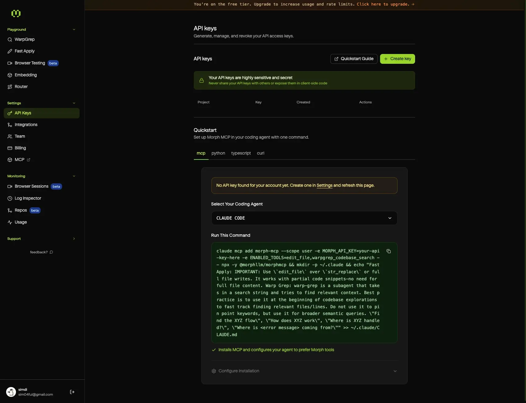
The system employs two primary layout modes. Marketing pages use centered single-column composition with generous vertical breathing room—headlines sit in the upper third, supporting content clusters below, and terminal-style command blocks anchor the visual center. The dashboard uses a fixed left sidebar with a scrollable main content area, creating a persistent navigation context for dense tool interfaces.
Marketing pages constrain content to a maximum readable width of approximately 48rem centered in the viewport. The MCP landing page demonstrates this clearly: the headline, subhead, and install command form a tight vertical stack with substantial padding above and below. Product pages extend this with alternating full-width sections and constrained prose blocks.
The dashboard sidebar occupies a fixed width with internal padding of 1rem to 1.5rem. Navigation items stack vertically with compact spacing, grouped by function with subtle section headers. The main content area receives 3rem horizontal padding on wide viewports, scaling down to 2rem on narrower screens. Content blocks within the main area use consistent vertical rhythm with 1.5rem gaps between related elements.
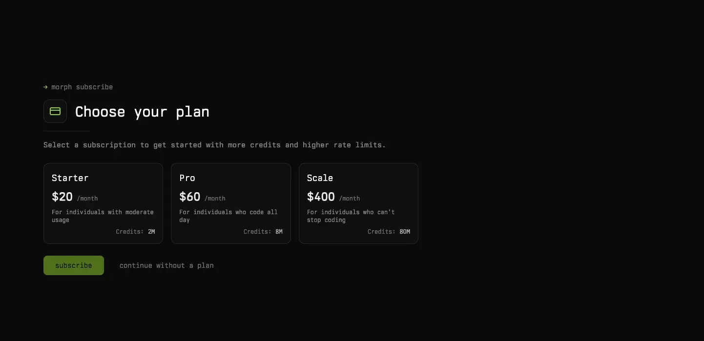
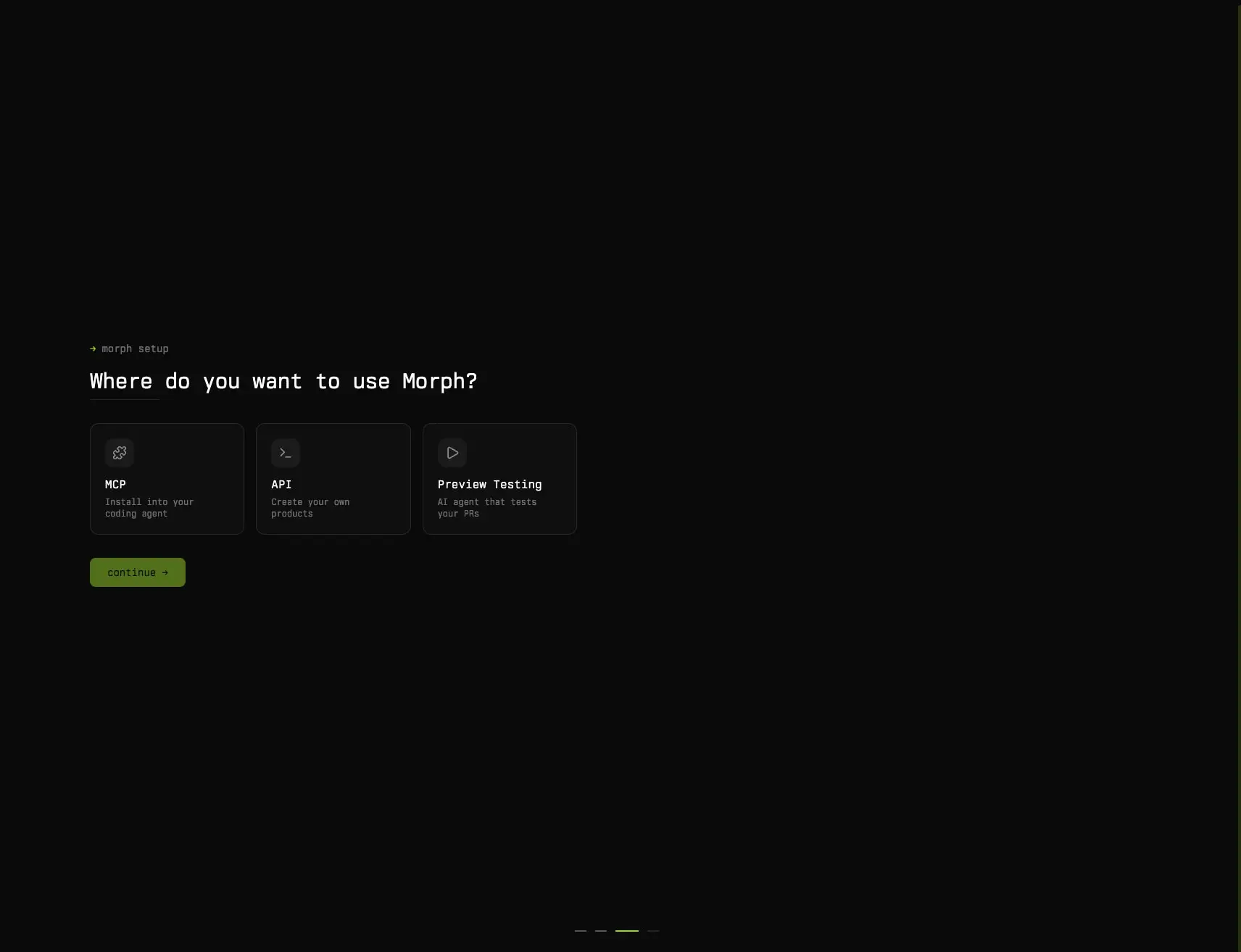
Card layouts appear in both contexts. Onboarding flows present three equal-width selection cards in a horizontal row with 1rem gaps. Pricing displays three tier cards with identical internal padding and aligned price positions. Dashboard panels use single-column stacking with 1px borders separating functional regions.
Visual language
The visual character derives from terminal aesthetics translated into polished interface elements. Rounded corners are restrained—0.75rem for cards and buttons, 0.5rem for inputs and navigation items, with full pills reserved for tags and status indicators. Borders are hairline-thin at 1px, using the subtle border token by default and shifting to active only on interaction.
Code presentation is central to the identity. Terminal blocks feature dark surfaces with syntax highlighting in green family tones—lime for commands, lighter mint for strings, white for output. The install command block on the MCP page uses a distinct container with subtle inner shadow and a copy action in the upper right, treating code as both content and interactive element.
The gradient language is minimal and functional. A horizontal amber-to-orange-to-amber gradient appears in banner notifications, creating a warm glow that signals without alarming. Product pages use a subtle linear gradient from near-black to transparent for depth behind hero content.
Iconography is simple and geometric. Navigation uses minimal line icons paired with text labels. Feature cards display single icons in rounded square containers. The overall impression is restraint—every element earns its place through functional necessity rather than decorative impulse.
Components
Primary button
- Anatomy: Text label with optional leading icon, contained in a rounded rectangle
- Surface: Background fills with accent-lime for primary actions, transparent with border for secondary
- Typography: body-medium token, ink color on lime fill, ink on transparent
- Shape: 0.75rem radius, 1px solid border when transparent
- Spacing: 0.75rem 1rem padding, compact height
- Composition: Inline-flex with centered items, gap of 0.5rem between icon and text
- Variants: Filled (lime background, dark text), outlined (transparent, border-subtle, light text), ghost (transparent, no border)
Terminal code block
- Anatomy: Container with header row and scrollable content area
- Surface: surface background, 1px border-subtle border, optional subtle inner shadow
- Typography: code token for content, label token for header metadata
- Shape: 0.75rem radius
- Spacing: 1rem padding, header row with 0.75rem vertical padding
- Composition: Header flexes between prompt indicator and copy action; content uses preformatted whitespace
- Variants: Inline (for single commands), expanded (for multi-line with scroll), with-line-numbers (left gutter)
Sidebar navigation
- Anatomy: Vertical stack of section groups, each containing icon-label pairs and nested items
- Surface: canvas background, surface-elevated for active item
- Typography: navigation token for primary items, navigation-small for nested, label for section headers
- Shape: 0.5rem radius on individual items, full-width container
- Spacing: 1.5rem vertical section gaps, 0.5rem item padding, 0.75rem icon-text gap
- Composition: Left-aligned icons with right-aligned expansion chevrons; beta badges as trailing pills
- Variants: Collapsed (icons only), expanded (full labels), nested (indented children)
Selection card
- Anatomy: Icon container, title, description, and optional selection indicator
- Surface: transparent with border-subtle, surface on hover
- Typography: heading for title, body-small for description
- Shape: 0.75rem radius
- Spacing: 1.5rem padding, 1rem gap between elements
- Composition: Vertical stack with icon top-aligned; selection state adds border-active or accent indicator
- Variants: Default, selected, disabled
Pricing tier card
- Anatomy: Plan name, price with period label, description, feature list, and action button
- Surface: surface background, 1px border-subtle
- Typography: section-display for price numerals, heading for plan name, body-small for features
- Shape: 0.75rem radius
- Spacing: 2rem padding, 1.5rem vertical gaps between sections
- Composition: Price aligned left with period label inline; feature list as vertical stack with check indicators
- Variants: Highlighted (accent border, subtle gradient background), default
Banner notification
- Anatomy: Full-width bar with text and optional action link
- Surface: Linear gradient from accent-amber through accent-orange to accent-amber at low opacity
- Typography: body-small, ink or dark text depending on gradient density
- Shape: No radius, full-bleed horizontal
- Spacing: 0.75rem vertical padding, centered or left-aligned content
- Composition: Single line with inline link; dismissible variant adds close action
Responsive behavior
The sidebar navigation collapses to icon-only mode below approximately 1024px viewport width, with a toggle mechanism to expand. Marketing page headlines scale down from 3rem to 2rem on narrow viewports, maintaining line-length control through padding reduction rather than font scaling alone. Pricing cards stack vertically below 768px, with the highlighted tier maintaining prominence through order or full-width treatment.
Code blocks maintain horizontal scroll rather than wrapping, preserving command integrity. Terminal containers gain additional horizontal padding on mobile to prevent text collision with viewport edges. The MCP install command block, being the critical conversion element, remains fully visible without scroll on all tested widths through font size adaptation.
Dashboard main content transitions from three-column layouts to single column at 768px, with filter and action bars stacking vertically. Table views convert to card lists on mobile, with each row becoming a self-contained panel.
Practical implementation guidance
Preserve
- The extreme contrast between near-black canvas and bright lime accents—this is the core brand signature
- Goga Thin at light weights; the delicacy is intentional and distinguishes the identity
- Monospace rendering for all code and command content, including the terminal aesthetic with prompt indicators
- The restrained corner radius system—0.75rem maximum for most elements, pills only for tags
- Horizontal padding generosity on marketing pages; the emptiness signals confidence
Avoid
- Introducing additional accent colors beyond the lime-green and amber family; the palette is intentionally narrow
- Heavy font weights in Goga; the Thin cut is the identity—Medium and Bold should appear sparingly
- Border-radius values larger than 0.75rem for primary containers; excessive rounding undermines the technical precision
- Pure white backgrounds in any context; even marketing pages use near-black
- Decorative gradients beyond the functional amber banner and subtle depth gradients
Recommended build order
- Establish the dark canvas and surface layer system with exact color tokens
- Implement Goga Thin at body size with proper fallbacks for rendering consistency
- Build the terminal code block component with syntax highlighting colors
- Create the sidebar navigation structure with active/hover states
- Develop button variants with lime fill and transparent outlined modes
- Add marketing page layouts with centered composition and responsive scaling
- Implement card components for onboarding and pricing flows
- Polish with micro-interactions—subtle border color transitions, copy feedback
Accessibility
- Maintain minimum 4.5:1 contrast for all body text; the ink on canvas pairing exceeds this significantly
- Ensure code blocks are keyboard-navigable with visible focus indicators
- Provide text alternatives for all icon-only navigation items in collapsed sidebar mode
- Use aria-live regions for copy-to-clipboard feedback in terminal blocks
- Respect reduced-motion preferences for any gradient or transition animations
- Test lime accent on dark backgrounds for users with color vision differences; the brightness generally maintains distinguishability
Scope note
This guide covers the marketing site and dashboard interface visible in the captured images, including the MCP landing page, onboarding flows, pricing page, and API keys dashboard. Mobile breakpoints, animation specifications, form validation states, and dark-mode toggle behavior are not represented in the available material.
Sites change, so a screenshot can differ from the guide.
Loading…Similar designs
This guide describes the public website and isn't an official morphllm.com design system. Not affiliated with morphllm.com.