Overview
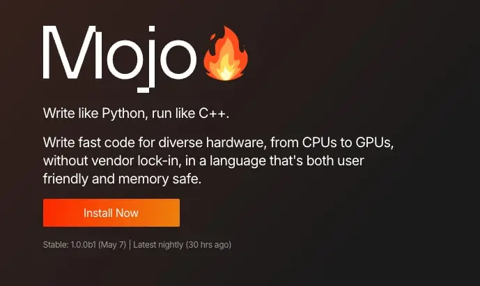
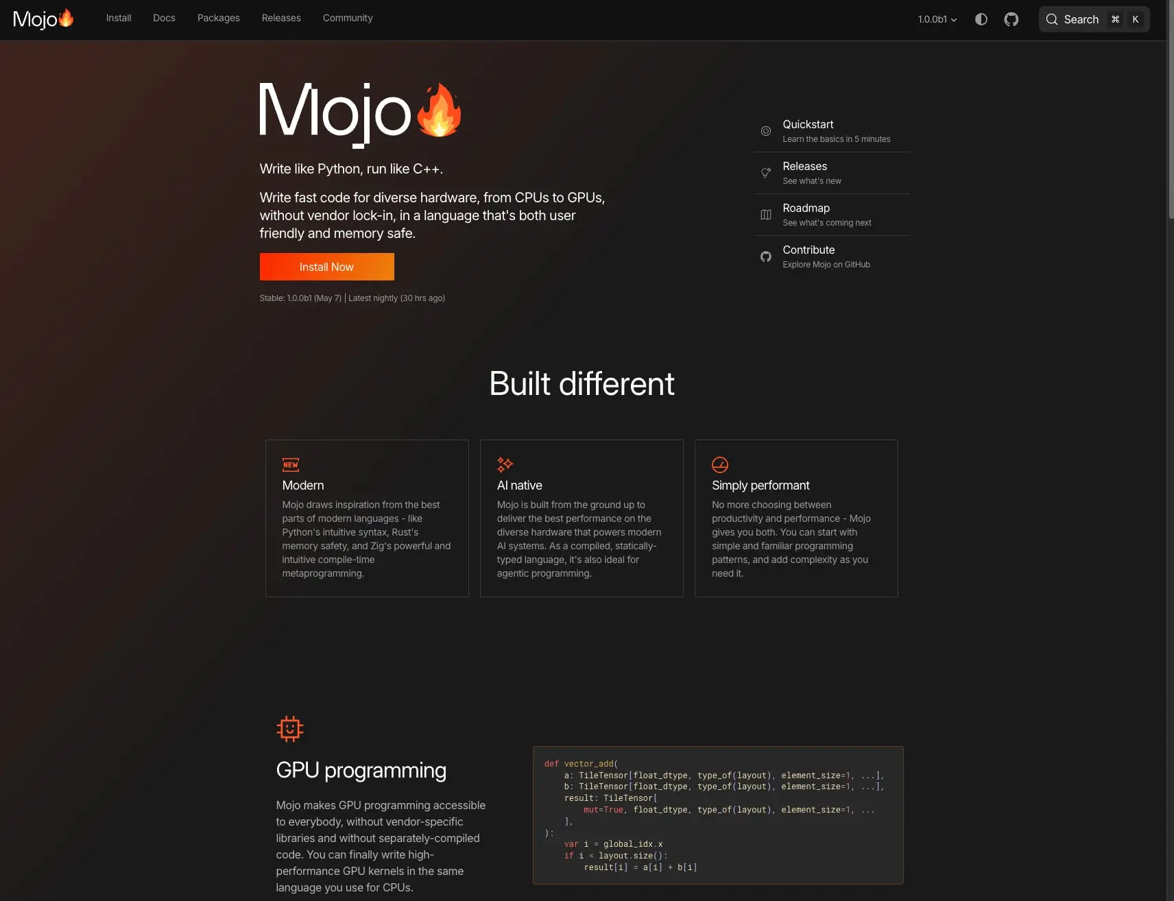
The Mojo programming language landing page presents a dark, developer-centric visual system built on near-black backgrounds with vivid orange gradients and accents. The design prioritizes readability for technical audiences through high-contrast typography, generous whitespace, and structured information hierarchy. The hero section establishes immediate brand recognition with an oversized wordmark paired with a flame emoji, while the body content organizes features into bordered cards and code samples that demonstrate the language’s capabilities. The overall impression is sophisticated and technical—reminiscent of modern developer tooling interfaces—with a warm energy injected through the orange-to-amber gradient system that appears in buttons, decorative glows, and syntax highlighting.
Colors
The color system operates on a dark-mode foundation with a carefully controlled warm accent palette. The near-black canvas creates immersive depth, while orange and amber tones provide energy and draw attention to calls-to-action. Neutral grays handle structural borders and secondary text without competing with the accent system.
| token | value | use |
|---|---|---|
| canvas | #000000 | Page background, navigation bar, deepest layer |
| surface | #1A1A1A | Feature cards, code blocks, elevated containers |
| surface-elevated | #292828 | Subtle elevation within dark hierarchy |
| border | #3A3A3A | Card borders, dividers, code block outlines |
| ink | #FFFFFF | Primary headings, body text, button labels |
| ink-muted | #9A9A9A | Secondary descriptions, metadata, captions |
| ink-dim | #606770 | Tertiary information, disabled states |
| accent-orange | #FD2B01 | Primary button gradient start, strongest accent |
| accent-orange-bright | #FF552A | Decorative gradient glow, hover emphasis |
| accent-amber | #ED810C | Primary button gradient end, warm highlights |
| accent-yellow | #EBDBB2 | Code syntax: strings, literals |
| accent-coral | #EA6962 | Code syntax: keywords, operators |
| accent-blue | #B5C0F6 | Code syntax: types, annotations |
| accent-gold | #D8A657 | Code syntax: functions, methods |
The interface employs a linear gradient from accent-orange to accent-amber at 105 degrees for primary buttons, creating a warm, energetic call-to-action. A subtle decorative gradient sweeps from rgba(255, 85, 42, 0.15) across the upper left of the hero, adding atmospheric depth without overwhelming content. Code syntax highlighting uses a coordinated palette of yellow, coral, blue, and gold against the dark surface, making type annotations and keywords immediately scannable. The system maintains strict discipline: warm accents appear only in interactive elements, decorative flourishes, and code tokens, while neutral grays handle all structural and informational roles.
Typography
The type system pairs Inter for all interface text with Roboto Mono for code samples. Inter appears in weights 400 and 500, with negative letter spacing throughout to achieve a tight, modern developer-aesthetic. The hierarchy ranges from a 48px hero display down to 12px captions and code, with clear differentiation between marketing headlines and technical content.
| token | family | size | weight | leading | tracking | use |
|---|---|---|---|---|---|---|
| hero-display | Inter | 3rem | 500 | 1.4 | -0.02em | Hero wordmark, major section headings |
| section-display | Inter | 2rem | 500 | 1.1 | -0.0225em | Section titles like “Built different” |
| body-large | Inter | 1.25rem | 500 | 1.3 | -0.025em | Hero tagline, lead paragraphs |
| body | Inter | 1rem | 400 | 1.4 | -0.02em | Navigation, card titles, general content |
| body-small | Inter | 0.875rem | 400 | 1.429 | -0.021875em | Card descriptions, secondary content |
| caption | Inter | 0.75rem | 400 | 1.667 | -0.025em | Metadata, version strings, timestamps |
| label | Inter | 0.75rem | 400 | 1.667 | -0.025em | Small labels, badges |
| code | Roboto Mono | 0.75rem | 400 | 1.4 | normal | Code blocks, inline syntax, type annotations |
The 48px hero display creates immediate visual impact for the Mojo wordmark, while the 32px section display handles content divisions like “Built different” and “GPU programming.” Body-large at 20px carries the hero’s descriptive tagline with slightly heavier weight for emphasis. The 16px body size serves as the workhorse for navigation, card headings, and general interface text. Smaller sizes handle supporting information: 14px for card body copy, 12px for captions and code. Roboto Mono appears exclusively at 12px for all code samples, with syntax coloring providing hierarchy within monospace blocks. Verify licensing for these families before production use.
Layout
The page employs a centered content column with generous horizontal margins, creating a focused reading experience against the dark canvas. The hero section occupies the full viewport width with asymmetric content placement—text and primary action anchor the left while a subtle gradient glow emanates from the upper left corner. Below the hero, content sections stack vertically with substantial vertical rhythm.
The navigation bar spans the full width with inline links for Install, Docs, Packages, Releases, and Community, plus version selector and utility icons on the right. The hero content sits in a left-aligned block with the wordmark, tagline, description paragraph, and primary button stacked with tight vertical spacing. A sidebar navigation on the right of the hero offers Quickstart, Releases, Roadmap, and Contribute links with icon prefixes.
The “Built different” section centers its heading and presents three feature cards in an equal-width row: Modern, AI native, and Simply performant. Each card contains an icon, title, and description paragraph. Below this, the GPU programming section splits into a two-column layout with explanatory text on the left and a framed code block on the right.
Spacing follows a clear hierarchy: 80px separates major sections, 48px provides internal section padding, 24px handles card internal spacing, 16px manages element groups, and 8px handles tight component spacing. The 372.5px horizontal margins on the content container create a comfortable reading measure while maintaining visual breathing room on large displays.
Visual language
The visual language balances technical precision with approachable warmth. The dark canvas suggests serious developer tooling, while the orange flame emoji and gradient accents prevent austerity. Iconography appears as simple line icons or emoji—feature cards use minimal geometric marks, the Mojo brand employs a flame emoji as wordmark punctuation, and navigation items carry small symbolic prefixes.
Cards and code blocks share a consistent treatment: dark surface backgrounds with single-pixel borders in muted gray, creating subtle definition without heavy shadows. The absence of drop shadows throughout reinforces the flat, modern aesthetic. Rounded corners are restrained—2px for cards and code blocks, slightly more for buttons, with circular elements reserved for icon buttons.
The decorative gradient in the hero deserves particular attention: a 130-degree sweep of translucent orange that fades to transparent over 900 pixels, creating an ambient glow that suggests heat and energy without obscuring content. This gradient appears only in the hero atmospheric layer, never repeating elsewhere on the page.
Code presentation follows established developer conventions: dark background, syntax-colored tokens, generous internal padding, and a subtle border framing. The color coding assigns distinct hues to semantic categories—types in blue, keywords in coral, strings in yellow, functions in gold—enabling rapid visual parsing of code structure.
Components
Primary action button
- Anatomy: Text label centered within a rounded rectangular container
- Surface: Linear gradient from
accent-orange(#FD2B01) toaccent-amber(#ED810C) at 105 degrees - Typography:
bodytoken, white text - Shape:
buttonradius (approximately 6.4px), no border - Spacing: 0px 22px padding, compact horizontal proportions
- Composition: Inline placement following descriptive text
- Variants: None visible; single primary action style
Feature card
- Anatomy: Icon, title, and description paragraph stacked vertically
- Surface:
surfacebackground (#1A1A1A),bordercolor (#3A3A3A) 1px solid border - Typography: Title uses
bodytoken (16px, weight 500), description usesbody-small(14px, weight 400) inink-muted - Shape:
smallradius (2px) - Spacing:
comfortableinternal padding (16px), equal width in three-column row withtightgap (8px) - Composition: Top-aligned content, icon precedes title with minimal vertical spacing
- Variants: Three visible instances—Modern (with “NEW” badge), AI native, Simply performant
Code block
- Anatomy: Multi-line code sample with syntax-colored tokens
- Surface:
surfacebackground,bordercolor 1px solid border - Typography:
codetoken (Roboto Mono, 12px) - Shape:
smallradius (2px),coderegion uses 4px radius - Spacing:
comfortablepadding (16px) - Composition: Framed container, left-aligned code with preserved whitespace
- Variants: Inline code spans appear within body text with
accent-yellowcoloring
Navigation bar
- Anatomy: Logo with flame emoji, text links, version dropdown, utility icons, search
- Surface:
canvasbackground, no border - Typography:
bodytoken for links,captionfor version string - Shape: Full-width bar, no radius
- Spacing:
tightvertical padding (4px), inline horizontal distribution - Composition: Logo left-aligned, links center-left, utilities right-aligned
Secondary link list
- Anatomy: Icon prefix, title, and subtitle description
- Surface: Transparent, no background
- Typography: Title uses
bodytoken, subtitle usescaptioninink-muted - Shape: No radius
- Spacing:
compactvertical padding between items, horizontal divider lines - Composition: Stacked vertical list with left-aligned icon and text
- Variants: Quickstart, Releases, Roadmap, Contribute instances visible
Responsive behavior
The desktop layout shows a full two-column hero with sidebar navigation and a three-column feature grid. At narrower viewports, the sidebar navigation should collapse above or below the hero content, and the feature grid should reflow to a single column with full-width cards. The code block in the GPU programming section should remain horizontally scrollable rather than wrapping, preserving line integrity for readability.
The centered content container with 372.5px margins provides substantial buffer on large displays; this should reduce to comfortable minimum margins (approximately 24px) on tablet and mobile widths. Navigation links should collapse to a hamburger menu on small viewports, with the logo and primary utilities remaining visible.
Typography should scale down proportionally: hero-display from 48px to approximately 32px on mobile, section-display from 32px to 24px. Body sizes may remain fixed at 16px for readability. The decorative gradient glow should be repositioned or reduced in extent to prevent visual imbalance when the hero stacks vertically.
Practical implementation guidance
Preserve
- The near-black canvas with warm orange accent system—this contrast defines the brand identity
- Tight negative letter spacing on Inter headings for the modern developer-tool aesthetic
- The syntax color palette in code blocks: blue for types, coral for keywords, yellow for strings, gold for functions
- Restrained border usage: single-pixel hairlines in muted gray, no shadows
- The flame emoji as brand punctuation in the wordmark
Avoid
- Light backgrounds or light-mode variants without complete palette rethinking
- Heavy drop shadows or elevation effects—the flat surface hierarchy is intentional
- Rounding corners aggressively; keep cards and code blocks nearly square
- Mixing additional accent colors beyond the established orange-amber family
- Generic button styles that lose the specific 105-degree gradient angle
Recommended build order
- Establish the dark canvas and surface hierarchy with exact hex values
- Implement Inter typography with negative tracking at all sizes
- Create the primary button with precise gradient angle and color stops
- Build card and code block containers with border treatment
- Add Roboto Mono for code regions with syntax coloring
- Implement hero layout with decorative gradient glow layer
- Construct feature grid and responsive reflow behavior
- Add navigation with version selector and utility icons
Accessibility
- Ensure the orange gradient button maintains minimum 4.5:1 contrast ratio; the gradient may require a darker start value or text shadow for compliance
- Code blocks should include visible focus indicators for keyboard navigation
- The dark canvas with white text generally provides excellent contrast; verify
ink-muted(#9A9A9A) onsurface(#1A1A1A) meets WCAG AA for large text or UI components - Provide syntax highlighting color alternatives or increased contrast options for users with color vision differences
- The decorative gradient glow should not contain essential information, as it lacks sufficient contrast for text legibility
Scope note
This guide covers the Mojo language landing page hero, feature grid, and code presentation sections. Footer content, documentation pages, package registry interfaces, and interactive code execution features are not represented in the captured pages. Motion, hover states, and mobile-specific layouts were not captured and should be designed to complement the established static system.
Sites change, so a screenshot can differ from the guide.
Loading…Similar designs

This guide describes the public website and isn't an official mojolang.org design system. Not affiliated with mojolang.org.