Overview
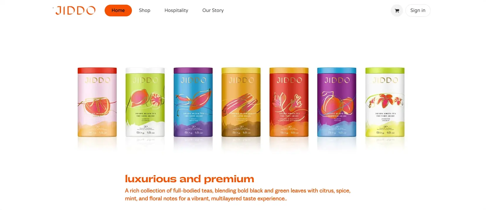
JIDDO presents a premium tea brand through a clean, approachable digital experience. The design centers on a vivid orange identity that carries from the wordmark through primary actions and key headlines, creating immediate brand recognition. White space dominates the canvas, allowing colorful product photography to become the focal point. The typographic system pairs a distinctive geometric sans-serif for the logo and display headings with a rounded, friendly body typeface that softens the overall impression. Components favor pill-shaped buttons and gently rounded fields, reinforcing an accessible, contemporary feel. The homepage showcases seven tea canisters in a horizontal array, each with unique colorways that signal flavor variety, while the footer anchors the experience with an elegant gold floral illustration. The overall effect balances premium positioning with warmth and invitation.
Colors
The palette is intentionally constrained, letting product photography supply chromatic variety. Orange serves as the singular brand accent, applied with discipline to interactive elements and key communications. Neutrals provide hierarchy and readability without competing with the product imagery.
| token | value | use |
|---|---|---|
| action | #F25C00 | Primary buttons, active navigation pills, logo, links, and section headlines |
| action-hover | #D14E00 | Darker orange for button hover states and emphasis |
| ink | #1A1A1A | Primary text, headings, and form labels |
| muted-ink | #6B6B6B | Secondary text, breadcrumbs, inactive navigation, and placeholders |
| canvas | #FFFFFF | Page background and button fill on secondary actions |
| surface | #F5F5F5 | Subtle background variation for alternating sections |
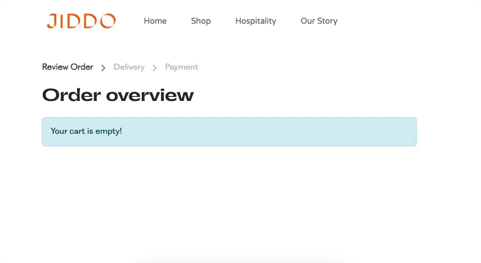
| surface-info | #CCE8F0 | Informational banners and empty-state messages |
| border | #E0E0E0 | Input field borders and divider lines |
| border-focus | #F25C00 | Focus ring on text fields and interactive elements |
The orange action color appears at full saturation for the logo, primary buttons, and major headlines. When used as text, it creates strong contrast against white backgrounds for promotional messaging. The muted-ink gray provides a softer alternative for navigation items in their default state and for breadcrumb trails. The light blue surface-info tone appears sparingly for system feedback, as seen in the empty cart banner. Product photography introduces saturated teals, magentas, golds, and corals, but these remain photographic rather than interface colors.
Typography
The type system combines two distinct personalities: a precise, geometric sans for brand expression and a rounded, approachable sans for readability and UI elements.
| token | family | size | weight | leading | tracking | use |
|---|---|---|---|---|---|---|
| hero-display | Pp Gatwick | 3rem | 700 | 1.1 | -0.01em | Homepage product section headlines |
| section-display | Pp Gatwick | 2.5rem | 700 | 1.15 | -0.01em | Page titles and major section headers |
| body | Varela Round | 1rem | 400 | 1.6 | 0 | Paragraph text and descriptions |
| body-large | Varela Round | 1.25rem | 400 | 1.5 | 0 | Lead paragraphs and featured descriptions |
| label | Varela Round | 0.875rem | 400 | 1.4 | 0.01em | Form labels, button text, and captions |
| navigation | Varela Round | 1rem | 400 | 1.5 | 0 | Main navigation and menu items |
| logo | Pp Fragment-Sans Regular | 1.5rem | 400 | 1 | 0.05em | Brand wordmark in header and footer |
Pp Gatwick, designed with bold weight, delivers the premium character for display typography. Its tight tracking and confident weight suit short, impactful headlines. Varela Round provides the workhorse type for all body, navigation, and interface text; its rounded terminals contribute to the friendly, accessible brand personality. The logo uses Pp Fragment-Sans Regular with slightly expanded letterspacing for distinctive brand recognition.
Verify licensing for these families before production use. Pp Fragment-Sans Regular is designed by Mat Desjardins of Pangram Pangram. Font Awesome supplies iconography.
Layout
The layout follows a centered, contained approach with generous vertical breathing room. The homepage hero presents product canisters in a full-width horizontal arrangement, allowing the photography to extend toward the edges while text content remains within a narrower reading measure below.
The navigation bar spans the full viewport width with interior padding, placing the logo at the left, primary links centered, and utility actions at the right. On the cart page, a breadcrumb trail sits below the navigation, establishing hierarchy through typographic weight and chevron separators rather than background containers.
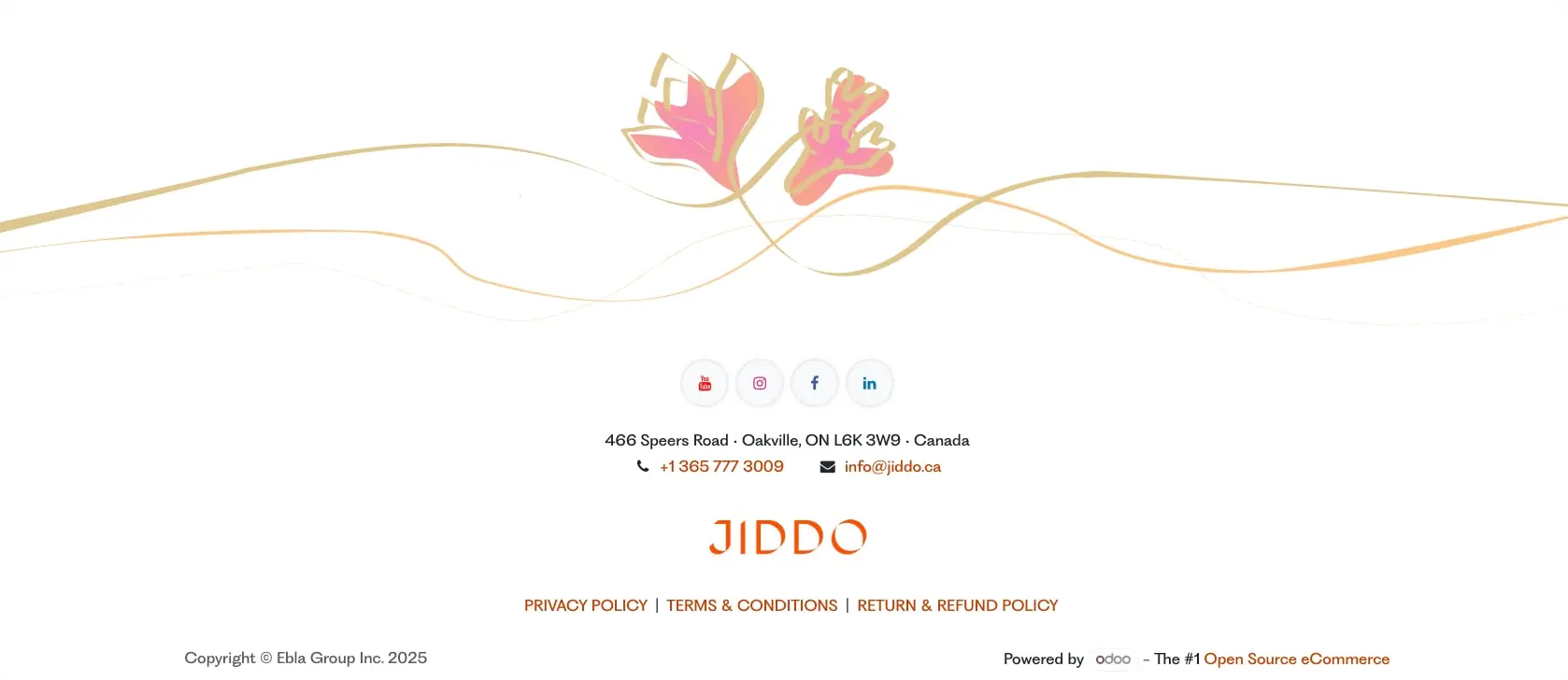
Content sections stack vertically with substantial separation. The footer occupies a wide area with centered alignment, using decorative illustration as a top border before organizing contact information, social links, and legal text in a vertical rhythm.
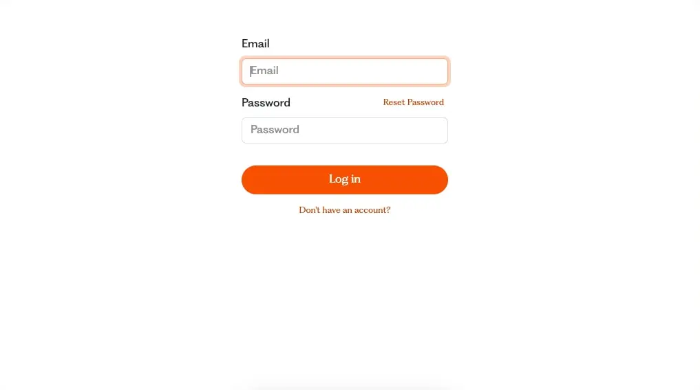
Grid behavior relies on a flexible system where product imagery can break out of strict columns, while text and form elements maintain comfortable measure. The login form demonstrates a narrow, centered column approach for focused tasks, with fields and button sharing equal width for visual cohesion.
Visual language
The visual identity draws from premium beverage packaging translated into digital space. The JIDDO wordmark uses a distinctive geometric construction with the final “O” as a perfect circle, creating memorable brand geometry that echoes across the product line.
Photography treatment emphasizes clean product shots with soft reflections, presenting tea canisters as collectible objects. Each canister carries its own color identity—coral, lime, teal, gold, magenta, purple, and white—creating a rainbow spectrum that suggests variety and exploration. These product colors do not appear in the interface palette, maintaining visual separation between content and chrome.
Decorative illustration appears in the footer, where gold line-art botanicals with pink accents create an elegant, organic counterpoint to the otherwise geometric design. Thin gold wave lines extend horizontally, suggesting movement and natural origin.
Iconography uses simple, recognizable social platform marks in their native colors within circular containers, avoiding custom icon styling in favor of platform familiarity.
Components
Primary Button
- Anatomy: Text label centered within a fully rounded container
- Surface: Solid action orange background with white text
- Typography: label token, white color
- Shape: Pill shape with 9999px border radius
- Spacing: 0.75rem vertical padding, 2rem horizontal padding
- Composition: Full-width in narrow contexts, intrinsic width in navigation
- Variants: Default orange fill; secondary variant uses white fill with orange border and text
Text Field
- Anatomy: Label above, input below, with optional helper link aligned to the right
- Surface: White background with light gray border
- Typography: body token for input text, label token for field label
- Shape: 0.5rem border radius
- Border: 1px solid border color, transitioning to action orange on focus
- Spacing: 0.75rem vertical padding, 1rem horizontal padding
- States: Focus state shows orange border ring; placeholder text uses muted-ink color
Navigation Bar
- Anatomy: Logo left, primary links center, utility actions right
- Surface: Transparent or white background
- Typography: navigation token for links
- Composition: Horizontal flex layout with space-between distribution
- Variants: Active page shown with orange pill background on link; inactive links use muted-ink color
Info Banner
- Anatomy: Single line of text within a rounded container
- Surface: Light blue background
- Typography: body token
- Shape: 0.5rem border radius
- Spacing: 1rem vertical padding, 1.25rem horizontal padding
- Use: System messages, empty states, and non-critical alerts
Footer
- Anatomy: Decorative illustration band, social icon row, contact details, logo, legal links, copyright
- Surface: White background
- Typography: body token for contact information, label token for legal links
- Composition: Centered vertical stack with consistent spacing between elements
- Spacing: Generous top padding equivalent to section spacing, tighter bottom padding
Product Display
- Anatomy: Horizontal array of product canister images with descriptive text below
- Surface: White background allowing product colors to dominate
- Typography: hero-display token for section headline, body-large token for description
- Composition: Full-bleed imagery with contained text block below, left-aligned
Responsive behavior
The design is optimized for desktop viewing. When adapting to narrower viewports, the horizontal product array should transition to a scrollable carousel or stacked grid to maintain legibility of individual canister details. The navigation links may collapse to a menu trigger, preserving the logo and cart access.
Form layouts like the login page naturally suit narrow viewports with minimal adjustment, though field padding and button touch targets should maintain at least 44px height for accessibility. The footer content should reflow from centered single-column to appropriate multi-column arrangements on larger screens if not already doing so.
Typography scales should reduce by approximately 15-20% on small screens to preserve line length comfort, with hero-display dropping to around 2rem and body maintaining 1rem for readability.
Practical implementation guidance
Preserve
- The distinctive orange as the singular brand accent; do not introduce additional saturated interface colors
- The rounded, friendly character of Varela Round for all body and interface text
- The pill-shaped button treatment as a signature component
- The generous white space that elevates product photography
- The gold botanical illustration as a footer signature element
Avoid
- Competing accent colors that would dilute the orange brand identity
- Sharp-cornered buttons or fields that contradict the rounded visual language
- Dense text blocks without adequate line height; the friendly typeface needs room to breathe
- Dark backgrounds that would obscure the light, premium character
Recommended Build Order
- Establish the color tokens and apply canvas background
- Implement typography scale with both font families loaded
- Build navigation bar with logo, links, and active state treatment
- Create button and form field components with consistent rounding
- Develop product display section with responsive image handling
- Construct footer with illustration, contact details, and legal links
- Add interactive states: hover, focus, and active transitions
Accessibility
- Ensure orange action text on white backgrounds meets WCAG AA contrast ratios; the vivid orange may need darkening for small text
- Provide visible focus indicators using the border-focus color on all interactive elements
- Maintain logical tab order through navigation, forms, and footer links
- Use aria-labels for icon-only buttons such as cart and social links
- Consider reduced-motion preferences for any decorative animations
Scope note
This guide covers the homepage, authentication, and cart surfaces visible in the captured images. Product detail pages, checkout flow beyond the cart, and mobile-specific layouts are not represented. Measurements are practical adaptation targets. Motion, sound, and dynamic states such as loading or error conditions are not documented. Verify licensing for Pp Gatwick, Pp Fragment-Sans Regular, and Varela Round before production use.
Sites change, so a screenshot can differ from the guide.
Loading…Similar designs

This guide describes the public website and isn't an official jiddo.ca design system. Not affiliated with jiddo.ca.