Overview
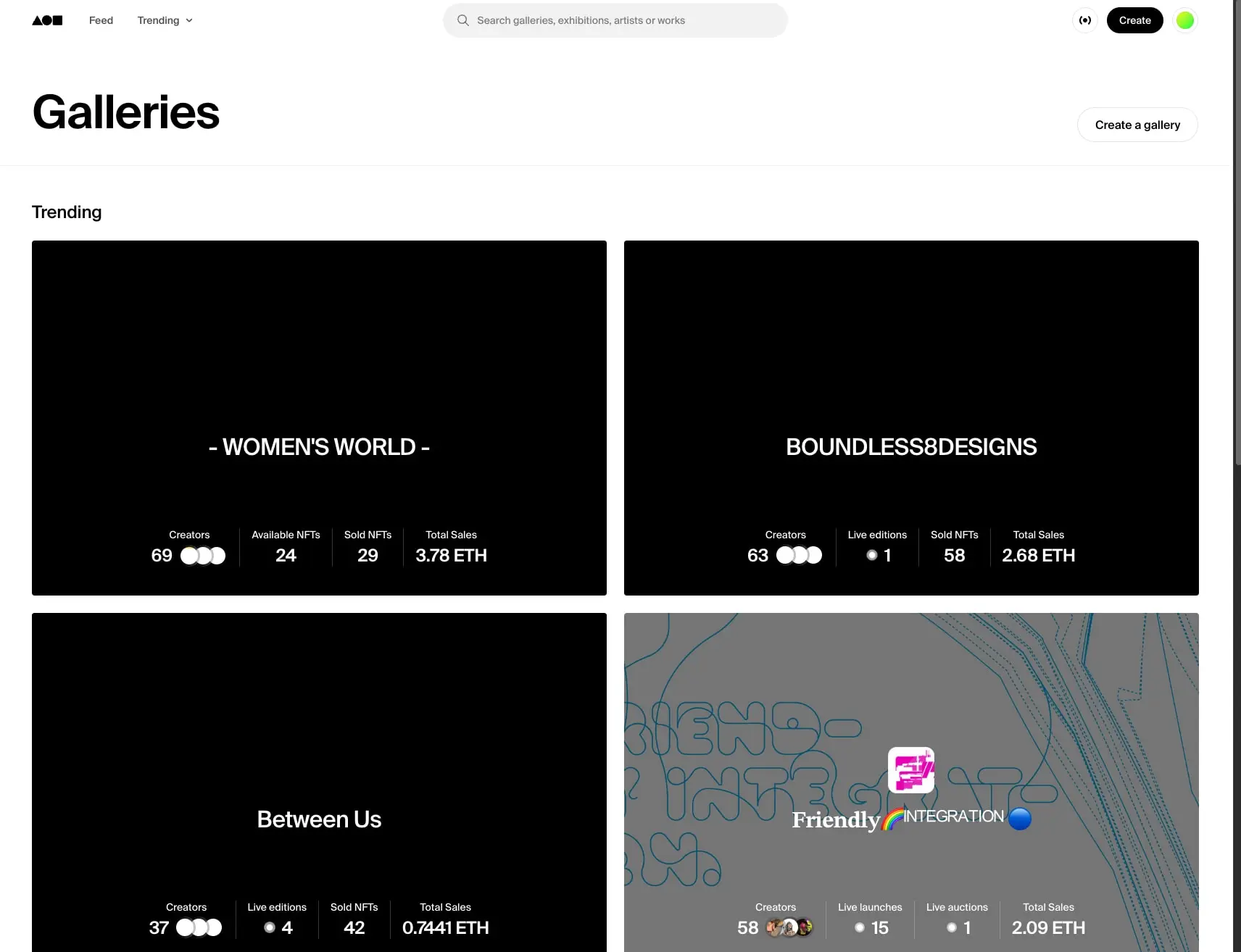
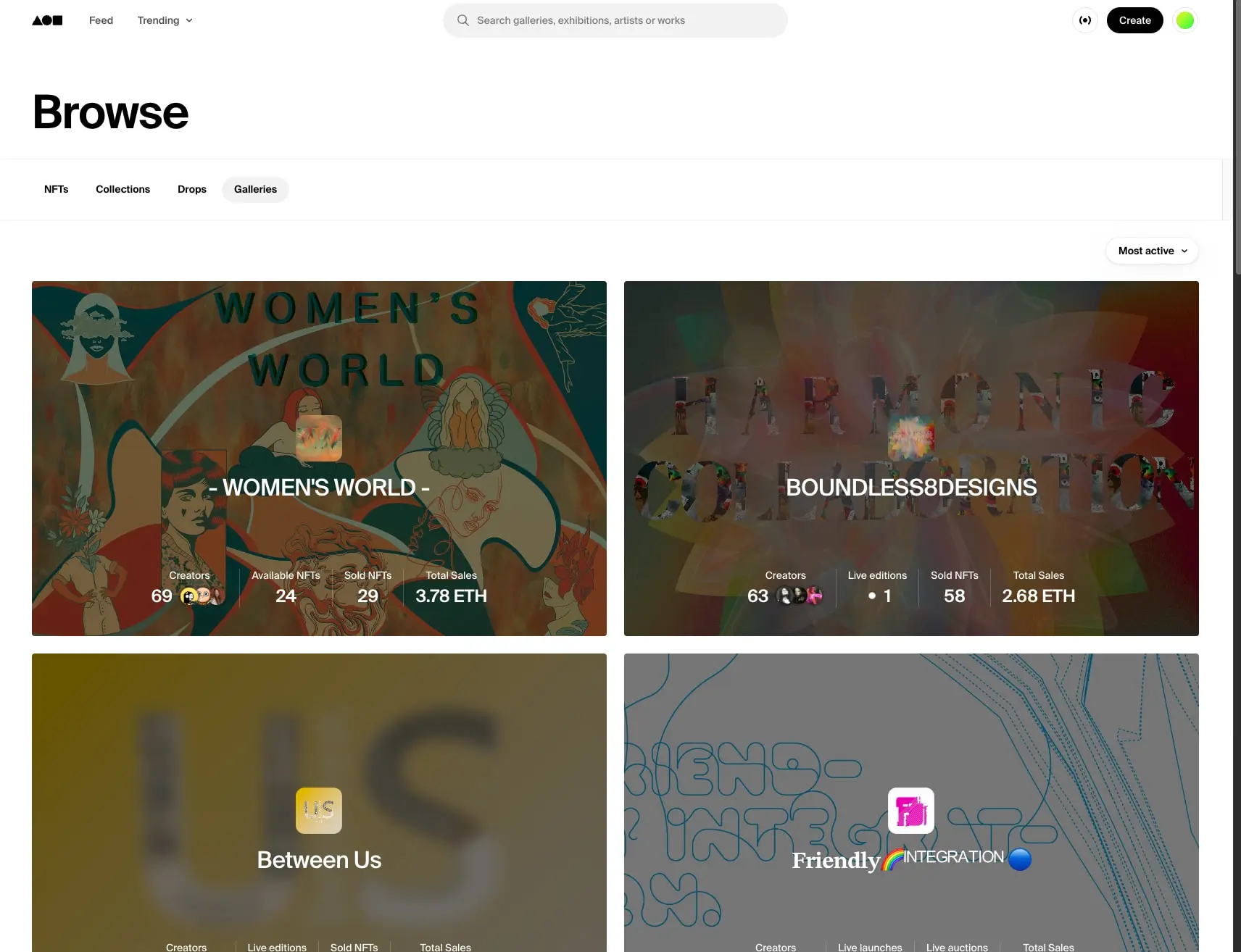
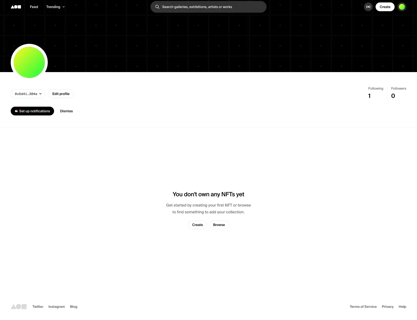
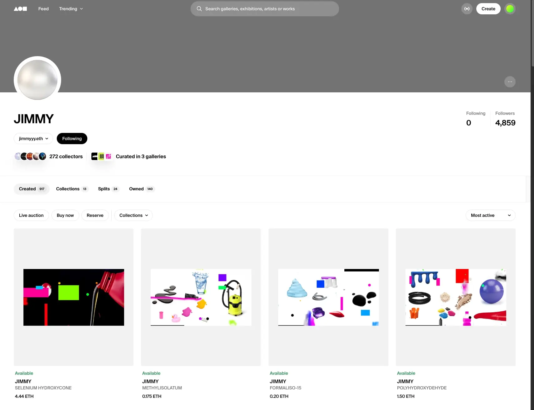
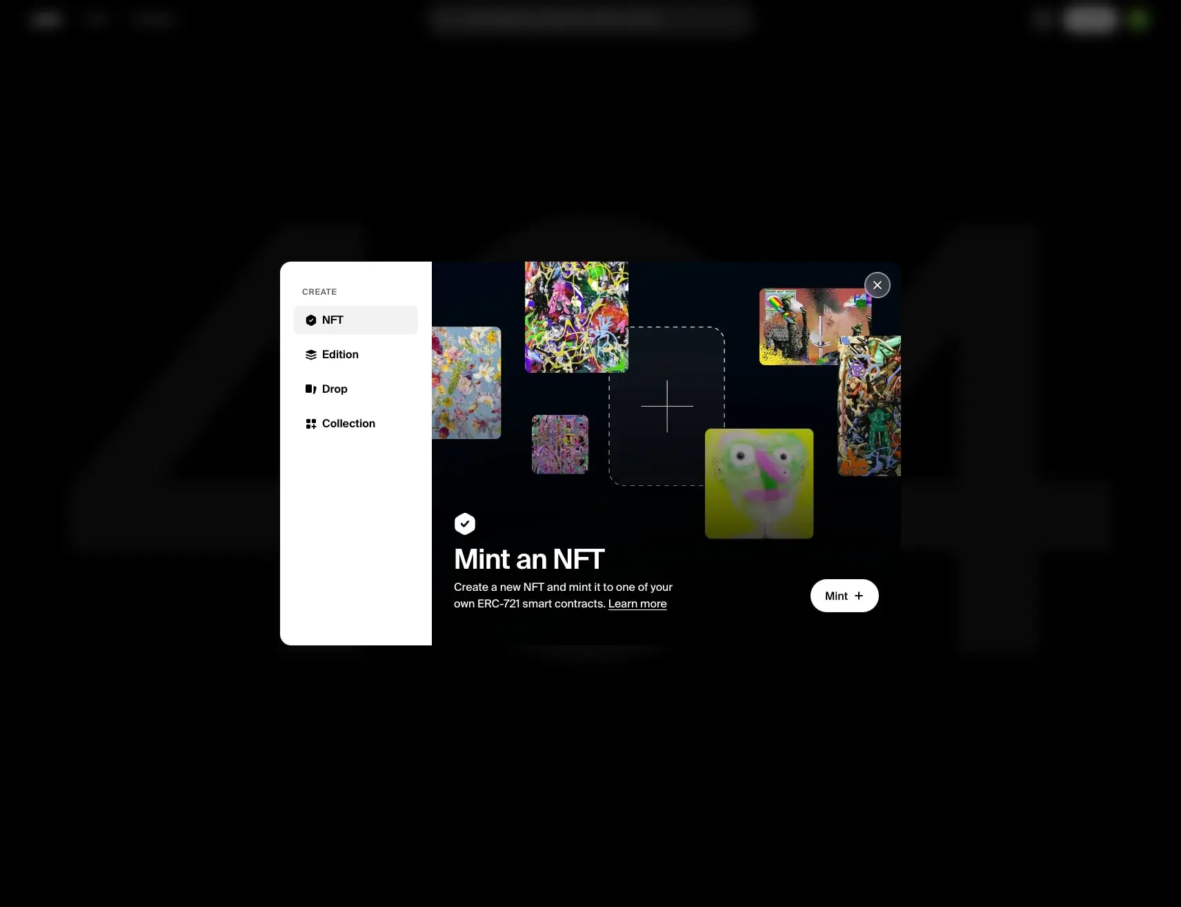
foundation.app presents a predominantly dark surface treatment in the captured pages. The system is anchored by #000000, #171717, and #ffffff, with typography led by Font. The guide below names reusable design roles only where the captured evidence supports them.
The reference set uses representative captured pages. It is a design reference, not a claim about the site’s private source code or a complete responsive specification.
Design tokens
The token names are practical labels for the recorded values. They are not claims about the source site’s variable names.
Colors
| token | value | observed use |
|---|---|---|
| color.text | #000000 |
text on page content |
| color.text | #171717 |
text on page content |
| color.surface | #ffffff |
surface on page content |
Typography
| token | font family | size | weight | line height | letter spacing | observed use |
|---|---|---|---|---|---|---|
| type.body-16px | Font | 16px | 400 | normal | normal | <div>, <a>, and <div> in the main |
| type.display-860px | Font | 860px | 600 | normal | -68.8px | <div> |
| type.utility-12px | Font | 12px | 400 | normal | normal | <div> and <span> |
| type.body-16px | Font | 16px | 500 | normal | normal | <a>, <a> in the main, <div> in the main, and <button> in the button |
| type.body-14px | Font | 14px | 500 | normal | normal | <a> and <button> in the button |
| type.body-16px | Font | 16px | 400 | 28px | normal | <p> and <div> |
| type.body-14px | Font | 14px | 400 | 21px | normal | <h2>, <a>, and <div> |
| type.utility-12px | Font | 12px | 400 | 21px | normal | <p> |
| type.display-32px | Font | 32px | 500 | 40px | -0.64px | <div>, <h2>, and <h3> |
| type.body-14px | Font | 14px | 400 | 16px | normal | <div> |
| type.heading-14px | Font | 14px | 600 | normal | normal | <h2> and <div> in the main |
| type.heading-24px | Font | 24px | 600 | normal | -0.24px | <div> |
| type.display-40px | Font | 40px | 500 | 44px | -0.8px | <a> |
| type.display-32px | Font | 32px | 600 | normal | -0.64px | <h1> in the main |
| type.body-20px | Font | 20px | 400 | 35px | normal | <div> |
| type.heading-16px | Font | 16px | 600 | 16px | normal | <button> in the button and <div> |
| type.body-14px | Font | 14px | 400 | normal | normal | <div> |
| type.body-24px | Font | 24px | 500 | normal | -0.24px | <h2> and <h1> |
| type.body-16px | Font | 16px | 400 | 24px | normal | <div> and <a> |
| type.heading-14px | Font | 14px | 600 | 17.5px | normal | <div> and <button> in the button |
Spacing
| value | property | observed element |
|---|---|---|
16px 20px |
padding | page content |
0px 48px |
padding | page content |
0px 0px 0px -68.8px |
margin | page content |
57.25px 48px 57.25px 0px |
padding | page content |
8px 48px |
padding | page content |
16px 0px |
padding | page content |
48px 0px 48px 48px |
padding | page content |
24px 0px |
padding | page content |
Shape and depth
The captured pages use 1px 0px 0px solid none none 0px, 1px solid 9999px, 0px none 8px, 1px 0px solid none 0px, 0px none 9999px, 0px none 16px, 1px solid 8px, and 0px none 12px border treatments. Recorded gradients include linear-gradient(rgb(0, 0, 0), rgb(0, 0, 0)), linear-gradient(rgba(0, 0, 0, 0) 23.96%, rgba(0, 0, 0, 0.85) 79.69%), and linear-gradient(135deg, rgb(255, 246, 31), rgb(25, 255, 62)). Recorded shadows include rgba(0, 0, 0, 0.05) 0px 0px 0px 1px inset, rgba(0, 0, 0, 0.15) 0px 0px 2px 0px, rgba(0, 0, 0, 0.07) 0px 4px 7px 0px, rgba(0, 0, 0, 0.15) 0px 12px 40px 0px, and rgba(0, 0, 0, 0.02) 0px 0px 4px 0px, rgba(0, 0, 0, 0.02) 0px 8px 16px 0px, rgba(0, 0, 0, 0.04) 0px 16px 32px 0px.
Colors
The visual system is predominantly dark surface treatment. Surface colors include #ffffff. Text colors include #000000 and #171717. Keep image-derived colors separate from interface colors.
Typography
The captured type system uses Font. The table records measured size, weight, leading, and tracking where available; it does not establish licensing or a complete fallback stack.
Layout
The captured pages use values such as 16px 20px, 0px 48px, 0px 0px 0px -68.8px, 57.25px 48px 57.25px 0px, and 8px 48px for padding and margin. These are measured usages, not a resolved scale. The available evidence does not establish container widths, grid rules, or breakpoints.
Visual language
The captured visual language is predominantly dark surface treatment. Surface treatment centers on #ffffff. Depth is supported by the returned gradients and shadows.
Components and states
The captured pages include repeated styling on <div>, <h2>, <a>, <h1>, <button>, <p>, <span>, and <h3> elements. The evidence does not identify reusable component boundaries or interaction states. Treat loading, focus, hover, pressed, error, and disabled states as implementation work to validate rather than as captured facts.
Responsive behavior
The captured token set does not establish breakpoint values or mobile behavior. Validate stacking, navigation changes, image treatment, and type scaling against the representative captures before implementing a responsive adaptation.
Practical implementation guidance
- Preserve the dark surface relationship and the measured type hierarchy before adding decorative treatment.
- Start from the returned typography, spacing, color, and border values; name any new scale or semantic role as an adaptation rather than as a source fact.
- Keep the captured font families separate from licensing decisions.
- Use screenshots to validate component anatomy, responsive behavior, focus treatment, and motion before shipping.
- Avoid introducing gradients or shadows beyond the captured treatment; the returned evidence includes those treatments.
Scope note
The guide uses representative captured pages. The evidence supports the values and observations above; it does not establish component semantics, interaction states, motion timing, breakpoint rules, font licensing, or a complete source stylesheet.
Sites change, so a screenshot can differ from the guide.
Loading…Similar designs
This guide describes the public website and isn't an official foundation.app design system. Not affiliated with foundation.app.