Overview
Doodle Warriors presents a bold, energetic visual system built around a dark foundation with vibrant purple action elements and playful coral-pink accents. The design targets aspiring digital artists with a confident, approachable personality that balances professional credibility with creative enthusiasm. The interface alternates between deep navy-black immersive sections and clean light-gray functional areas, creating visual rhythm across long-scrolling pages. Typography pairs a friendly, rounded display face for headlines with a clean sans-serif for body content, ensuring readability while maintaining character. The overall impression is of a modern ed-tech platform that doesn’t take itself too seriously—inviting users to join a creative community rather than complete a transaction.
Colors
The color system operates on a high-contrast dark mode with strategic accent warmth. The palette derives from the visible interface elements across the pricing, guarantee, and FAQ sections.
| token | value | use |
|---|---|---|
| ink | #0F0F1A | Primary dark background, expanded accordion fill, deep section backgrounds |
| ink-secondary | #1A1A2E | Elevated dark surfaces, pricing cards, bonus panels |
| surface | #FFFFFF | Light section backgrounds, collapsed accordion cards |
| surface-elevated | #F5F5F7 | FAQ section background, subtle differentiation from pure white |
| action | #7C3AED | Primary buttons, annual plan highlight, bullet accents, interactive emphasis |
| action-hover | #6D28D9 | Button hover states, deeper purple for depth |
| text-primary | #0F0F1A | Body text on light backgrounds, accordion questions |
| text-inverse | #FFFFFF | Text on dark backgrounds, guarantee section content, pricing details |
| text-muted | #A1A1AA | Secondary information, plan subtitles, supporting details |
| accent-coral | #FB7185 | Guarantee badge stars, decorative illustrations, urgency highlights |
| accent-pink | #F472B6 | Gift illustration, playful decorative elements |
The dark mode dominates immersive content sections—pricing, features, and guarantees—while light gray provides breathing room for functional content like FAQs. Purple serves as the unifying brand action color, appearing in buttons, plan highlights, and bullet markers. Coral and pink accents appear only in illustrations and decorative moments, preventing visual competition with the primary action purple.
Typography
The type system combines two families: Cobbler Sans for display and Catamaran for body content. Cobbler Sans delivers a rounded, approachable character with substantial weight for headlines. Catamaran provides clean, open readability across body sizes with excellent screen performance. The captured font sources include Catamaran-100, Catamaran-500, Catamaran-600, Catamaran-800, and Catamaran-900 as weight-specific variants of the Catamaran family, alongside Catamaran-Regular and Catamaran-Bold.
| token | family | size | weight | leading | tracking | use |
|---|---|---|---|---|---|---|
| hero-display | Cobbler Sans | 3.5rem | 700 | 1.1 | -0.02em | Page headlines, major section titles |
| section-display | Cobbler Sans | 2.5rem | 700 | 1.2 | -0.01em | Section headers, pricing title |
| price | Cobbler Sans | 3rem | 700 | 1 | -0.02em | Dollar amounts in pricing cards |
| body | Catamaran | 1rem | 400 | 1.6 | 0em | Paragraphs, descriptions, FAQ answers |
| body-bold | Catamaran | 1rem | 700 | 1.6 | 0em | Emphasized body text, questions |
| label | Catamaran | 1rem | 600 | 1.4 | 0.01em | Buttons, tags, small labels |
Verify licensing for these families before production use. No designer or vendor attribution is supported by the captured records.
The display sizes use tight leading and negative tracking for impactful headlines, while body text maintains generous line height for comfortable reading in longer content blocks. The weight contrast between Catamaran Regular and Bold creates clear hierarchy without size changes.
Layout
The page structure follows a full-width, centered content model with generous vertical rhythm. Sections stack with substantial padding, typically 5rem top and bottom, creating clear separation between content types. Maximum content width appears constrained to approximately 1200px, centered with automatic margins.
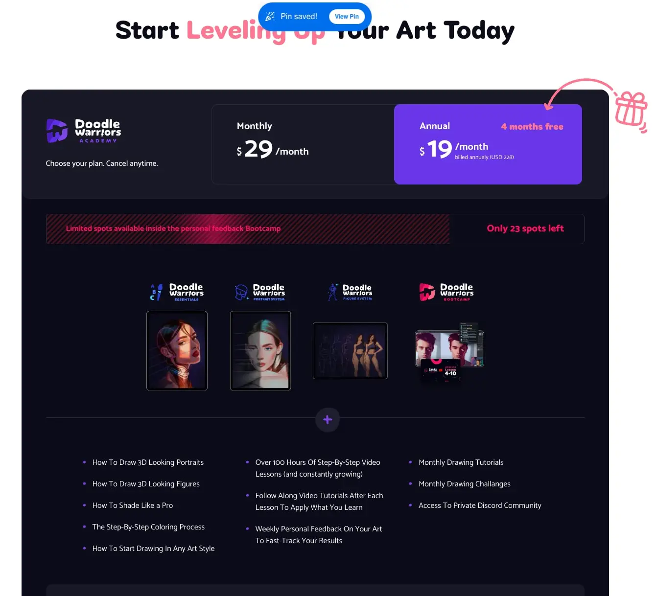
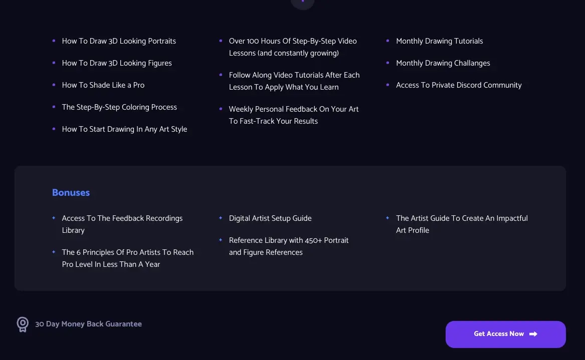
Horizontal spacing uses a 4px base unit (0.25rem), with component gaps at 1.5rem and section spacing at 5rem. The pricing section demonstrates a three-column layout for plan selection, with the highlighted annual plan occupying a visually dominant position through background color rather than size. Feature lists use a three-column grid with consistent bullet alignment.
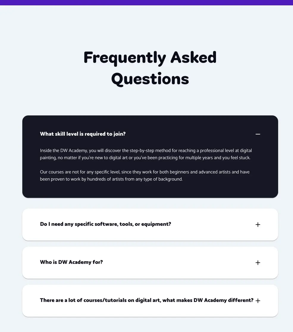
The FAQ section inverts the dark pattern, using a light gray background with stacked full-width accordion cards. Each card maintains internal padding of approximately 1.5rem, with generous vertical spacing between cards. The expanded state fills the card with the dark ink color, creating a dramatic reveal effect.
Z-index layering keeps decorative illustrations above section boundaries, as seen with the gift icon overlapping the pricing section edge. This creates depth without disrupting content flow.
Visual language
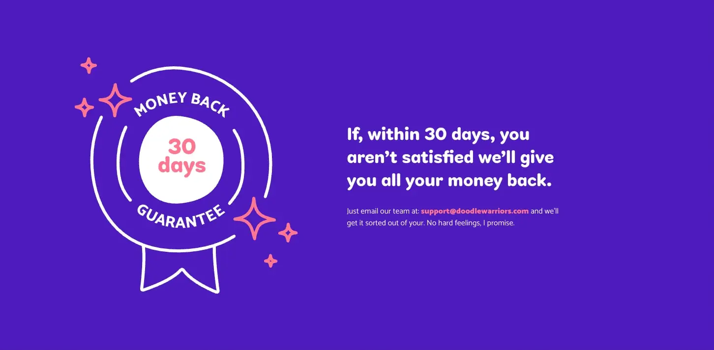
Illustration style leans heavily into line art with selective color fills—white outlines on dark backgrounds, coral accents for emphasis. The guarantee badge demonstrates this clearly: a circular seal with ribbon, rendered in clean strokes with starburst decorations in coral. This hand-drawn quality reinforces the creative-education positioning without appearing unprofessional.
Photography appears in product cards showing digital artwork samples—portraits and figure studies with dramatic lighting against dark backgrounds. These thumbnails use rounded corners and subtle borders to integrate with the dark interface.
Decorative elements include the gift box illustration with curved arrow, starburst shapes, and plus icons for accordion expansion. These maintain consistent stroke weight and simple geometry, feeling cohesive with the line-art badge.
The overall visual personality balances structure and playfulness: grid-aligned content with disciplined spacing, punctuated by organic illustrations and warm accent colors. This reflects the platform’s promise of systematic skill-building within a supportive creative community.
Components
Primary Action Button
- Anatomy: Text label with optional arrow icon, contained in a pill-shaped button
- Surface: Solid purple background (#7C3AED) with white text
- Typography: label token, uppercase or title case depending on context
- Shape: Full pill border radius (9999px)
- Spacing: Generous horizontal padding (2rem) with comfortable vertical padding (0.875rem)
- Composition: Icon positioned to the right of text with small gap
- Variants: Standard size for CTAs, potentially smaller for secondary actions
Pricing Card
- Anatomy: Plan name, price display with currency and period, optional billing note
- Surface: Dark background (#1A1A2E) with subtle border; highlighted variant uses purple gradient background
- Typography: Plan name in label token, price in price token, period in body token
- Shape: Rounded corners (1rem panel radius)
- Spacing: Internal padding approximately 2rem, price prominently displayed with surrounding whitespace
- Composition: Price aligned left or center, billing details below or beside
- Variants: Standard dark card for monthly plan, purple highlighted card for annual plan with “months free” badge
Feature List
- Anatomy: Purple bullet marker followed by text description
- Surface: Transparent on dark backgrounds
- Typography: body token for descriptions
- Composition: Three-column grid on desktop, single column on narrow viewports
- Spacing: Generous line spacing between items, column gaps at 2rem or more
FAQ Accordion
- Anatomy: Question text, expand/collapse icon (plus/minus), expandable answer area
- Surface: Collapsed state uses white (#FFFFFF) with subtle shadow; expanded state fills with dark ink (#0F0F1A)
- Typography: Question in body-bold, answer in body with inverse color when expanded
- Shape: Rounded corners (0.75rem)
- Spacing: Internal padding 1.5rem, vertical gap between cards approximately 1rem
- Composition: Full-width cards stacked vertically, icon positioned right
- States: Collapsed shows plus icon in dark; expanded shows minus icon, dark background, white text
Guarantee Badge
- Anatomy: Circular seal with ribbon tail, text arcs, central number display, surrounding starbursts
- Surface: White line art on purple background, coral star accents
- Typography: Display face for central number, sans-serif for surrounding text
- Composition: Left-positioned illustration with right-aligned text block
Responsive behavior
The design appears optimized for desktop viewing with substantial horizontal space. Key responsive considerations include:
- Pricing cards should stack vertically on narrow viewports, with the highlighted annual plan maintaining visual priority through position or full-width treatment
- Feature lists transition from three-column grid to single column, maintaining bullet alignment
- FAQ accordions remain full-width across breakpoints, with touch-friendly tap targets for expansion
- Guarantee section illustration may scale down or reposition above text on mobile
- Display typography should scale down proportionally, with hero-display potentially reducing to 2.5rem on small screens
Practical implementation guidance
Preserve
- The dark-mode-first aesthetic with high contrast between ink backgrounds and white text
- Purple as the singular action color, used consistently for buttons, highlights, and interactive states
- The rounded, friendly character of Cobbler Sans for all display typography
- Generous whitespace in pricing and guarantee sections—crowding undermines the premium positioning
- Line-art illustration style with selective warm accents
Avoid
- Introducing additional accent colors beyond the established purple, coral, and pink palette
- Using the dark ink background for long-form reading content—reserve for shorter, impactful sections
- Flat buttons without pill shaping; the rounded corners are integral to the friendly personality
- Generic stock photography that conflicts with the hand-crafted illustration style
Recommended Build Order
- Establish dark theme foundation with ink background and white text defaults
- Implement typography scale with both font families loaded
- Build pill button component as the primary interactive element
- Create pricing card structure with standard and highlighted variants
- Develop accordion pattern with dramatic dark expanded state
- Add feature list grid with purple bullet system
- Integrate guarantee section with illustration and text pairing
Accessibility
- Ensure purple action elements meet WCAG contrast requirements against dark backgrounds; the vibrant #7C3AED may need adjustment for small text
- Provide visible focus states on interactive elements, potentially using coral accent for keyboard navigation
- Maintain accordion keyboard operability with Enter/Space activation and arrow key navigation
- Consider reduced-motion preferences for any expand/collapse animations
Scope note
This guide covers the visible landing page surface including pricing, guarantee, features, and FAQ sections. Navigation, footer, course detail pages, checkout flow, and user dashboard are not represented in the captured pages. Measurements are practical adaptation targets derived from visual inspection. Motion behavior, form validation states, and mobile-specific layouts require additional design exploration.
Sites change, so a screenshot can differ from the guide.
Loading…Similar designs
This guide describes the public website and isn't an official doodlewarriors.com design system. Not affiliated with doodlewarriors.com.