Overview
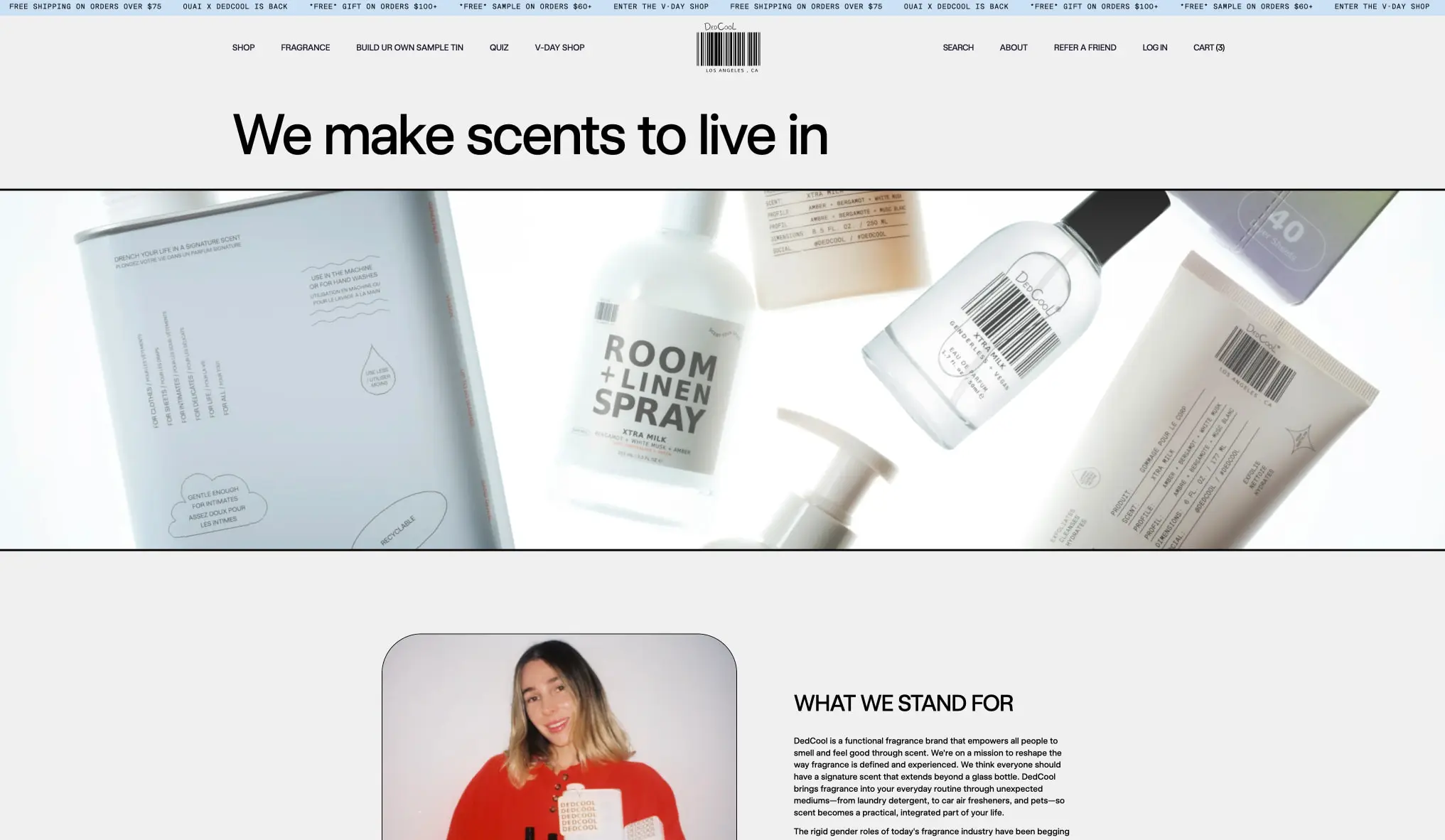
DedCool uses a near-invisible storefront frame so the products and the page voice can stay in front. The home page opens with a tiny utility ticker, a sparse uppercase navigation line, a centered barcode wordmark, and a single oversized headline. Below that, a full-width product band shows pale packaging against a white field, so the page feels airy rather than boxed in.
The same system repeats across the about, rewards, and login pages. A rounded portrait card, a wide reward grid, a comparison table, and a minimal sign-in form all sit inside the same light canvas. The brand relies on scale, spacing, and crisp rules more than on decoration. Orange appears as a narrow accent lane; most of the interface stays black, white, and soft gray.
The design reads as editorial and direct. It gives the copy room to feel like a statement, while the product photography supplies the mood and the color range. Nothing in the frame should compete with the bottles, the barcode mark, or the large page headings.
Colors
| token | hex | use |
|---|---|---|
| canvas | #F6F6F3 |
Main page background and broad negative space |
| paper | #FFFFFF |
White cards, forms, and reward tiles |
| ink | #000000 |
Headings, nav, rules, and logo marks |
| muted-ink | #1A172C |
Secondary copy, footer text, and quieter page text |
| border | #B8B7B2 |
Hairlines, input rules, and table dividers |
| accent | #FF6B18 |
Reward outlines, check marks, and the strongest callout color |
| accent-soft | #CFE0F1 |
Pale blue pill, small badge surfaces, and gentle callouts |
The system is light-first. The canvas stays pale, the paper surfaces stay white, and the strongest visual weight comes from black ink and thin rules. Dark is used only for text, the barcode mark, and the deepest footer or utility text. Photography fills the middle of the palette with beige, misty blue, blush, and warm gray packaging tones, so the interface itself can remain restrained. Accent is tightly controlled: orange marks the reward cards and the check marks in the comparison table, while the soft blue pill appears as a secondary highlight rather than a second brand color. That balance keeps the page calm while still giving one clear path to action.
Typography
Universal Sans carries the big statements, the about copy, the login form, the footer, and most navigation. Messina Sans Mono is the smaller utility voice: the ticker, tiny labels, reward amounts, and other compact informational text. The hierarchy depends on size, spacing, and a few weight changes rather than on many families or ornate styling. Verify licensing for these families before production use.
| token | family | size | weight | leading | tracking | use |
|---|---|---|---|---|---|---|
| hero-display | Universal Sans | 5rem | 700 | 0.95 | -0.03em | Main home headline and other dominant page statements |
| section-display | Universal Sans | 3.5rem | 700 | 0.98 | -0.02em | Large section titles such as rewards and login |
| subsection-display | Universal Sans | 2.5rem | 700 | 1 | -0.015em | About headings and secondary feature statements |
| body | Universal Sans | 1rem | 400 | 1.45 | 0em | Paragraph copy, helper text, and form text |
| body-medium | Universal Sans | 1rem | 500 | 1.45 | 0em | Emphasized body text, reward copy, and CTA text |
| navigation | Universal Sans | 0.75rem | 500 | 1.2 | 0.02em | Header links and compact interface labels |
| label | Messina Sans Mono | 0.75rem | 400 | 1.2 | 0.08em | Small all-caps labels, reward figures, and utility text |
| micro | Messina Sans Mono | 0.625rem | 400 | 1.1 | 0.1em | Ticker copy and the smallest informational lines |
The display scale stays bold and compact enough to feel editorial, not airy or lifestyle-soft. Small text gets a little tracking so it reads cleanly across the thin rules and the narrow header rail. Use Universal Sans wherever the page needs a plain, confident voice. Use Messina Sans Mono only when the design needs a tiny technical note, a price-like label, or a utility cadence.
Layout
The layout is built around a centered column and a few very wide horizontal chapters. On the home page, the top rail spans the width of the viewport but remains visually light. The headline then sits in a broad centered zone with generous space above and below, so the eye lands on the product strip without distraction. The image band is almost full width, which gives the packaging enough scale to feel like a display wall.
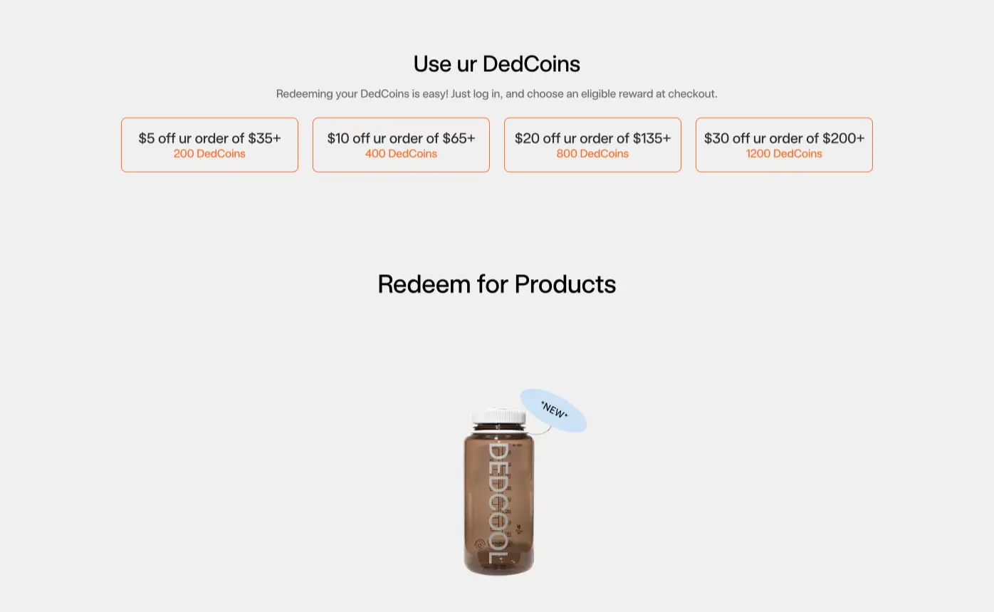
The about page shifts into a split composition. A rounded portrait card sits on one side while the copy block holds the other side with a clear title and a dense paragraph stack. The card radius softens the image without making the page playful. The rewards page goes back to centered presentation: a heading, a short explanatory line, four outlined reward cards in a row, and then a large product and tier section beneath. The comparison table uses thin horizontal rules and roomy row heights, which makes the information feel precise rather than crowded.
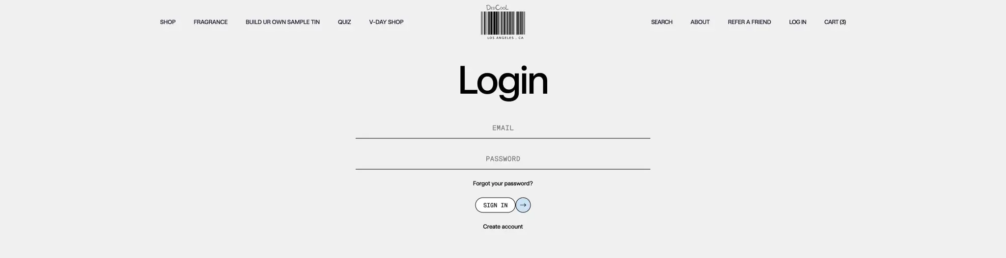
The login page is the most restrained layout. The form fields sit under a large title, then a tiny help line and a compact sign-in control. The barcode mark remains part of the header language, so the page still feels branded even when the content is functional.
Spacing is generous but disciplined. The visible rhythm often lands on wide vertical gaps, around 2.5rem to 4.375rem for normal separations and much larger jumps for the hero and section breaks. Side gutters are also strong: the desktop pages keep a centered measure with large left and right framing space, which helps the pages stay quiet and premium rather than dense.
Visual language
DedCool is defined by restraint. The page frame is almost monochrome, so the products and the words can supply the character. Thin rules separate rows, fields, and tables. Rounded corners appear in a few controlled places: the about portrait card, the reward tiles, and the small pills. Those corners soften the page without turning it into a soft-focus lifestyle brand.
The barcode wordmark is central to the identity. It gives the interface a lab-like, labeled feeling that fits the clean fragrance packaging. The product photography stays bright and airy, often on a white field, so the packaging edges and printed labels stay readable. The image treatment is not heavy or cinematic; it is clear, pale, and product-first.
Accent color is used sparingly and with intent. Orange shows up on the reward tiles and the table checks, which makes the benefits feel active without flooding the page. The soft blue pill is the gentlest accent and should stay rare. Keep shadows minimal or absent. The system gets its depth from spacing, line weight, and image contrast, not from glowing surfaces.
Components
Utility ticker
- Anatomy: one-line promo strip with repeating short offers.
- Typography:
microin Messina Sans Mono, all-caps feel, tight line height. - Surface: white or near-white background with black text.
- Composition: stretches edge to edge and stays visually light.
- Visible state: static text band with no heavy framing.
Primary nav and wordmark rail
- Anatomy: centered barcode mark, left product links, right account links.
- Typography:
navigationin Universal Sans. - Surface: same light canvas as the page, no visible panel.
- Spacing: wide gaps between groups; the row should feel airy, not packed.
- Visible state: plain text links with the brand mark holding the middle.
Hero lockup
- Anatomy: oversized statement, thin separator line, then a wide product image band.
- Typography:
hero-displaywith compact leading and slight negative tracking. - Surface: white field with black text and a broad photographic strip.
- Composition: the headline must sit high and clear before the image takes over.
- Visible state: one dominant message, no secondary card framing.
About split block
- Anatomy: rounded portrait card and a text block headed by “WHAT WE STAND FOR.”
- Typography:
subsection-displayfor the heading,bodyfor the paragraph. - Shape:
cardradius on the image container. - Spacing: generous gutter between image and text.
- Composition: the portrait should carry warmth while the text stays direct and compact.
Reward card row
- Anatomy: four outlined tiles with a cash-value line and a DedCoins line.
- Typography:
body-mediumfor the main line,labelfor the coin count. - Shape:
cardradius with a thin orange border. - Surface: white paper with no fill color drama.
- Visible state: each tile reads as a selectable reward option rather than a raised button.
Reward tier table
- Anatomy: heading, short intro line, product bottle stage, then a multi-column benefit table.
- Typography:
section-displayfor the title,labelandbodyfor the table. - Structure: thin gray row dividers and centered column headings.
- Accent: orange check marks carry the positive signal.
- Composition: the rows should stay broad and readable; the table is the information centerpiece.
Login form
- Anatomy: large page title, two ruled fields, password help, sign-in control, and create-account link.
- Typography:
section-displayfor the title,bodyandnavigationfor the form language. - Surface: plain white or canvas background with hairline rules.
- Shape: the sign-in control uses a compact pill or small rounded control.
- Visible state: minimal and functional, with no decorative panel around the form.
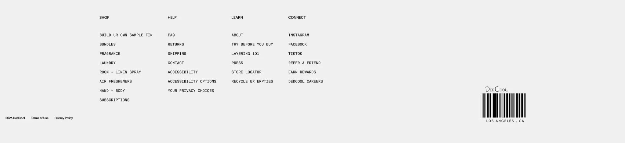
Footer directory
- Anatomy: four link columns, small legal line, and the barcode mark at the edge.
- Typography:
navigationfor headings andmicroorlabelfor smaller items. - Surface: wide light field with low visual contrast.
- Composition: link columns should read like a quiet index, not a promotional block.
Responsive behavior
When the layout narrows, keep the reading order simple: utility line, brand rail, headline, image, and then the support sections. The hero headline should wrap in balanced lines instead of squeezing into one long line. The product strip should crop before labels become unreadable. The about split should collapse to one column, with the portrait above the text. Reward tiles should flow from four across to two across and then to one across as space decreases. The comparison table should switch to stacked rows or another narrow-friendly presentation before the columns become too tight. Keep the barcode mark legible at every width and preserve the clean edge spacing around the forms.
Practical implementation guidance
Preserve
- Keep the page mostly white, black, and gray so the products stay in front.
- Keep the barcode identity and uppercase utility language.
- Keep the large headline scale and the wide breathing room around it.
- Keep orange limited to reward emphasis and other narrow calls to action.
- Keep radii modest: a small card curve and a stronger pill curve are enough.
Avoid
- Avoid heavy shadows, glossy cards, and layered gradients.
- Avoid adding extra accent colors that compete with the orange line.
- Avoid filling the page with small rounded boxes; the layout should stay open.
- Avoid mixing many font families or adding decorative display faces.
- Avoid crowding the header or turning the promo row into a dense banner.
Recommended build order
- Set the canvas, ink, border, and accent colors.
- Build the utility ticker and the brand rail.
- Build the hero lockup and product strip.
- Add the about split block.
- Add the reward cards and reward table.
- Add the login form.
- Finish with the footer directory and then tune the narrow-width flow.
Accessibility
- Keep the thin rules visible enough to separate fields and table rows.
- Make sure the orange accents do not carry meaning by color alone.
- Keep the sign-in control and reward tiles large enough to tap easily.
- Use clear labels for the login fields and concise alt text for the portrait and product images.
- Preserve strong contrast for the small mono text in the ticker and reward labels.
Scope note
This guide covers the desktop home, about, rewards, and login surfaces for dedcool.com. Measurements are practical adaptation targets. Small-screen layouts, motion, loading states, and alternate campaign pages are not included.
Sites change, so a screenshot can differ from the guide.
Loading…Similar designs
This guide describes the public website and isn't an official dedcool.com design system. Not affiliated with dedcool.com.