Overview
Base Power Company’s visual system presents a confident yet approachable energy brand that balances technical credibility with residential warmth. The design pairs an editorial, high-contrast serif display face for headlines with a clean, contemporary variable sans-serif for all functional text. The color story moves between a warm off-white canvas, a deep forest green for immersive moments, and a distinctive lime green that signals action without the aggressive urgency of pure red or orange. Photography emphasizes real homes, real customers, and real equipment—grounding the brand in tangible outcomes rather than abstract technology. The overall impression is of a trustworthy neighbor who happens to be an engineer: competent, transparent, and genuinely helpful.
Colors
The palette operates in three modes: warm neutral for everyday reading, deep forest for brand immersion and footer anchoring, and lime green for interactive emphasis.
| token | value | use |
|---|---|---|
| canvas | #F5F0E8 |
Primary page background; warm off-white with subtle cream undertone |
| surface | #FFFFFF |
Card backgrounds, elevated panels, FAQ and step-card resting states |
| ink | #1A1A1A |
Primary text, headings, strong borders, footer wordmark watermark |
| muted-ink | #5C5C5C |
Secondary body text, captions, legal copy, expanded FAQ answers |
| action | #B8E06E |
Primary buttons, active states, promotional highlights, subscription submit |
| action-ink | #1A1A1A |
Text on action backgrounds for maximum contrast |
| forest | #1B3A1B |
Footer background, immersive sections, active step-card surface |
| forest-muted | #2A4A2A |
Footer navigation links, secondary text on forest backgrounds |
| border | #E0DCD5 |
Subtle dividers, accordion separators, card outlines in resting state |
| border-strong | #1A1A1A |
Secondary button outlines, emphasis borders |
The warm canvas avoids sterile white, making photography of homes and equipment feel naturally integrated rather than pasted onto a blank page. The forest green carries the brand’s environmental positioning while providing enough depth for large typographic watermarks like the oversized “BASE” wordmark in the footer. Lime green is used sparingly and strategically—reserved for the single most important action on any given view, which prevents visual fatigue and maintains its attention-grabbing power.
Typography
Two families divide the labor: Clarendon Wide handles display and brand voice, while PP Neue Montreal Variable manages everything functional.
| token | family | size | weight | leading | tracking | use |
|---|---|---|---|---|---|---|
| hero-display | Clarendon Wide | 4rem | 700 | 1 | -0.02em | Homepage hero headlines, major section titles |
| section-display | Clarendon Wide | 2.5rem | 700 | 1.1 | -0.01em | Section headers, step-card titles, FAQ section heading |
| body-large | PP Neue Montreal Variable | 1.25rem | 400 | 1.4 | 0em | Intro paragraphs, expanded FAQ answers |
| body | PP Neue Montreal Variable | 1rem | 400 | 1.5 | 0em | Standard paragraphs, descriptions, footer legal |
| label | PP Neue Montreal Variable | 0.75rem | 500 | 1.2 | 0.05em | Buttons, tags, uppercase labels like “SWITCHING TO BASE IS EASY” |
| navigation | PP Neue Montreal Variable | 0.875rem | 400 | 1.2 | 0em | Footer links, header navigation, utility text |
Clarendon Wide, designed by Patrick Griffin and published by Canada Type, brings a compact, authoritative presence to headlines without feeling old-fashioned. Its bold weight and slightly condensed proportions allow large statements to fit comfortably in standard layouts. PP Neue Montreal Variable, designed by Mathieu Desjardins and published by Pangram Pangram Foundry, provides a full weight range in a single file, enabling fluid transitions between body and emphasis without loading additional font assets. Verify licensing for these families before production use.
Layout
The page structure follows a centered, contained model with generous breathing room. Content maxes out at approximately 1200px, centered with automatic margins. Sections stack vertically with substantial separation—typically 6rem between major content blocks—to let each message land distinctly.
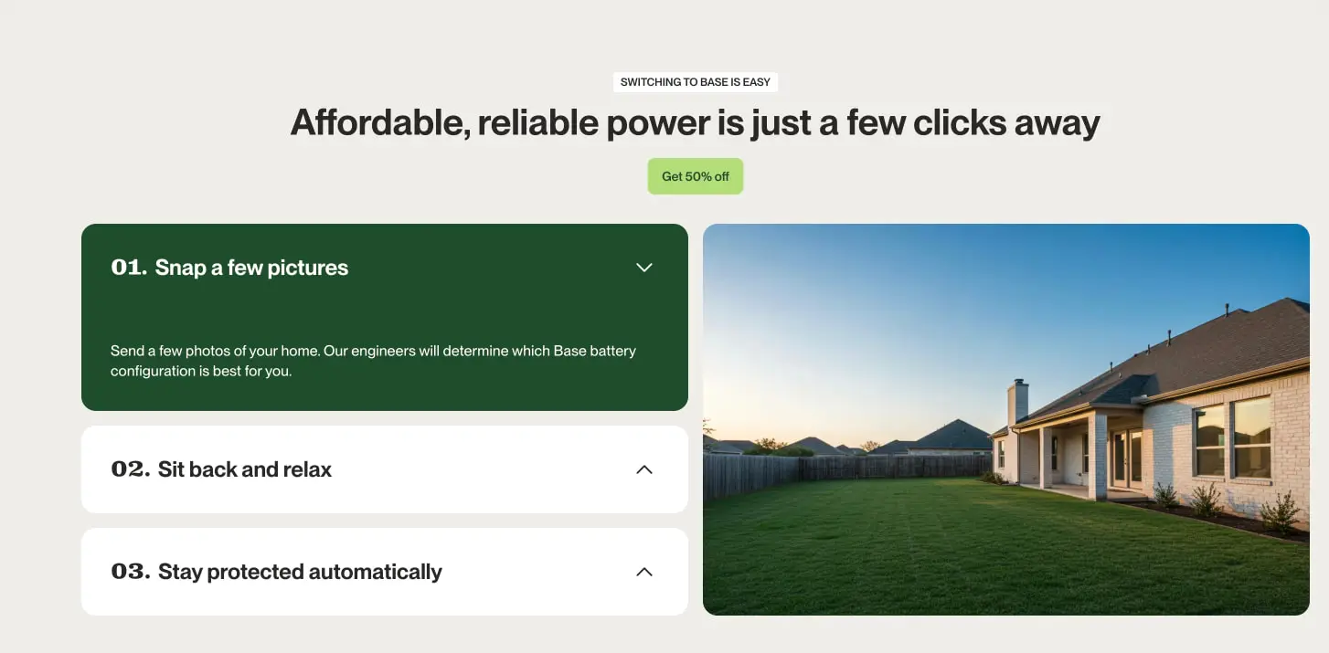
The grid is fundamentally single-column for text content, with asymmetric two-column arrangements for feature sections. In the step-by-step onboarding panel, the left column carries stacked expandable cards while the right column presents a large photographic scene that anchors the procedural content in real-world context. This 50/50 split feels balanced without being rigid; the photography column often bleeds to the edge or uses rounded corners to soften the rectilinear structure.
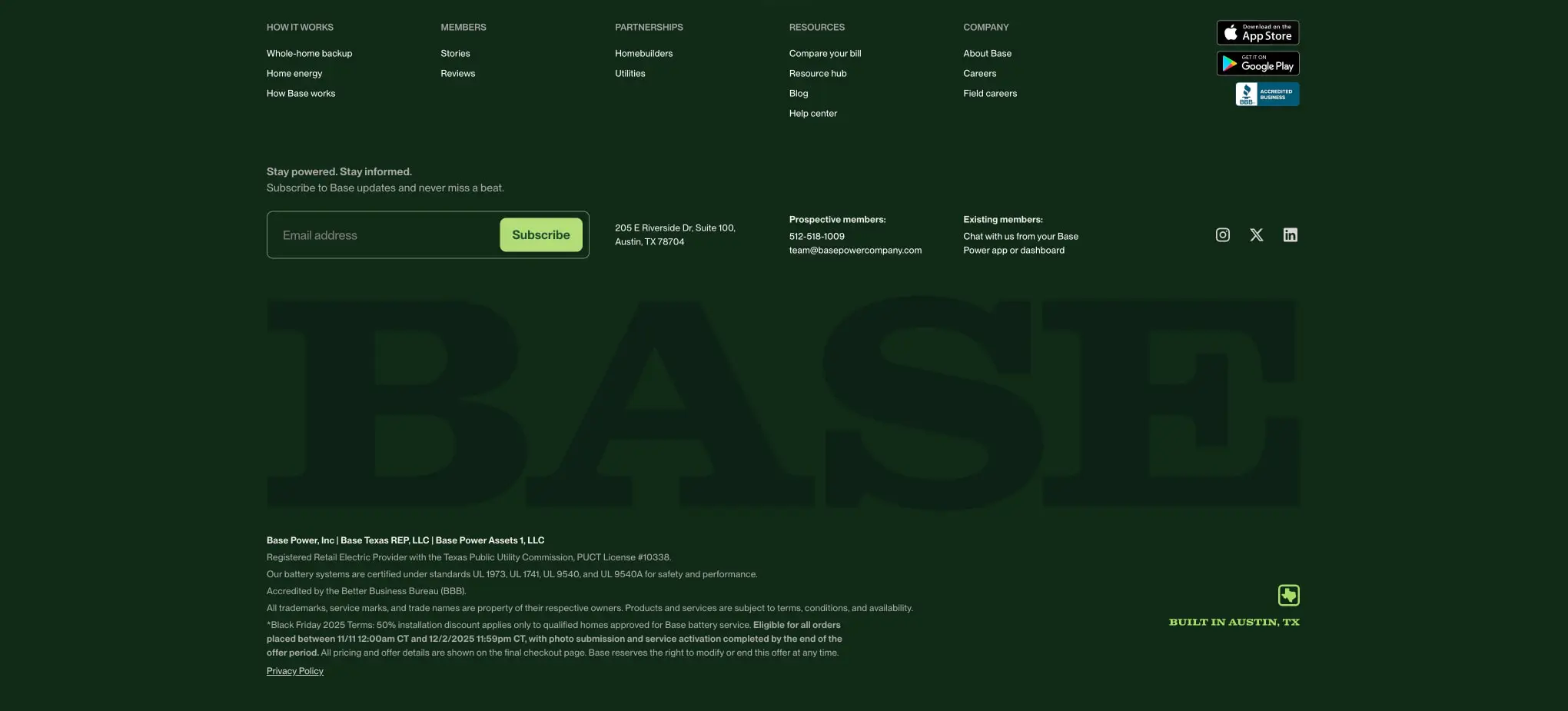
Footer layout uses a multi-column link grid above a massive typographic watermark. The “BASE” wordmark scales to fill nearly the full viewport width, functioning as both brand reinforcement and visual texture. Below this, legal copy and accreditation marks sit in a compact horizontal band.
Spacing follows a 4px base unit (0.25rem), with semantic steps at 8px, 16px, 24px, 32px, 48px, and 96px. Card padding consistently uses 32px (2rem), while section gutters use 96px (6rem). This limited scale prevents arbitrary decisions and maintains vertical rhythm.
Visual language
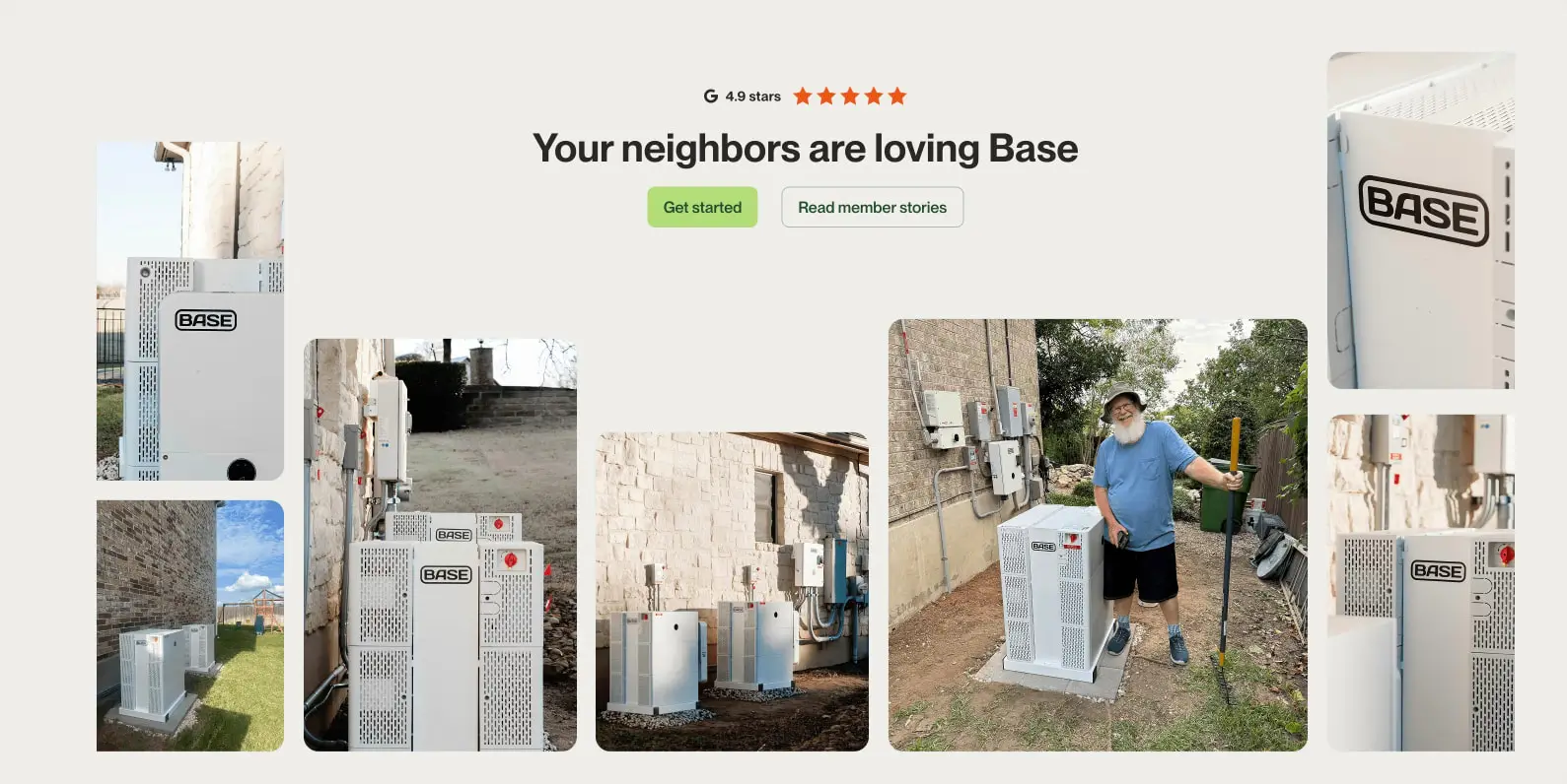
Photography is documentary and unstyled—real customers beside real equipment in real Texas backyards. Images receive moderate rounded corners (1rem to 1.5rem) that soften their edges without making them feel like interface elements. The collage arrangement in the social proof section overlaps and staggers photographs at different scales, creating organic visual movement against the grid’s regularity.
Iconography is minimal and functional. Chevron arrows indicate expand/collapse states in accordions and step cards. Star ratings use filled orange-red shapes for social proof. App store badges and accreditation marks appear at natural sizes without custom styling.
The brand’s voice in type is declarative and direct. Headlines state benefits plainly: “Your neighbors are loving Base,” “Affordable, reliable power is just a few clicks away.” There is no ornamental language or excessive enthusiasm—confidence comes from clarity.
Components
Primary action button
- Anatomy: Text label centered within a solid filled container
- Surface:
actionbackground withaction-inktext - Typography:
labeltoken, uppercase or title-case depending on context - Shape:
rounded.button(0.5rem) with no border - Spacing: 0.75rem vertical padding, 1.5rem horizontal padding
- Composition: Appears singly or in pairs with a secondary outline button
- Variants: “Get started,” “Get 50% off,” “Subscribe”—all share identical styling
Secondary action button
- Anatomy: Text label within a transparent container with visible border
- Surface: Transparent background,
border-strong1px border,inktext - Typography:
labeltoken - Shape:
rounded.buttonmatching primary action - Spacing: Identical padding to primary for visual pairing
- Composition: Positioned immediately beside primary action when paired
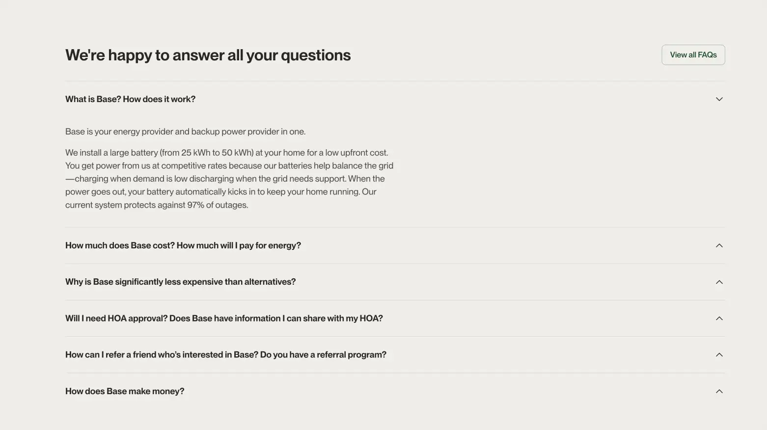
FAQ accordion item
- Anatomy: Question text with right-aligned chevron icon, optional expanded answer below
- Surface: Transparent background, separated by
border1px horizontal rules - Typography: Question uses
bodyatinkweight approximately 500; answer usesbody-largeatmuted-ink - Shape: No border radius; full-bleed separators
- Spacing: 1.5rem vertical padding per item
- Composition: Stacked vertically with consistent left alignment
- States: Collapsed shows chevron pointing down; expanded shows chevron pointing up with answer text revealed below
Step card (expandable)
- Anatomy: Numbered title, chevron icon, optional descriptive paragraph
- Surface: Resting state uses
surfacebackground; active/expanded state usesforestbackground withsurfacetext - Typography: Number and title use
section-displayat approximately 1.5rem; description usesbodyatsurfacecolor when active - Shape:
rounded.card(1rem) - Spacing:
card-padding(2rem) internal padding; 1rem gap between stacked cards - Composition: Left column of two-column layout, stacked vertically
- States: One card may be expanded at a time, showing descriptive text and inverting colors
Footer
- Anatomy: Multi-column navigation grid, email subscription form, massive watermark wordmark, legal copy, social links
- Surface:
forestbackground throughout - Typography: Navigation links use
navigationatforest-muted; headings usebodyatsurfaceweight 500; legal copy usesbodyat reduced opacity - Shape: No border radius on outer container; subscription input uses
rounded.button - Spacing: Generous internal padding; columns distributed with flex or grid
- Composition: Navigation occupies upper portion; watermark dominates center; legal and social occupy bottom band
- Elements: App store badges, BBB accreditation mark, social media icons in monochrome
Responsive behavior
The two-column step-card layout should stack vertically on narrower viewports, with photography moving above or below the procedural cards. The FAQ section remains single-column but may reduce horizontal padding. Footer navigation should collapse from multi-column to stacked links. The massive “BASE” watermark should scale down proportionally or hide on small screens to prevent layout breakage. Button pairs may stack vertically with full-width treatment when horizontal space is constrained.
Practical implementation guidance
Preserve
- The warm off-white canvas against pure white cards—this subtle layering creates depth without shadow
- Clarendon Wide for all display headlines; the serif character is central to brand recognition
- Lime green exclusively for the single primary action per view
- Real photography with rounded corners rather than illustrations or stock imagery
- The oversized footer watermark as a distinctive brand signature
Avoid
- Using forest green for large text blocks; it is reserved for immersive containers and active states
- Multiple competing action colors; the lime green must remain unique
- Generic sans-serif for headlines; the Clarendon Wide contrast is intentional
- Sharp-cornered cards; the rounded treatment is consistent across all elevated surfaces
- Centering body text; left alignment maintains the documentary, straightforward tone
Recommended build order
- Establish the canvas and surface color variables with the warm off-white base
- Implement the two-font hierarchy with Clarendon Wide headlines and PP Neue Montreal Variable body
- Build the primary and secondary button pair with exact padding and radius
- Create the FAQ accordion with border separators and chevron states
- Construct the step-card component with active/inactive color inversion
- Assemble the footer with multi-column navigation and watermark scaling
Accessibility
- Ensure
forestonsurfacetext combinations meet WCAG AA contrast; the dark green on white passes, but verify lime green on dark text - Provide visible focus states for all interactive elements, particularly the expandable cards and accordion items
- Chevron icons should have accessible labels indicating expand/collapse action
- The massive footer watermark should be decorative (
aria-hidden) rather than announced to screen readers - Maintain keyboard operability for the step-card and FAQ accordion patterns
Scope note
This guide covers the homepage and its primary sections: hero, social proof, FAQ, onboarding steps, and footer. Interior pages, mobile navigation patterns, form validation states, and motion behaviors are not represented in the captured pages. Measurements are practical adaptation targets derived from visible proportions in the provided images.
Sites change, so a screenshot can differ from the guide.
Loading…Similar designs
This guide describes the public website and isn't an official basepowercompany.com design system. Not affiliated with basepowercompany.com.