Design character
10er makes creator funding feel direct rather than financial. A near-black field, oversized centered language, one saturated blue action, and a small yellow circular mark create the shell. Creator work—podcast covers, portraits, expressive type, and vivid artwork—provides the personality. The product chrome remains spare.
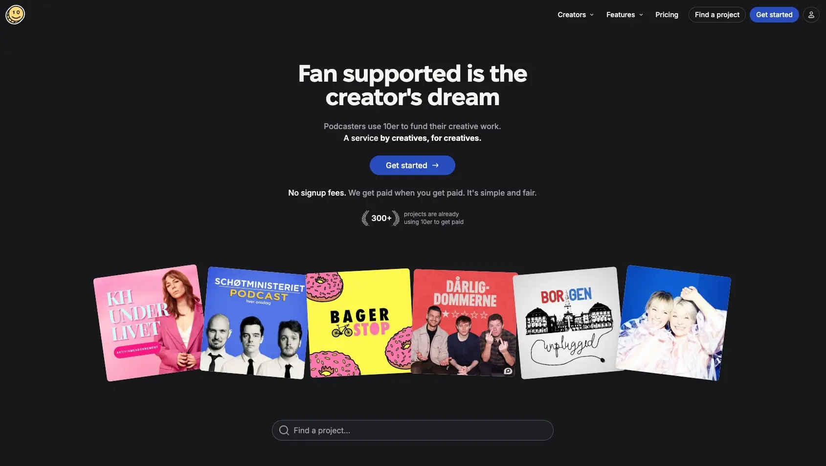
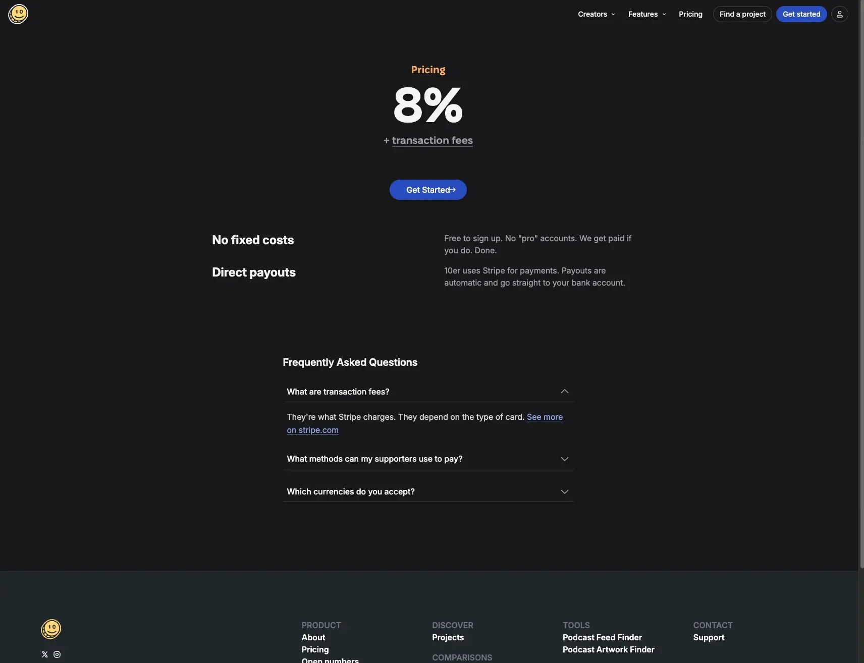
The central contrast is dark infrastructure and colorful creator work. On the home page, a compact promise ends in a loose fan of project covers. On pricing, the same dark field makes one number, one action, and a few plain-language benefits feel decisive.
Overview
The captured scope includes the homepage and pricing page at wide desktop sizes. Both views use a compact navigation bar, centered content, pills for actions and utilities, white/gray type, blue for the primary path, thin dividers, and a lighter charcoal footer. Information is deliberately reduced to a promise, proof, a fee, benefits, and FAQ instead of a dashboard.
Key characteristics:
- Dark canvas with high-contrast off-white text and muted gray support copy.
- Fixel as the recorded family reference across display and UI roles.
- A 48px home claim and a 96px pricing figure create two intentional display scales.
- Blue appears on the primary action; black and outlined pills support parallel utilities.
- Creator-cover art is the expressive gallery, not generic decoration.
- Round controls and 24px panels soften the dark interface.
- Thin borders and small 0/1/2px shadows create quiet depth.
Design tokens
The token names below are practical labels for observed values. The names are descriptive, not official 10er naming.
Color inventory
| Token | Value | Observed use | Support |
|---|---|---|---|
| color.text | #f4f4f5 | Hero, pricing number, headings, navigation | Recorded primary text |
| color.text-muted | #9f9fa9 | Supporting copy, descriptions, labels, fine print | Recorded secondary text |
| color.on-dark-action | #ffffff | Inverse/action emphasis in the homepage capture | Recorded accent |
| color.inverse | #000000 | Inverse control context in the homepage capture | Recorded accent |
The exact dark canvas, blue button, yellow logo, warm pricing label, and footer charcoal are visible in the captures but were not returned as measured palette values. Keep their relationships, but do not turn them into exact tokens here.
Typography inventory
The site asset identifies Fixel. The capture profile establishes the measured hierarchy below; it does not establish a license for use outside 10er.
| Token | Family | Size | Weight | Line height | Tracking | Observed use |
|---|---|---|---|---|---|---|
| type.price | Fixel | 96px | 700 | 96px | Unavailable | Pricing percentage |
| type.hero | Fixel | 48px | 700 | 48px | -1.2px | Two-line homepage claim |
| type.section | Fixel | 24px | 700 | 32px | Unavailable | FAQ and section heading |
| type.card-title | Fixel | 20px | 600 | 28px | Unavailable | Benefit and content-card emphasis |
| type.body | Fixel | 16px | 400 | 24px | Unavailable | Descriptions and page copy |
| type.body-relaxed | Fixel | 16px | 400 | 26px | Unavailable | Longer pricing explanation |
| type.ui | Fixel | 16px | 500–600 | 24px | Unavailable | Navigation, button labels, actions |
| type.meta | Fixel | 14px | 500 | 20px | Unavailable | Supporting labels and quiet UI |
| type.micro | Fixel | 12px | 400 | 16px | Unavailable | Small utility details |
The hierarchy is intentionally blunt: a giant promise or price, a short explanation, then one action. Weight 700 belongs to the central claim and number; 600 carries headings; 400–500 keeps the platform conversational.
Spacing inventory
| Value | Captured context |
|---|---|
| 8px | Tight internal padding on small controls |
| 12px | Horizontal inset on compact home controls |
| 16px | Repeated local gap and small section separation |
| 20px | Pricing content inset |
| 24px | Home content gap and large-card rhythm |
| 28px | Control and content-panel padding |
| 32px | Wide control/panel inset |
| 64px | Repeated desktop section padding and section gap |
| 96px | Large home-panel padding in one viewport capture |
The 1689–1712px views use large outer margins—about 84.5px on the home capture and 404.5px on the pricing capture. Those are wide-layout outcomes, not portable tokens. Preserve the centered measure and vertical rhythm rather than copying raw margins.
Shape, border, and depth inventory
| Token | Value | Observed use |
|---|---|---|
| radius.card | 24px | Soft content panels in the home capture |
| radius.pill | very large radius | Actions, search field, account control |
| border.hairline | 1px solid | FAQ rows, outlined utilities, content regions |
| shadow.rest | 0 0 0 0 | Most dark-shell surfaces |
| shadow.lift | 0 1px 2px 0 | Small, quiet lift where captured |
No gradients were recorded. Value changes, thin borders, product artwork, and restrained shadows create the depth.
Colors
Text on dark
#f4f4f5 is the dominant text tone. It carries the hero, pricing number, headings, navigation, and action labels without using pure white everywhere. #9f9fa9 is the support layer for descriptions, fee qualifiers, body copy, and footer labels.
Accent discipline
The blue Get started action is the principal conversion color in both captures. Blue means the next step, not every link or panel. Black and white appear as inverse treatments. The yellow mark and warm pricing label are small identity notes rather than a broad UI palette.
Creator artwork
The home gallery supplies the strongest saturation: pink, yellow, red, blue, and photographic imagery belong to individual creator projects. Keep that color inside the gallery; do not transfer it to navigation or pricing chrome.
Typography
Family and hierarchy
Fixel is the recorded family reference. The screenshots show no competing display or editorial face. Personality comes from scale, weight, and the tight -1.2px hero tracking, not from type mixing.
- The 48px/48px home headline is compact, centered, and set at 700.
- The 96px/96px price turns the fee into the pricing page’s visual anchor.
- 24px/32px labels structure FAQ and secondary sections.
- 20px/28px and 16px/24px handle benefits, navigation, descriptions, and creator-platform detail.
- 14px/20px and 12px/16px keep metadata quiet.
Availability
The captured site asset identifies Fixel. This is a reference to the site, not a grant of font rights. If Fixel is unavailable in an adaptation, preserve the measured hierarchy and tone with a properly licensed alternative.
Layout
Homepage composition
The home page follows a deliberate vertical sequence:
- Compact global header.
- Centered two-line claim and short explanation.
- One primary blue action.
- Reassurance line and a small 300+ proof marker.
- Six creator covers in a loose horizontal fan.
- Wide rounded project search field.
The gallery is the hero’s base, not a generic card grid. The rest of the frame is still and symmetrical, so the cover art can be playful.
Pricing composition
Pricing narrows into a centered column. A warm label sits above the giant 8% figure, then the underlined fee qualifier and blue action. Benefits become a left/right split: bold benefit names at left, concise explanation at right. FAQ returns to a single vertical list. The footer switches to lighter charcoal and a multi-column link layout.
Whitespace philosophy
Empty dark space establishes confidence. The hero does not crowd the header, the covers do not crowd the search, and the price does not crowd its explanatory copy. Preserve the large intervals before reducing type scale or adding containers.
Visual language
Dark shell, bright work
The shell is flat, near-black, and low-noise. The visual peak is the row of real creator covers, not a gradient or glass effect. Covers are intentionally louder than the product UI.
Pill geometry
The primary action, outlined project finder, search field, and account utility all use fully rounded geometry. Large content surfaces remain softly rounded rather than pill-shaped.
Lines instead of cards
FAQ uses full-width rows divided by hairlines. Pricing uses open space around its number and benefits. Add a border only when it defines a choice, search field, or row boundary; do not surround every section with a card.
Footer value shift
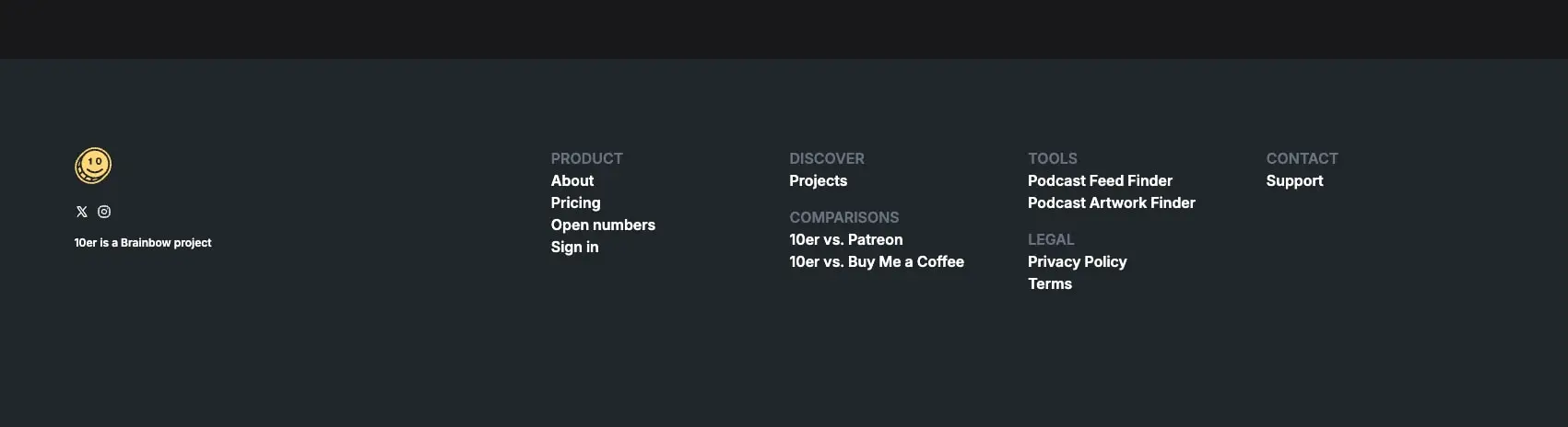
The footer moves to lighter charcoal so its multi-column link inventory becomes readable without competing with conversion content above.
Motion
No motion or transition data is available. Do not infer cover animation, hover behavior, or accordion timing from the stills.
Components and states
Global header
The circular yellow 10 mark sits at left. Creators and Features include chevrons; Pricing is a plain link. At right, an outlined Find a project pill, blue Get started pill, and circular account utility form the conversion cluster. The header stays quiet enough for the hero to read first.
Hero stack
Anatomy:
- Two-line statement.
- Short explanation.
- Filled blue Get started pill with trailing arrow.
- Reassurance sentence.
- Compact 300+ proof marker.
The hero has one action. Reassurance and proof support it rather than becoming separate cards.
Creator-cover gallery
Six rectangular covers sit in a relaxed fan. Each cover retains its own identity; the group receives the stagger and slight rotation. Keep the covers large enough to read as projects and avoid turning them into identical upright cards.
Project search
The search is a wide pill-shaped dark-field utility with a search icon, muted placeholder, and thin light outline. It is discovery UI, so it remains secondary to the primary action.
Pricing statement
Anatomy:
- Small warm Pricing label.
- Giant 8% display.
- Underlined transaction-fee qualifier.
- Filled blue action.
- Benefit/explanation split.
The central number carries the section. Do not add plan cards, comparison matrices, or a second primary action around it.
FAQ accordion
One question is open and several are closed. Rows contain bold question text, a right-aligned chevron, and a divider; the expanded row reveals muted body copy and an underlined external link.
| State | Visible treatment |
|---|---|
| Collapsed | Bold question, downward chevron, bottom divider |
| Expanded | Upward chevron, body answer, underlined link |
Hover, focus, disabled, loading, error, and validation states are not established.
Footer
The footer uses lighter charcoal and sparse link columns. Product, Discover, Tools, Legal, and Contact labels are muted; links are high contrast. Brand mark, social icons, and “10er is a Brainbow project” sit in a separate left block.
Responsive behavior
The captures cover wide desktop widths and a shorter desktop viewport. Home maintains a centered hero and horizontal cover gallery; pricing maintains its centered price, benefit split, and desktop footer columns.
Mobile breakpoints, navigation collapse, cover stacking, and touch-target changes are not shown. A responsive adaptation should preserve information order—header, claim, action, proof, covers, search; then price, benefits, FAQ, footer—before preserving desktop columns.
Practical guidance
Preserve
- Dark shell plus colorful creator-art contrast.
- One primary blue action per major decision.
- Single-family Fixel hierarchy with tight display text.
- The 48px hero and 96px pricing-display distinction.
- Pill actions and a wide pill search field.
- Whitespace and thin dividers instead of a dense card system.
- Loose tilted creator covers as the expressive centerpiece.
- A lighter charcoal footer for information architecture.
Avoid
- Adding a rainbow of UI accents because creator art is colorful.
- Turning pricing into a SaaS plan-table grid.
- Covering the dark canvas with gradients, glass, or heavy shadows.
- Making every control a filled blue button.
- Flattening the creator gallery into identical upright cards.
- Inventing mobile behavior, motion, or unseen states.
- Treating the Fixel reference as a font license.
Known gaps
The captures do not establish exact dark-surface, blue-action, yellow-logo, or pricing-label values; mobile/tablet behavior; hover/focus/disabled/loading/error states; motion; or the full project-detail flow.
Reference scope
This guide studies four 10er captures: two homepage views and two pricing views, at 1689–1712px desktop widths. The representative captures cover the hero/gallery and pricing/FAQ/footer.
Sites change, so a screenshot can differ from the guide.
Loading…Similar designs
This guide describes the public website and isn't an official 10er.com design system. Not affiliated with 10er.com.